Abby Bader
-
Posts
269 -
Joined
-
Last visited
Content Type
Profiles
Case studies - Free
Case studies - Premium
Resources
Insider
Courses
Forums
Store
Everything posted by Abby Bader
-
-
I remember we had a lot of connection issues with the old Unity system back in the days and the Avid guys were hanging around day and night with blue rings around their eyes. With the ISIS and Baselight I haven't experienced any connection issues. Most of the studios I've been working with the last years have tech guys and hot lines to the support services because they can't afford down times and clients waiting. Please give us an update when it's up and running again.
-
I'm not sure if I understand, are you looking for craigslist kind a sites or learning resources?
-
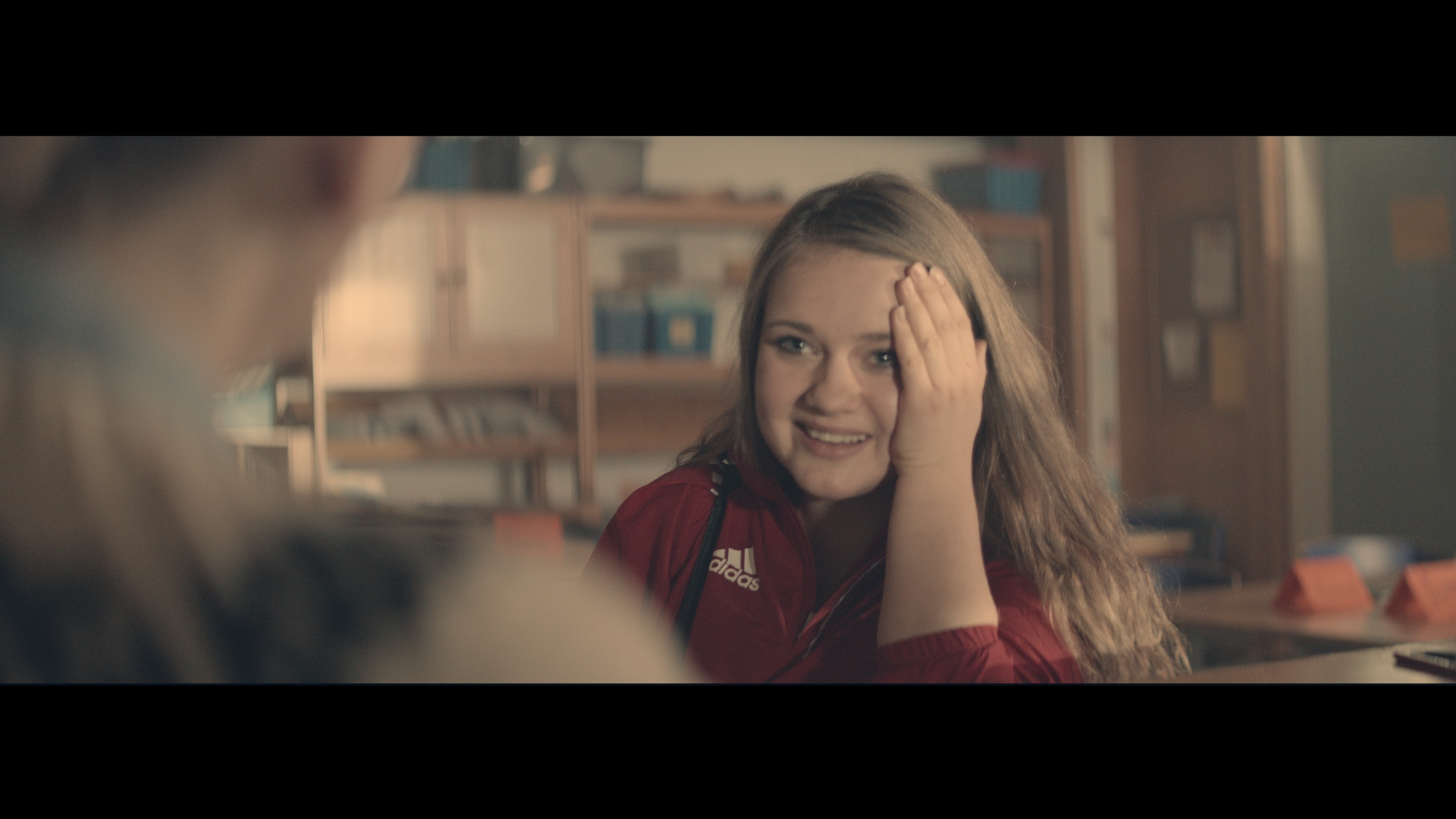
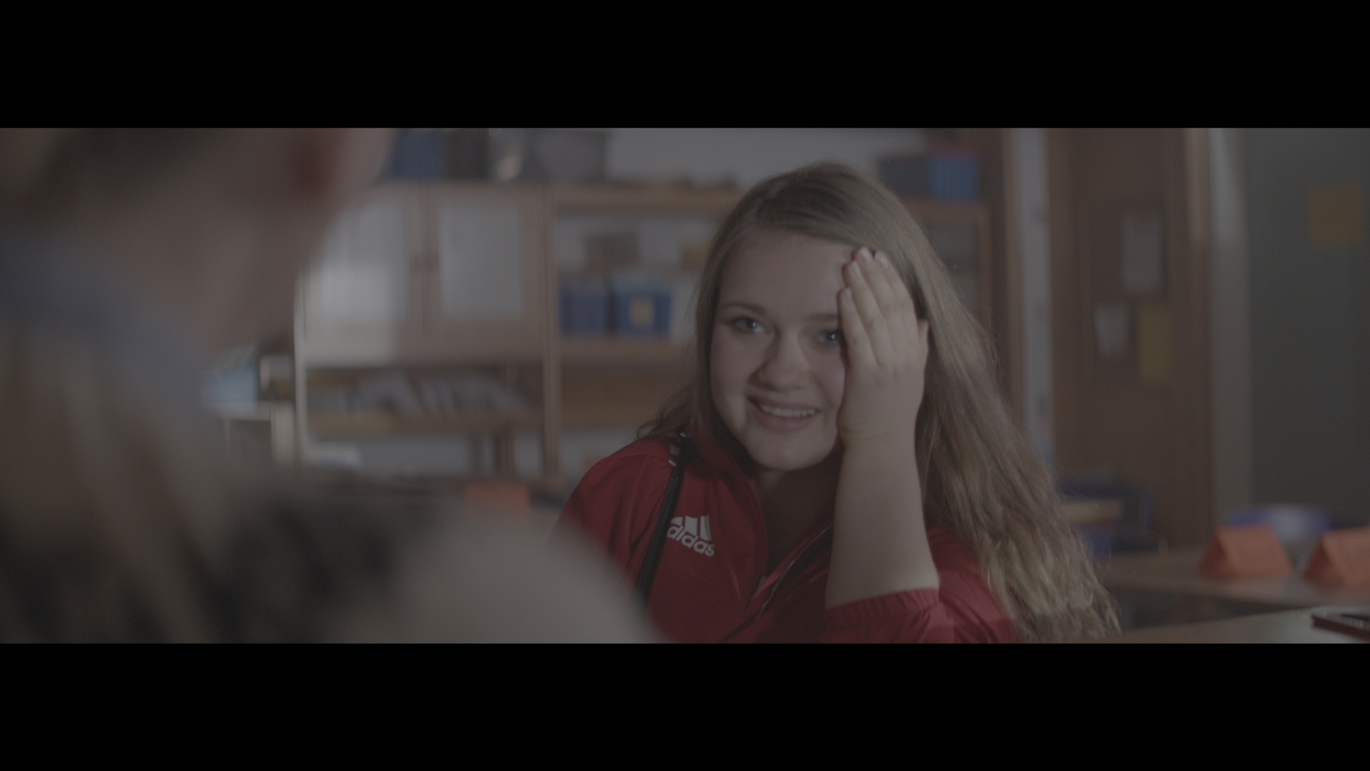
I'm not quite sure if we landed on that kind of look. Sometimes we are inspired by something and put example images on the table but as we start working we might end up in a different place. Here are before and after on one of the scenes.

-

Best color grading and color science book
Abby Bader replied to a topic in Editing , Color grading & Finishing
I agree in @Tom Poole's statement in one of the other threads. "My advice to my assists and people coming up is always the same "Immerse yourself in all things visual - photography, film, art, whatever it is". These are the things that will make you a good colorist, and also allow you to hold conversations with other creatives. -
https://www.dezeen.com/2016/01/06/super-8-camera-kodak-relaunch-yves-behar/
-
Ferannia P30 35mm B&W Stock is coming back...
Abby Bader replied to Frank Wylie's topic in General Discussions
Great, miss old Tri-x film!- 4 replies
-
- 3
-

-
- 35mm
- black and white
- (and 1 more)
-
Correct. Add +1 in each color channel in the offset controls (+r +g +b) for one global density point. One global density point is 1/12 of a stop. 36 increments (+12r +12g + 12b) is a full stop.
-
Hi Neila, Nice to see you here! In this article by Dan Muscarella you can read that "A combination of one printer point on all the three primary colors is equal to a full 1/12 of a stop, also known as a full point of global density. " It means that if you add one point of red, one point of green and one point of green you have increased the brightness with 1/12 of a stop. If you instead add 12 point of red, 12 point of green, and 12 point of blue you have increased the brightness with 1 full stop. Abby Master Study in DaVinci Resolve Printer Lights - Insights - Lowepost
-
Stay on top of your game!
-
colloquial term for 'Gamma'
Abby Bader replied to Andy Minuth's topic in Editing , Color grading & Finishing
It's too dark!! -
Sure Mark, that would not be a problem at all and is an approved workflow. Maybe @Daniele Siragusano can elaborate more on that?
-
What is the best color grading software?
Abby Bader replied to Bledar Cili's topic in Editing , Color grading & Finishing
Great to see you here Anthony! Can you elaborate more on how Aces in Baselight is better than in the other correctors? -
Personally, I like to push, pull and rotate the second screen. I feel more relaxed with a distance to my scopes but that's my issue
-
If the model got light skin you would like to hide the blue / magenta beneath the surface, especially around the eyes. Just like girls do in real life to make the skin look more healthy and to make the eyes pop. Adding some warmth to knock out those colors will often result in some more "life" to the model even if you want to keep the overall skin tones natural.
-
The importance of film preservation
Abby Bader replied to Tom Evans's topic in Editing , Color grading & Finishing
Interesting Frank! -
Beautiful spot and great words!
-
Day for Dusk Grade Advice
Abby Bader replied to Shane Taylor's topic in Editing , Color grading & Finishing
Cold skin tone is perfectly fine, I just ment you need to be careful with texture and facial details. One of the shots was lit very flat, and it's rarely flattering with completely white and washed out skin tones in that context. -
Hi Pepijn. Sorry, should have linked to the article
-
Day for Dusk Grade Advice
Abby Bader replied to Shane Taylor's topic in Editing , Color grading & Finishing
When working with night exteriors you need to evaluate the top level light and at the same time consider how much you want to stretch the black values to preserve a rich image with enough details. The overall color cast is magenta and that's a pretty bold choice, but that could definitely work. Sometimes I throw in different reference images with different color palettes to see what works best on my footage. I often end up in a more blue direction for day-for-dusk. When de-saturating the image so much that the flesh tones almost turns white you need to be careful not to loose too much facial details and texture. Good luck! -
Beautiful ad and a powerful grade. Well done James!
-
Beautiful ad and a powerful grade. Well done James!
-
You are are great inspiration and I like your approach to imitate film.