Stig Olsen
-
Posts
382 -
Joined
-
Last visited
Content Type
Profiles
Case studies - Free
Case studies - Premium
Resources
Insider
Courses
Forums
Store
Everything posted by Stig Olsen
-
The MANIAC Workflow(8K HDR for Netflix)
Stig Olsen replied to Ildus gabidullin's topic in General Discussions
Hi James. The tools are distributed under the same type of model as Dolby distributes "Dolby Digital"; they sell licenses directly to the studios and networks. It's only available to certified post production facilites, and consists of both a software and a hardware part.- 3 replies
-
- 1
-

-
- davinci
- panavision
- (and 3 more)
-
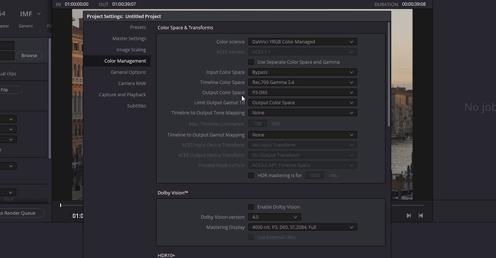 We continue our DaVinci Resolve 17 training with a new high-end course in Color Management Workflow. This is an intermediate course for colorists and visual effects artists taught by our instructor Lee Lanier. In this training series you will learn to work with both display-referred and scene-referred management including ACES, matching camera profiles with color space transforms and DCTLs, how to set up your projects for multiple color space outputs, everything about RED IPP2 and RAW workflow, how to use the Gamut tool, LUTs, CSTs and OpenColorIO in Fusion, and much more. The DaVinci Resolve project files and footage are available for download so that you can easily follow along. Download project files The DCTL that comes with the project files is created with a tool called Resolve Math Extra (OFX) developed by Paul Dore. It can be downloaded from this site. About the instructor Lee Lanier has created visual effects on numerous features films for Walt Disney Studios and PDI/DreamWorks. Lee is a world-renowned expert in the video effects field, and has written several popular high-end software books, and taught at the Gnomon School of Visual Effects in Hollywood. Who is this course designed for? Colorists Visual effects artists Lessons overview Lesson 01: Introduction and terminology Lesson 02: Display vs scene referred Lesson 03: Display referred space and LUTS Lesson 04: Mixing Camera footage in display referred Lesson 05: Matching cameras with an OFX plugin Lesson 06: Color management in Fusion Lesson 07: Using RCM Resolve color management Lesson 08: Working with ACES Lesson 09: RCM and ACES inside fusion Lesson 10: Adding color transforms in resolve Lesson 11: Adding LUTS and using opencolorIO Lesson 12: Switching to RCM wide gamut Lesson 13: New color space aware tools and HDR palette Lesson 14: RCM input and and output DRTS Software required A free version of DaVinci Resolve or DaVinci Resolve studio
- 86 comments
-
- 27
-
-

-
You can add a TimeSpeed tool from the Miscellaneous menu and set the speed value to zero.
-
Fusion doesn't recognize layer stacking in the edit module so it will not automatically fill the transparent area with the bottom layer clip. Instead, you can mark both clips in the edit module, right click and create a "Fusion clip" to bring both of them in.
-
 This is the ultimate course for editors and conform artists who want to learn everything about conforming inside of DaVinci Resolve! With 21 lessons and almost 5 hours of in-depth DaVinci Resolve training, Kevin McAuliffe will take you through every step and technical detail of the process from conforming media to mastering the final picture. About the instructor Kevin is an award winning editor and visual effects creator based in Toronto with over 15 years of teaching and training experience. Over the past years Kevin has delivered world-class work for clients such as Warner Bros, Walt Disney Company, 20th Century Fox, Universal and Elevation Pictures. Who is this course designed for? Editors Conform Artists Colorists Software required A free version of DaVinci Resolve or DaVinci Resolve Studio. Avid. Premiere and Final Cut X are used in some of the lessons. This training series is sponsored by our friends at digitalrebellion.com
- 41 comments
-
- 20
-
-
-
Master Study in DaVinci Resolve Printer Lights
Stig Olsen posted an insider Article in Color Grading
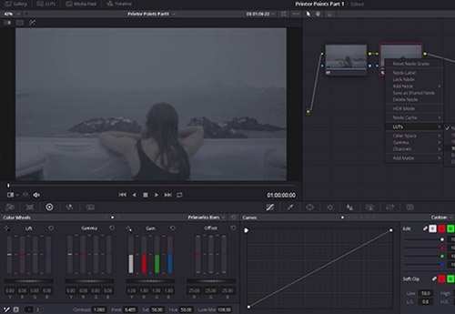 Printer points were mechanical adjustments that affected the color balance and brightness of film before the digital age, and the technical process was done by a color timer. The systems used a series of dichroic filters that split the light into red, green, and blue, and each color then passed through 'light valves'. These were metal vanes that opened and closed in precise increments to allow the exact amount of light through to replicate the exact value for each light point. The three colors were then recombined back into full spectrum light and output to the film. In digital grading, printer points are still very popular and common corrections for setting the primary balance, but also for creating looks. One of the reasons for its popularity is that printer points move the signal in its entirety and alter the entire tonal range in the image. This way, we stay true to the way the original image was shot, and the result can be very clean and cinematic. To illustrate this we can look at the waveform when we add red and subtract green to a grey-scale image. The relationship between the shadows, midtones and highlights stays consistent, and the contrast never changes. By using controls that separate tonal ranges such as lift, gamma and gain, we betray the natural relationship between the shadows, midtones and highlights. This is illustrated with a gain adjustment in the example below. Other reasons for its popularity are that printer points are extremely accurate corrections that can be measured, and they are easier to communicate than wheel values. Printer points in DaVinci Resolve Printer points are equivalent to the Offset Controls that can be found underneath the 'primaries bar' menu inside of DaVinci Resolve. By default, the exposure of each color channel is set to 25 as a starting point, which refers to the center of the scale in most standard printer setups. By moving the sliders of the individual color channels up and down, the color balance will be altered. The combination of red, green and blue and the opposites cyan, magenta and yellow in varying degrees of intensities can create a variety of different colors. When working with the color channels we also need to take the brightness into account. By moving all the three color channels ganged together the brightness of the image changes. Moving all the color channels ganged together one time will change the brightness equal to about 1/12th of a full camera stop, and by moving them together twelve times the brightness will change equal to a full camera stop. Adjusting the individual channels also affects brightness, but at different levels. Changes in the red channel affects brightness more than the two others, and green slightly more than blue. However, to say how the eye would perceive these differences would be difficult as we have our greatest sensitivity in the green spectrum and our eye is more sensitive to changes in brightness than color. The combination of brightness and color can be used creatively, and in the example below we get dark yellow by subtracting blue and green. Some other interesting combinations are to remove blue and green to get red, remove red and green to get blue and to remove red and blue to get green. In the next example, we add red and green to get to yellow instead but this time the brightness increases. Other examples are to combine red and blue to get magenta and green and blue to get cyan. Corrections through the curve of a LUT The Offset Controls are calibrated to work on the narrow range of log encoded images only, and the results of the corrections are designed to be viewed through the curve of a LUT. This way the offset controls will act more like a traditional exposure control, as the image will expand and compress based on the shape of the curve. We can apply our corrections on a node prior to the LUT to keep the node structure clean, but the result will be the same if they are applied on the node with the LUT itself because corrections will take effect prior to the LUT. Creatively we can choose to apply the offset corrections in video gamma space after having normalized the image, but the controls will act differently than what it's designed for and the result will be different. Adding a point of red to the exposure in video gamma space gives you lifted red shadows, which isn’t the way exposure should work When we look at the corrections through the curve of the LUT, we will see more changes in the straight line portion of the curve rather than in the ends. It means that we can push color into the image without affecting the blacks and highlights as much as the midtones. Just the way different film stocks would act in the past when film was color timed chemically. The color balance of the image may also be altered depending on the color variables in the LUT. Some LUTs are also designed to push cooler tones into the shadows and yellow into the highlights even though we only adjust the brightness. The more aggressive the curve is, the more changes happens when working under the LUT. In this representation of the popular Fujifilm 3513DI D55 LUT (that can be found in the DaVinci Resolve 3D LUT list), we can see how the color channels interact with one another. Even though the exposure vary and color shifts happens, the contrast don't change. We can view the offset corrections through any curve, but the only way to keep the relationship between the tonal ranges and stay true to the way the original image was shot, is to use the exact same LUT that the DOP exposed for on set. If the DOP shot on Alexa with the Alexa K1S1 LUT in the camera, that is the one we should grade under and watch the corrections through. Balancing with Offset Controls With different light sources and color temperatures, it's sometimes necessary to balance an image to remove a color cast. Usually the color cast is apparent in the entire image and can for that reason effectively be removed with simple offset adjustments. Sometimes it's sufficient to only adjust one of the color channels, but in the example below we need to adjust two channels to bring the image into balance. To reduce blue, we can add yellow by lowering the numerical value of the blue channel, and then we can add red by raising the numerical value of the red channel. By pivoting the red and blue channel around the green channel that is placed in the middle, we don't change the exposure to much from how it was orignally exposed. In addition to color temperature, images can also have a tint issue. While color temperatures ranges within the orange/blue spectrum, tint ranges within the green/magenta spectrum. If the color cast is magenta, we can add green to correct the color balance, and vice-versa. Davinci Resolve has a Tint Control to deal with these situations but it's calibrated to work in video gamma space. That means the range can be a bit narrow on log-encoded images if the cast is too strong. Offset corrections can therefore be a better choice in those situations too. Balance the image or not Remember, white balancing usually means adjusting the colors so the image looks more natural -not necessarily «correct» on a scope. If a blue color cast works for us, there’s no rule that says we must neutralize the white balance. Sometimes we also deliberately ignore the balance for artistic reasons. This particular image is supposed to be blue and it’s perfectly natural. Just as a sunset needs to stay nice and warm. It's up to us to adjust the white balance, or to adjust it at all. Balance or not, it's essential to apply the LUT before judging how to approach the image. Full, half and quarter increments The offset controls can be available on the numerical keypad section of the keyboard by activating the hotkeys in the color drop-down manu. They are also available in half and quarter increments. A more sophisticated way to work with the offset controls in DaVinci Resolve could be to map the keys to a Keypad. By Lowepost Thanks to John Daro, Paul Dore, Douglas Delaney, Florian 'Utsi' Martin, Tyler Roth, David Cole, Walter Volpatto, Adam Inglis, and Paul Ensby for contributing to this article.
- 22 comments
-
- 42
-
-
-
Hi Everyone! After having used the last years to discuss color grading with the best colorists in the world, seen many different approaches, techniques and ways to build grades, we thought it was a good idea to create a video tutorial series and share some of the techniques and insight we have learned. We landed on doing scripted (pre-written) tutorials. That means we can concentrate the content, be far more to-the-point, make them shorter and avoid wasting your time with distractions. The first one is about silver retention (bleach bypass) and is available for our premium members in the insight sectiom right now! I hope you like it!
-
Hi Everyone! I'm just checking in to invite you all to the Color Grading Lounge group on Facebook. The group grows fast with many lively discussions. See you there, Stig
-
B efore beginning the shoot, Roger Deakins performed many photo chemical tests at film labs and post facilities to see if he could get the look that he and the Coen Brothers wanted. They were to shoot in lush, green Mississippi during the summer, but wanted a dusty, brown, burned out hand-tinted look that reflected the 1937 Depression era. The only place he felt could give him this was Cinesite at that time. I became involved during the testing. You have to remember that back then, in terms of color grading for film output, while not exactly the Stone Age, was more like the Bronze or Iron Age. There were no such things as real time conforming, 3D look-up-tables, 2K digital projectors, or real time playback of data files. These things are taken for granted today. It was pretty much the wild west for grading. We used Silicon Graphics CRT monitors that the engineering staff at Cinesite calibrated especially for film, which gave a reasonable contrast range approaching film, but color accuracy was another matter. We would film out test frames after every session (film recording was very slow and expensive back then) and view the print the next day if the print met LAD AIM (the film equivalent of color bars, so to speak). If not, a new print was struck until it did. Then we would see what we had. The interesting thing was that some scenes we thought would be very straightforward proved to be problematic, while others we thought would be troublesome proved to be no problem at all. A-B negative rolls We had cut A-B negative rolls to be scanned on a Spirit Datacine. For anyone who is not familiar with cut A-B neg rolls, a brief primer: the neg is cut together in a normal editing environment. When a transition is required (dissolve, wipe, etc.), enough handles to cover the duration are included in the shot, followed by black leader until the next transition is required, then the camera original shots are continued on, and so forth. This is the A-roll. Then the B-roll is created inverse to the A-roll. Using A-B cut negative required a lot of reel changes and cleaning of the transport, since the black leader normally used in cut neg left a lot of residue on the rollers and in the gate. Sometimes a C-roll is used, but I don’t recall if we had any. We may have had one or two. This continues for every film roll. Green-to-brown transform The grading was done operationally like a typical telecine session, and we used a Pandora Int's Poggle with MegaDEF system. That was the only system at that time (circa 1999 - 2000) that worked with 2K (2048 x1556) data. As in modern grading systems, we could select a color and adjust the range affected by phase, saturation, luminance, etc. Deakins and the Coen Brothers wanted to do the green-to-brown transform entirely in the grading bay, but throughout the process we didn’t want to change all the greens to a single shade of brown. That could look phony. So we would change the trees, for example, to one shade/density of brown and the grass to another. Sometimes on a shot we would change a grass field to one shade, the shrubbery on the edges of the field somewhat different, and the trees yet a little more different. The biggest issue in the grading process was that the greens we were changing to dusty, burnt brown didn’t translate well at all on the monitor. Being that this was the crux of the whole project, we had to deal with it somehow. The only way I knew to do this in any kind of timely manner was to look at the difference between the print and what we saw on the monitor, try to determine in my mind how different it was in grading terms, apply an opposite adjustment to the file, film it out, and see where we were. After a few of these, it became a bit easier to apply a mental LUT, but it still required a proper grading on the monitor so that Deakins and the Coens could determine what they wanted, film it out, view the print, and make the change. A bit cumbersome to say the least. Outside of losing the greens, it was a pretty common grading session. We made sure the RGB controls were balanced properly and that the brightness and contrast ranges were appropriate. Of course the film had an overall look, a palette, but no other individual colors were specifically isolated or treated as a whole. It wouldn’t make sense to have the environment be a burnt, dusty look and have the talent be in bright, saturated primaries. It wasn’t shot that way. Everything had to look as a whole. Secondary controls, of course, were used as necessary. The type of adjustment is varied depending on content and desired results. One example of this was a shot of the actors on a handcar. The shot pulls out and tilts up to a very wide shot. Besides tracking the foliage, the sky was almost white, so we put some windows in the sky to give it a gradated late day look. The sky gradations also had to be tracked. There was no “special” attention paid to skin tones, eyes, etc. They just had to look like they were supposed to and consistent throughout a scene and throughout the film. We used normal grading procedures, still stores, and what felt right, even if it wasn’t a technical “match”. Deakins and the Coen brothers were great to work with. Deakins was intimately involved. He was present in the bay virtually every day as far as I recall. The Coen brothers came in periodically to view film out tests, but they were very much on the same page as Deakins, so there was no need for them to be present daily. Julius Friede
-
Want to know how it looks like when Tyler Roth, senior colorist at Company 3 grades a TVC? We recorded a remote grading session (screen only) and made 6 short edits for you. Click here or go to our video menu.
-
Most dramas, features and commercials are shot progressive, but transmitted in an interlaced environment at the end. The common workflow is to work progressive through the entire pipeline, but to change the project settings to 1080i50 before final output. You will not experience any field issues because they will be duplicates of each other, but as mentioned above, you can benefit from the interlacing on some animated effects like end crawls and transitions if those are added after the timeline change.
-
On the shot below I've used "Sharpen Edges" with increased edge mask strength and decreased edge blur, combined with some customized grain.

-
Inspector attributes can be copied by selecting and copying (ctrl+c) the main clip and then right-clicking the target clip choosing paste attributes.
-
HBO's Band of Brothers has inspired colorists for years and the look has been copied numerous times since it was released in 2001. DI colorist @Stuart Fyvie worked on the team with Luke Rainey (RIP) coloring this award-winning show, and two years ago (!) he wrote a story for us that we want to share with you today. This story is big, never told before, full of insight and tech-talk. It's really a must-read. Thank you Stuart!
-
Hi everyone! We are setting up a virtual feed from C3 to our suites for an upcoming set look session. This feed is received through the Streambox Media Player on Windows and it works perfectly. But we want to extend the display monitor view to a HDMI monitor connected to a Q M2000 card, is that possible? It's not possible to run the signal through any external output devices such as a Decklink on Windows.
-
Lowepost is looking for tech experts that would like to write product reviews in exchange for products. PM or cm@lowepost.com Thanks, Stig
-
Hi Everyone! We have finally managed to build the review system, and first out is the list of color books! Please feel free to write a review and rate books you have read. If you're logged in, you can also suggest books you think others will enjoy. The list can be found in the resource section or by clicking this link https://lowepost.com/list/books/ Feel free to share the news!
-
Disable "automatically import source clips into media pool" and enable "link to source camera files" when loading the AAF into the Media Pool.
- 1 reply
-
- 2
-
-
-
Lowepost members got 20% discount on the ARRI Training for Advanced Color Science in August. See calendar for coupon code and link to the event.
-
Alter Ego (Eric Whipp's company) is looking for an enthusiastic colour assistant to join their team. Location: Toronto Position: Full Time Salary: TBD DESCRIPTION Alter Ego is looking for a full-time Colour Assistant to join our team. As a Colour Assistant you will gain valuable hands on knowledge of the commercial industry at Canada’s largest commercial colour and visual effects studio. The Colour Assistant’s primary responsibility is to manage all ancillary aspects of the current and upcoming sessions, enabling the artist to focus solely on the operation of the Colour Suite. This includes preparing the suite for client attended sessions, coordinating meals and ensuring the suite is always presentable. REQUIREMENTS • 1-3 years of experience working in a post-production environment. • Knowledge of Photoshop and various editing software. • Understanding of various file and camera formats i.e., R3D, Alexa, Sony, Canon & Phantom. • Understanding of Baselight would be considered an asset. ROLES • Working knowledge and understanding of the post production workflow. • Detail oriented and highly organized. You are responsible for the accuracy, quality and technical standards of all deliverables. • Have the ability to remain flexible and adaptable. Must be proactive and able to anticipate the needs of the Colourist. • Strong ability to multi-task and meet deadlines while working under tight schedules. • Exceptional interpersonal and communication skills; excellent email and phone etiquette. • Willingness to take direction and to collaborate with others. • Enjoy working in a team-based environment. • Passionate about the work and willingness to learn. colourjobs@alteregopost.com
-
David Cole, Technicolor won 'Outstandig Color Grading - Feature Film' at HPA Awards 2003 for his amazing color work on Life of Pi. In the new premium article he talks about look development, grading techniques, integrity of shots, continuity of skin tones, lights and shapes and to be true to the vision of the film and story.
-
Molinare are recruiting for runners! Do you have hospitality or customer service experience, a passion for post production and an excellent work ethic? If this is you, then please send your CV and cover letter to enquiries@molinare.co.uk
-
We're happy to announce that we have a new article out from Steffan Perry, that leads Framestore’s grading department as Head Of Colour. In this comprehensive article he gives you a technical breakdown of his color work on the ground-breaking commercial for Galaxy, where they brought Audrey Hepburn, the big screen beauty icon of the 50s and 60s, back to life.
-
Bright light from windows
Stig Olsen replied to Nicolas Hanson's topic in Editing , Color grading & Finishing
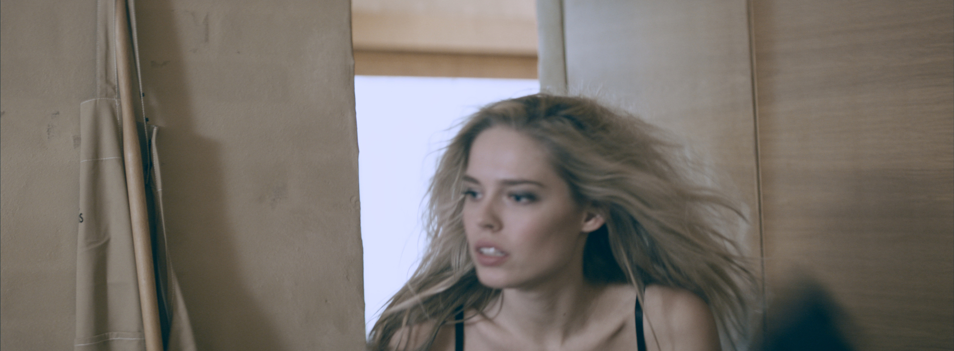
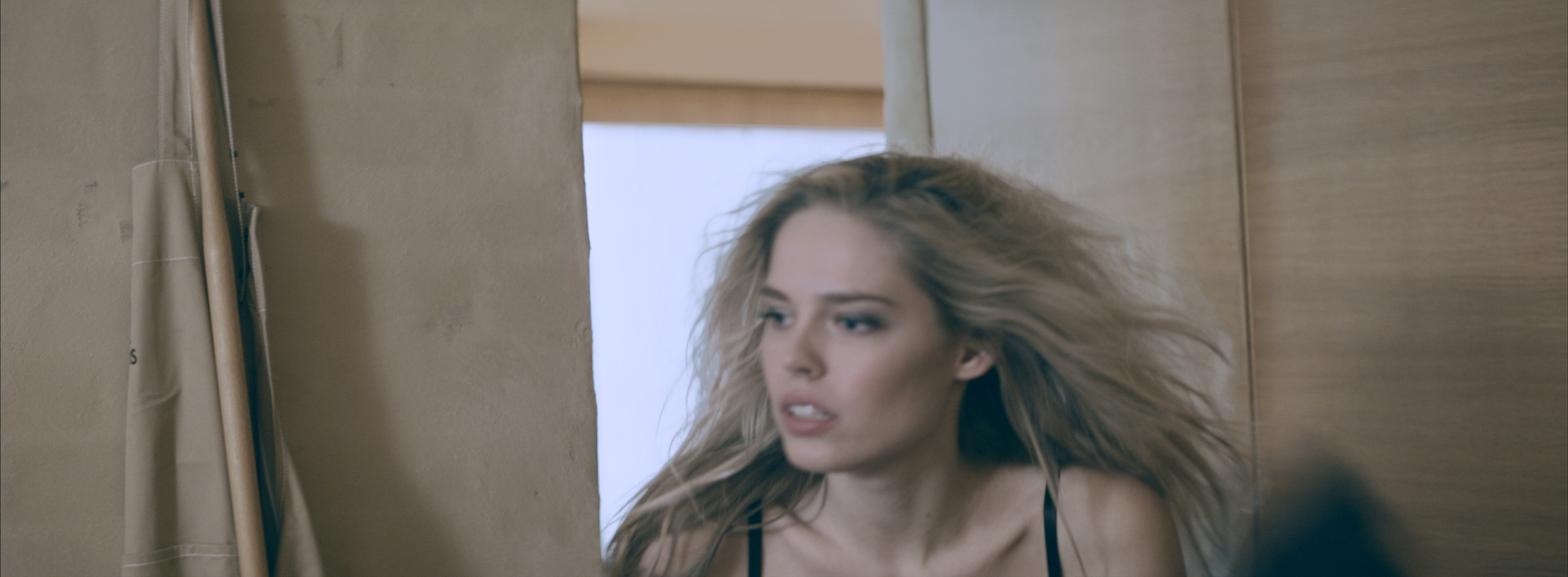
The halo around subjects is often introduced by lenses and could be tricky to reduce if the front light is weak. My experience is that un-ganging the curves and changing only the y-values could help in those cases. Even thought I try to avoid keys, a luminance key with a lot of blur could also help if you use garbage mattes to focus the key. I find it especially useful when trying to retain hair details as in the example below.
-
Great work Margus!