Keidrych wasley
-
Posts
25 -
Joined
-
Last visited
Content Type
Profiles
Case studies - Free
Case studies - Premium
Resources
Insider
Courses
Forums
Store
Everything posted by Keidrych wasley
-
Company3, Tinting blacks/neutrals, Contemporary blue look
Keidrych wasley replied to Rihards's topic in DaVinci Resolve
Wholeheartedly agree. A simple tone curve, sat and LGG can be immensely powerful. I just think understanding a tools limitations is an important part of learning how to use them.- 19 replies
-
- 1
-

-
- blue shadows
- teal and orange
- (and 3 more)
-
Company3, Tinting blacks/neutrals, Contemporary blue look
Keidrych wasley replied to Rihards's topic in DaVinci Resolve
Try recreating Yedlins LUT, or Mitch’s 2383 with LGG, you’ll soon come up against a wall of complexity. Recreating a complex print film LUT using primaries is impossible. The maths available in LGG can’t get you even remotely close, because the underlying math in LGG is too simple / basic. This is a good reason why studying color science and LUTs has value because it helps to understand the underlying math and what is happening ‘under the hood’. Learning to use LGG and learning about LUT building (along with the more complex color science that LUT building entails) are equally important and both of high value. The sliders in Ravengrade from memory are mostly simple operations, eg adding gain in linear for exposure, changing tone curve for ‘volume’ etc. The complexity is in the data collection and the implementation of the data used to build the looks. For example Mitch supplied a print film emulation based upon a very large data set and implemented extremely smoothly. Take a look at some of those looks as a graphical 3D cube, there’s some very advanced color science on display such as extremely smooth outer gamut curvature etc that made me smile.- 19 replies
-
- 1
-
-
- blue shadows
- teal and orange
- (and 3 more)
-
Look Development using Arri Isabela Chart!
Keidrych wasley replied to Daniel Rheaume's topic in DaVinci Resolve
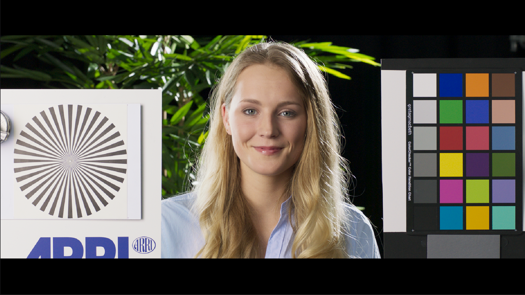
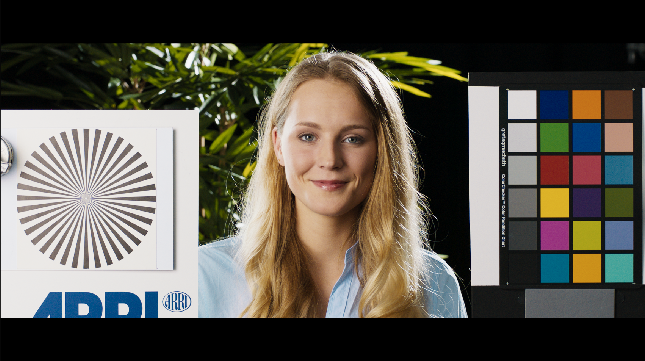
From memory I think you are right and well spotted, the Isabella 18% grey card is underexposed. Arri have stated that logC 18% grey should hit 398, or 400 on a 0-1023 10 bit scale and Isabella grey card does not hit this value. Personally I would say that for look development you ideally want to use many more shots across all sorts of lighting environments. One single shot tells you very little about how a show LUT travels. -
Thankyou for your reply. I have some further thoughts... You’re making an assumption that Steve Yedlin used all of those data points in his transform. The data points are there so that you know what something should look like, this does not mean they are all used. In order to keep the transform smooth it is likely that fewer points are used than measured. In any case those 6000 samples were to cover a wide exposure scale, there were 230 odd colour points from the chromaticity diagram. If we were to break a hue into 16 that would only be about 14 data points across a hues saturation range, the rest of the data is the exposure range because Steve went from -8 to +3 stops in half stop increments. So with that in mind, 14 points per hue slice/segment isn’t that much and certainly not when it comes to the amount of data points actually contained within eg a 32x cube. So it becomes more about having smart scattered data interpolation rather than the number of points? Regarding hues I understand it can be the case that one camera may see two hues where a second sees one, but is for example the Alexa fundamentally flawed enough not to be able to create a good perceptual match with film? I think there is a reason Steve went as far as creating a much more detailed spectral response model of the Alexa sensor. If you are just filming charts I don’t think that will cut it. In your examples the red of the Mavo is way off, are you suggesting it is not possible to get the reds to be correct with a more accurate transform? As far as I can imagine, using colour management like ACES will lead to this type of inconsistency because aces just uses a matrix and tone curve, there needs to be a more rigorous under the hood colour science employed? Whilst I can well understand it is the case that some cameras are not able to separate hues as well as others, I can only imagine the Alexa captures enough information to create a good perceptual match, as Steve demonstrated. I note however that products like emotive color, also based on more in depth color science and data collection have created excellent matches to arri color science so I don’t see why the greater body of a look can’t be implemented across multiple cameras as long as the data collection and transform is rigorous enough. The issue as far as I see it is having more rigorous methods for taking the input camera into a ‘neutral’ working space from which you can then apply the look, which means having your own custom color science. A tall order I appreciate. When you say that Dehancer has to solve much more variation on the input, surely the case should be that the user provides dehancer with correctly exposed images, and if not it is for the user to balance the image before hitting dehancer. As far as I see it, the task with Dehancer should be to convert a cameras spectral response and tone curve into a ‘neutral’ space, and then apply the film transforms whilst preserving mid grey throughout. From my understanding this is the path Yedlin took and I don’t see why that is a very particular technical case? Difficult and labour intensive yes but not particular or ‘restricted’ etc. If each input camera is well measured, it can be transformed into a ‘working space’, and from that working space looks can be applied that maintain 18% grey - ACES already attempts to do this. It just takes rigorous and difficult colour science to achieve this. I think saying Yedlin’s methods are some sort of edge case is a bit of an easy way out, and in my mind he demonstrates it is possible by perceptually matching multiple cameras to his target look - red, arri, 35mm, 65mm, Sony etc etc. I mean the whole body of his work and message is that it’s not about the camera so much as the math in the transform. As long as the camera measures enough information it can be whatever you want it to be, and in my view he went a long way towards demonstrating this. Regarding your grain emulation how are you able to verify that grain changes colours when there is no such thing as film without grain to compare to? How do you know for example that grain adds yellow to deep reds? What are you using for comparison to make that judgement? I think any colour transform should be kept out of grain, or at least let the user decide with another slider. Your model also clips blacks which I’m not a fan of and have run into trouble with, again I think let the user decide whether their blacks are going to be clipped. I find all this particularly frustrating because your grain model is otherwise rather good and it’s great that you do not take the overlay approach.
-
Perceptually matching digital sensors to film has already been demonstrated by Steve Yedlin. Further to that, Star Wars The Last Jedi was shot 50/50 film and digital, with cutbacks to the same shot on film and then digital. As Steve Yedlin described it, "It's the best display prep demo". If digital "can't match the color separation of film", how was this possible and how is it possible that he demonstrates just that not only via his work, but also in the Display Prep Demo, the Display Prep Demo Follow Up and the Resolution Demo? Using a matrix and tone curve is not enough to match one digital sensor to another, and certainly not enough to match eg an Alexa to a negative scan. The lack of a match in Dehancer is not the problem of digital sensors, it's the methods being used to gather the data and the mathematical implementation of that data. If you are using a matrix and tone curve to match cameras or filming color charts, and your source film data set is from limited measurements of color charts printed to and then measured on photographic paper then I think that would be the source of any mismatch, not the fault of the digital sensor. I'm sure there is good reason Steve Yedlin used a SkyPanel and 6000 measurements to profile the Arri digital sensor and 5219 rather than color charts or any other method. I enjoy Dehancer, however just yesterday I was trying to use Dehancer for grain, but finding that deep reds are shifted considerably to the degree that I could not use it and don't want to have to 'correct' everything back. I have everything switched off here, and all grain settings are at 0. The transform into aces is not the cause, just turning grain on and off creates this shift. Grain Off: Grain On:

- 74 replies
-
- 1
-
-
- colorgrading
- film
- (and 2 more)
-
Interesting. Thanks for putting in the work. I think it demonstrates that the colour science is quite a ways off. Hopefully that means a better and more accurate 5219 profile and under the hood colour science will be in Dehancers future. It would be great if a company would be willing to go to the lengths Steve Yedlin did to profile his film path, particularly in how the cameras were profiled etc but in terms of the public domain it seems no one has gone to those lengths yet, or had the knowledge for how to do so.
-
The thing to bear in mind is when you increase saturation in a typical color corrector using the saturation knob what happens is you are effectively increasing the luminance of all the colours and pushing them all equally to the edge of your gamut. So the colours are becoming brighter and brighter and more garish and unnatural. Film on the other hand saturates differently - as saturation increases the luminance of colours decrease. Both the color corrector and film density saturation look saturated, but with a totally different perceptual feel. The color corrector saturation will make an image become more and more thin looking, the film density / subtractive saturation will become more and more ‘rich / thick’ and deep looking. Film will also shift hue along with reducing luminance eg deep low luminance reds might become more yellow instead of more bright and magenta etc. The way that film saturates is part of the reason it is still studied and modelled digitally.
-
Lift gamma gain makes 1D adjustments and is very simple and limited math. Lift gamma gain will effect your tone curve and contrast. Tetra / Paul Dore's Film Density will make 3D adjustments not possible with lift gamma gain. Tetra can make adjustments to color that are independent of contrast and do not effect contrast. So if you want to lower the perceptual density / luminance of specific colours to make them feel 'rich' without effecting your contrast, Tetra can be very powerful indeed. It's important to point out that 2 images with the same contrast can have very different feelings of color richness and color 'density' depending on how the colours are being effected, and to make those types of more complex adjustments requires tools capable of 3D color manipulation. Another tool for example would be Resolve Hue vs Lum curves.
-
Tetra is a dcil tool floating about online if you google it. Very useful for shifting the position of primaries, changing their colour and luminance without effecting the greyscale and doing so quite cleanly.
-
Density can be used as a term to describe the lowering of colour luminance which brings a perceptual richness to colours. If for example using Tetra you lower all three channels of red (red red, red green, red blue) you will get a perceptual ‘density’ to red as the luminance is lowered. There are tools that add saturation whilst lowering luminance to model a film style subtractive saturation which also brings a feeling of density to colour.
-
Sounds like a gamma tag issue. What are the gamma tags of your exported file? If it’s 1-1-1 this will be why QuickTime and finder are washed out. QuickTime and finder will read the gamma tag and adjust for 1-1-1 (1.96 gamma ). VLC is not color managed and so it does not adjust the file based on the gamma tag metadata and instead defaults to gamma 2.4. If you set Resolve gamma tags to rec709 gamma 2.4 (1-2-1) QuickTime and finder will look correct however bear in mind that YouTube/Vimeo will enforce 1-1-1 gamma tags when they encode making the image washed out again. You can help this somewhat by encoding a gamma 2.4 to gamma 2.2 conversion Using a CST node at timeline level in Resolve.
-
Hi, Can you please reinstate the ability to maintain image sharpness when using grain. With 4.1 it is now impossible to keep the original image sharpness and you are forced into having a soft image. This was not the case with V3. I'm all for authenticity but please allow users to decide rather than enforcing a soft image. Thanks
-
Please fix v4. It’s a cpu disaster and no longer runs in real-time on my Mac Pro 2019 with vega ii. Version 3 was fine.
- 74 replies
-
- 1
-
-
- colorgrading
- film
- (and 2 more)
-
Setting up a new Flanders Scientific DM240
Keidrych wasley replied to César Ricardo Alpuche's topic in Monitors/Projectors
If you are working in Resolve leave video levels set to auto, and don’t change the Flanders. Set Resolve colour management to rec709 gamma 2.4. Set your Flanders to rec709 gamma 2.4. Do your grade. After you have finished if you want the grade to look the same once it is on Vimeo or YouTube and played back on a Mac or iPhone using safari or chrome follow these steps. Assuming you have exported a prores master file and will create deliverables from the master... Bring the master file back in to resolve. Add a colour space transform node. Set output gamma to rec709a. In the node key set to 75% (75% of the node effect). Then on the deliver page choose h.265. Set to main 10 (10 bit) and set the gamma tag to rec709a. Once you upload this to Vimeo / YouTube you should find it looks almost identical to a Flanders when using a fairly modern MacBook / iPhone via chrome or safari. Becuase Firefox is not colour managed it will not look correct. There can be a slight colour tint when using h.265 that is not there in h.264, if you get this you can add a node before the CST node and dial in a quarter to half point printer light plus or minus magenta. This above method should be used for online deliverable only, not for client review via QuickTime etc. -
Color Calibration Devices - Laptops And Screens
Keidrych wasley replied to KB Burnfield's topic in Mac/PC
I would suggest that an i1 display pro with the bundled i1 software calibrated to REC709 2.4 will be more than sufficient for the work you intend to do. You need to choose 'advanced workflows' in the i1 software, then choose the 709 preset and set luminance to 100cd/m2, and gamma to 2.4. Then grade in a darkened environment ideally with a bias light behind the monitor. If you start earning more money from grading and want to go a step up from this i'd suggest a blackmagic mini monitor for the SDI connection and one of the LCD Flanders Scientific monitors eg the AM210 / BM240 or second hand OLED CM250. All of these monitors come calibrated with a 3D lut, they then offer free calibration for the life of the monitor. -
Color Calibration Devices - Laptops And Screens
Keidrych wasley replied to KB Burnfield's topic in Mac/PC
Sure but what sort of work? Corporate? Short films, low budget branded content, documentary etc? -
Color Calibration Devices - Laptops And Screens
Keidrych wasley replied to KB Burnfield's topic in Mac/PC
What do you want the calibration for? What sort of work are you doing? A step up would be the i1 pro with LightSpace Lte but you would need an Sdi monitor I believe though it may do icc profiles. -
Color Calibration Devices - Laptops And Screens
Keidrych wasley replied to KB Burnfield's topic in Mac/PC
I found the i1 Display pro with the xrite software when set correctly got my GUI monitor (just South Korean rehoused apple display) very very close to my Flanders Scientific Oled cm250. It also worked well with a retina MacBook Pro. However, I wouldn’t use these for colour critical work though for client review or good-enough-to-get-by-in-a-pinch grading it’s fine. -
Alpha graphics jagged edges in DaVinci Resolve
Keidrych wasley replied to Amada Daro's topic in DaVinci Resolve
Yes. On media page right click the graphics file, go to 'clip attributes' and under alpha choose 'premultiplied'. -
I get more pronounced results from Pipeline, which leaves me confused when looking at your examples. Here are some examples of Alexa IDT vs Pipeline 2383. You can see my Pipeline 2383 exhibits more yellow greens, a warmer overall white balance, green in the blues etc. My workflow for these examples is Aces 1.1, Alexa-AcesCCT, Pipeline LUT, AcesCCT-REC709. Alexa_IDT Pipeline 2383 Alexa IDT Pipeline 2383 Alexa IDT Pipeline 2383 Alexa IDT Pipeline 2383
-
You can get them 50% off around black Friday. As to accuracy that's so hard to ever judge. Accurate to what? A film print can look so different depending on the settings used when it was processed / scanned. One thing for sure is the Pipeline LUTS look good and they are smooth artefacts wise. The only LUT i've seen that could demonstrate accuracy would be the one created by Steve Yedlin to emulate 5218 printed to 2383. I'm sure there are other accurate LUTS but they'll be propriety LUTS held by post facilities like efilm etc.
-
I would recommend trying Cinegrain Pipeline. I have Koji and have trialed Film Convert Nitrate. Koji has issues that create artefacts in some situations, Pipeline 2383 v2 can match the Koji with some small adjustments. As for Nitrate i could get something very similar to my favourite Nitrate LUT with the Pipeline LUTS and i preferred the Pipeline version. Pipeline LUTS are extremely smooth with no artefacts / banding etc at all. I do find their base setup too contrasty and a little on the warm side but this is easily adjusted. YMMV
-
Create a camera LUT inside DaVinci Resolve
Keidrych wasley replied to Tom Evans's topic in DaVinci Resolve
Just to add a layer to the conversation. Many DoP’s use custom LUTS some will be designed for the camera eg a .aml for the newer Alexa’s. Other DoP’s will use a custom lut loaded into a monitor. Roger Deakins uses one LUT only and has done since he started working with the Alexa. He has made minor changes to saturation and contrast for some films. The LUT has contrast curve baked in so that the image on the monitor 95% represents the final look of the finished film. This lut is then taken into post production for a consistent look from set to grade. This is why eg Sicario was graded in a week. Roger mostly shoots at 3200 or 5600 and creates the look from the lighting rather than a white balance / tint change. I’m a fan of this ‘one light’ one LUT approach but it won’t work for everyone of course. In resolve you can create a lut simply by manipulating the image with nodes then right clicking the timeline still and exporting a 32 cube LUT which you can the convert to whatever in lattice or if for Alexa mini etc use their free color tool. In fusion you can create 64 cube luts etc and get even more precise. Personally i’ve worked in aces and created a lut from a modified cinegrain pipeline 2383 lut which I modified to my liking then converted for use with the Alexa mini in camera. I’ve been very pleased with the results.