Abby Bader
-
Posts
264 -
Joined
-
Last visited
Content Type
Profiles
Case studies - Free
Case studies - Premium
Resources
Insider
Courses
Forums
Store
Everything posted by Abby Bader
-

ICA Training - Worth it?
Abby Bader replied to Sebastiano Dell'eva's topic in Editing , Color grading & Finishing
I don't have any first hand experience with their live classes, but they have a great reputation and are trusted instructors. -
Hi Serge. The production rented some old Russian Kowa lenses. Great texture and soft spots. The project is not released but I will post some images when I get permission.
-
What is the best color grading software?
Abby Bader replied to Bledar Cili's topic in Editing , Color grading & Finishing
Great to see you here @Rainer Bueltertand thank you for your great, detailed and insightful explanation! Personally, I prefer Baselight because I feel more comfortable with the toolset and I feel that it lets me get to a more pleasing result faster. -
Taking care of our eyes
Abby Bader replied to Andy Minuth's topic in Editing , Color grading & Finishing
Guys... start flirting more -
Taking care of our eyes
Abby Bader replied to Andy Minuth's topic in Editing , Color grading & Finishing
Marc, great to see you here! -
Great! Mumbai is a bit far but would love to participate if you are visiting Germany in the future!
-
Great insight Daniele, and nice to see you here! Reviewing the final grade in a proper grading theater is important, and especially today when delivering specialized versions like for IMAX etc. And don't forget, there are many other reasons to run the movie through a large screen as well.
-
Perception of the Colour Green
Abby Bader replied to Priyanka Patel's topic in Editing , Color grading & Finishing
It's not easy seeing green http://mobile.nytimes.com/blogs/6thfloor/2012/09/04/its-not-easy-seeing-green/?referer= -
Perception of the Colour Green
Abby Bader replied to Priyanka Patel's topic in Editing , Color grading & Finishing

-
Perception of the Colour Green
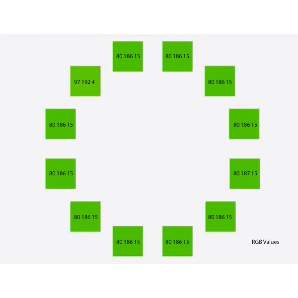
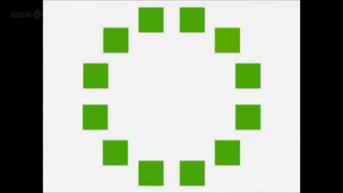
Abby Bader replied to Priyanka Patel's topic in Editing , Color grading & Finishing
Can you spot the different one?
-
What is the best color grading software?
Abby Bader replied to Bledar Cili's topic in Editing , Color grading & Finishing
Hi Bledar, Nice to see you here! I would say that DaVinci is a great tool to start learning if you aren't familar with color correctors or schooled in color theory. Part of the reason is that it's very intuitive, but it's also a lot of great documentation out there as well as tutorials from other users. The large studios are equipped with both of them, and colorists are drawn between them. Wouldn't say any of them are better than the other, it's like Avid vs. FCP vs. Premiere. You will get the job done. Personally I like the unique control and the way the color management tools work in Baselight, but some tools I find more user friendly in Davinci. Download the trial and try for yourself. Abby -
Trailer/Teaser grading
Abby Bader replied to Andy Minuth's topic in Editing , Color grading & Finishing
Probably a bit more cautious about dynamic range in low IRE and a wider color space that opens for more nuances. -
Thank you guys for the great input! I managed to create a look that is quite close to 1900s Photochrome. I will upload some shots if I can get permission to share them with you.
-
Absolutely stunning work and thank you for this great insight and for sharing your knowledge with the community.
-
Adam Scott is a master of his art, brilliant work on every spot I've seen from this guy.
-
It's a great tool. The different color channels can be used to add and subtract nuances and shape an image to be something really different. Just be careful that it could introduce some unwanted noise. I often find that I have to add some subtle grain before rendering to help match the noise levels.
-
YouTube just opened for HDR!
-
If you want and can afford the extra range that can be stored inside P3, go for P3. If you can't afford it, live with the restrictions and grade in REC 709 and convert it in DCP delivery.
-
I couldn't find any official tracks or IMDB credits so I would definitely go for ICA or online training.
-
There are a lot of courses like that out there, but I would be a bit careful. If you can get the tutors names I will look into it for you.
-
Make sure to NOT desaturate the images before clicking monochrome. Typical mistake. The sliders need color values to work.
-
Top Secret of the studios
Abby Bader replied to Alex Prohorushkin's topic in Editing , Color grading & Finishing
Lustre is discussed several times in the premium articles by the Technicolor colorists. -
Black Magic Design gave DaVinci a face to the masses, but their original color corrector (DaVinci 2k) was an industry leading tool way before that happened. People use it for their own reasons, and the big studios use it for other reasons than the price.
-
Taking care of our eyes
Abby Bader replied to Andy Minuth's topic in Editing , Color grading & Finishing
The distance, color temperature and contrast on my screens has a huge impact on my eyes. Small adjustments can make a difference. -
Have some of you tried the Dale Grahn Color app for Ipad? Looks cool, but can you actually learn something from using it?