Lowepost
-
Posts
776 -
Joined
-
Last visited
Content Type
Profiles
Case studies - Free
Case studies - Premium
Resources
Insider
Courses
Forums
Store
Everything posted by Lowepost
-
Hi Everyone! Sam Daley is one of the top colorists in New York and in our latest blog post he reveals his time management strategies. Time management is essential in color grading and a topic many of you have asked if we could cover! Read about project preparations, how to inspire the client, the 24 minute mark, lunch breaks(!), the good and bad cop relationship, client wish lists and much more! Sam also shares a print of his base starting point node tree. Enjoy!
-
 T his is going back a few years. Back to telecine days. I was working with a company that just got the Sony Vialta telecine. We were kind of a test facility for it in Australia. The Vialta was a sprocket driven telecine, meaning it worked similar to a film camera. It literally moved the film via the sprocket holes frame by frame and took a single frame capture. Theoretically, it was a superior picture as there was less film weave and a cleaner scan. Anyway, things were going okay and we were getting nice pictures out of it, but only in 35mm. They hadn’t developed a 16mm gate yet. Then one day a 16mm gate arrived from Sony in Japan, so we put it to use the following day on a 16mm job. Back in those days, we would lace up the roll of 16mm (about 30 minutes of original neg) and we would grade every shot. Once we were done and happy, we would rewind the roll of film and press play and lay it out to tape. So that’s what we did this one day. We were working on a PSA for anti-drugs. The commerical was a great idea. Nice clean interview footage of some old people saying things like “Those teenagers are always high”, but cut to action footage of teenagers riding their BMX bikes and jumping in the air. You get the general idea. So we decided to grade the action footage first which just happened to be on the first reel of 16mm. Remember this only our 2nd day using the 16mm gate. I graded the whole reel, hit rewind and waited. When the Vialta rewound, the picture on the screen would be all vertically blurry as the film whizzed by, so I couldn’t really see anything. The film rewound and I went to line up the countdown leader at the beginning when I noticed some white vertical scratch marks that I didn’t remember seeing there before. I suddenly went white with fear. I went over to the telecine and saw scratch marks along the neg, and dust all over the machine. I then noticed that all the sprockets had ripped and now the machine could not play the film. I had just aggressively scratched 30 minutes of original negative. Not good. We quickly got Sony on the phone to help solve the problem, and it turns out there was a tolerance problem with the gate when the film ran over a splice. When I got to the end of the reel, the film had run into the tail leader. It had slipped out of the sprockets slightly and then of course, I had hit rewind. The machine had quickly rewound the film while scratching huge white marks in the neg and ripping the sprockets as it went. Now I feel I aged about 10 years that day, but here’s where I got lucky. In my whole career it had never happened to me. The directors were not phased. They had actually brought scalpels and pens with them to scratch the neg for a look. They wanted to lay off a clean version for safety, then lay off another one after we had scratched up the neg to make it look frantic. We just never did a clean pass. I threw up the film on another telecine and re-graded the footage. Luckily we hadn’t got to the interview footage yet. The commercial ended up winning awards. Eric Whipp
 -
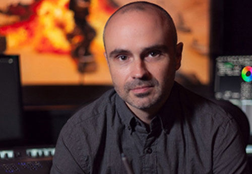
Parker Jarvie works as an senior color assistant in Company 3, and in our latest blog post he explains how he got into the company and what it takes to work your way up in one of the top post-production companies in the industry. Read about the tasks and responsibilities, the team work, client relationships, and how he was given the opportunity to build his own client base after seeing how it's done successfully at the highest level, and gaining the trust of the senior colorist. Enjoy! PS: Let us know if you want to contribute to the blog!
-
I n this non-audio color grading session, Tyler Roth is working together with the director and client to set a look for a TV commercial. The look that is created in this recording does not necessarily reflect the final result. In the first video the director wants to match the shots to a reference background. All images and clips copyright © 2017 Company 3
-
Color grading breakdown with colorist Tyler Roth
Lowepost posted an insider Article in Color Grading
 I n this color grading session, Tyler Roth is working together with the director and client to set a look for a TV commercial. The look that is created in this recording does not necessarily reflect the final result and is without audio. All images and clips copyright © Company 3
- 15 comments
-
- 21
-

-

-
Green color on Kodak 5219
Lowepost replied to Anton Meleshkevich's topic in Editing , Color grading & Finishing
The log scene exposure is the negative log (base 10) of the linear lightness of elements in a scene. By convention, the 100% scene white (as 1.00 brightness) is - log(1.0) = 0.0 Log exposure and the 18% gray is -log(0.18) = - (-0.7447) = 0.7447 Log exposure and a 20% gray is -log(0.20) = - (-0.69897) = 0.69897 Log exposure and a 2% black is -log(0.02) = 1.69897 Log exposure. The gamma of film is nominally 0.60. So the Log exposure needs to be multiplied by 0.60 to obtain Log scan densities. In Cineon terms the 0-1023 CV yields a scan density range of 0.0 - 2.046 where each CV is 0.002 scan density (referred to as printing density). To find the real Log scene exposure range that can be recorded the 2.046 scan density is divided by 0.60 = 3.41 Log scene exposure. Actually since the min. density is set at 95, the range is 95 - 1023 = 928CV = 928 * 0.002 = 1.856 which is then divided by 0.60 = 3.0933 Log scene exposure. What is meant by "balanced log Cineon CV input" is the CV associated with a scan that has had a R G B constant either added or subtracted to achieve a neutral gray at near LAD (445CV and corresponds to a 16% gray). LAD is usually 445CV which is is relative to the minimum scan density (0.0) by convention set at 95CV. Thus, (445-95) * 0.002 = 0.70 scan density. Since the scan density excludes any RGB minimum density (the scan density with no exposure), in this case the LAD scan density is 0.70 above the minimum base density. In Cineon CV a 1 stop increase in exposure (0.30 Log scene exposure) is * 0.60 = 0.18 scan density difference, which if divided by 0.002 yield 90. Cineon CV per stop of original neg exposure. In the older printer lights , 1 printer light = 0.025 scan density or 0.025 / 0.002 = 12.5 Cineon CV, therefore 90CV ~= 1 stop exposure = 90.0 / 12.5 = 7.2 Printer points per stop. So, to adjust an image in a color corrector that is stored as Cineon CV, for example, +2 PP (Printer Points) Red (brighter Red), -1 PP Blue, adjust image by adding 2*12.5 = 25 CV Red and subtracting -1 * 12.5 = -12.5 CV Blue I hope this is not too confusing. Cheers Mitch -
Green color on Kodak 5219
Lowepost replied to Anton Meleshkevich's topic in Editing , Color grading & Finishing
Hi Anton and Bryan, I am not sure , possibly due to they way the lut was built. If you are using a "true 5219" lut then the input would be log scene exposure to then impart the properties of 5219 into the image. However, if the scene exposure was not handled properly to account for the spectral response of the film, errors can arise. Remember, log scene exposure is not identical with balanced log Cineon CV input. It may or may not be depending on the methods used. To get log scene exposure from a 5219 film scan, the data is "un-built" back through the film tone scale, conversion to printing density, removal of inter-image cross channel effect. This is not for the faint of heart. So, if Cineon balanced CV were put into a "real 5219" lut it is possible to get color shifts. Also, maybe all the existing luts have their genesis from the same error prone source. If used properly, 5219 can produce reasonable greens. The main problem with saturated greens from film in general is the print dyes. To make green it needs lots of yellow and cyan dye in the print. However, each of those dyes tail into the green some and have the effect of reducing the saturation. Due to the dye set it is unavoidable. In a lut, to get a yellowish green there is insufficient cyan dye to balance the yellow dye. That seems to be a lut color balancing or modeling issue. Hope this helps Cheers Mitch -
Hi Everyone! We are very excited to announce that Lowepost just published a new color blog! The first post is about how to create Arri Look Files with Baselight, written and illustrated by senior colorist @Andreas Brückl, and the second one is a detailed 12 min video breakdown of a day-for-night scene from one of @Tobias Wiedmer's latest feature films. Enjoy! The Lowepost team!
-
Any changes to an image that is not a point to point transform, such as a 3DLut must be done with a spacial 2D filter to add speckle or any other image degradation effects. These can usually be done with a matrix kernel. Look up (web search) image transform matrices etc. to get an idea. If a more random effect is desired, by some code you might take each pixel and randomly change the RGB values by some amount, or another approach is to take the pixel and then some of the surrounding pixels along with some random function to change the pixel. Cheers Mitch
-
LUT based on print data
Lowepost replied to Nicolas Hanson's topic in Editing , Color grading & Finishing
Modeling of Motion picture type of 3DLuts is not well documented or taught in the literature. Many post production houses rely upon their either in-house or contracted color scientists for their "secret sauce" Luts. However, their is an open source 3DLut/ICC profile software package that it targeted towards displays and printers that is excellent and can be adapted to the types of 3DLuts we use with a bit of effort. It is ARGYLL CMS ( https://www.argyllcms.com/ ). On the website it has source code, tutorials etc. and explains a lot, primarily directed to ICC profiles, but the theory is sound. On the web, some users will talk about film emulation too using Argyll CMS. Most all of the transforms I do are calculated from my proprietary code that I have developed over the years. Also, many of the specific Luts for clients are proprietary to the specific post facilities and unfortunately Ican not share them. Another place to look for good info is the website for the Munsell Color Science Laboratory (https://www.rit.edu/cos/colorscience/rc_useful_data.php ) and( https://www.rit.edu/cos/colorscience ). It is associated with RIT (Rochester Institute of Technology) in Rochester NY, where Eastman Kodak is located. There are a few people at Munsell that were in my group when I was in the Color Science and Engineering Lab at Kodak. One person that is very knowledgeable is David Long. Cheers Mitch Bogdanowicz -
F or one of my latest projects my DoP asked me to create a custom LUT for him. We had a few camera tests prior to the shoot, and wanted to bring our custom look (as an LUT) to the set to see if his lighting, set colors, etc held up. While we were preparing the camera tests I read about the ARRI Look Library, a collection of 87 in-camera looks. The library was first released as part of the software package for the ARRI Amira Premium and Alexa Mini. For the Alexa SXT it is available as an optional license feature for 280 Euro. There is also an free IOS app which gives you an overview of all the looks. Download ARRI Look Library on Itunes or at the ARRI site. The library covers a lot, but if you need to customize one of the looks for different light setups etc, you have to create your own versions. The looks in the library are saved as ___.AML files, so in order to get your own custom look into the Alexa camera you have to create an ___.AML file. There was almost no documentation or known workflow about how to do that, so we ordered an ALEXA SXT (luckily Futureworks has its own camera rental department) to find our own workflow via trial and error. Maybe there is a more elegant way, but the following one worked for us. 1. Baselight setup: I usually work in ACES with a mix of various RRTs. Sadly, the ACES scene setup didn’t work out in combination with the ARRI Look File. It actually makes sense as the ARRI expects a straight REC709 setup. So your scene setup should be as below. 2. The grade: You can use almost everything in your grade layers, even LUTs in a Truelight operator, but you can not use keys or masks to generate your look. The camera viewer is most likely a REC709 or SRGB viewer, so you will get better results if your cursor output is REC709 instead of P3. 3. Export: After your grade is set, go to “Shots“, click right and choose “Export LUTs“. Note: The ARRI Color Tool, which we will need next, needs the AMIRA CUBE format. 4. ARRI color Tool To create the AML file you need the ARRI Color Tool. Strangely, the ARRI Color Tool doesn’t support ARRI RAW files. So either you export a DPX file or work with the dummy file “Isabella”. Now load your Amira Cube file (down left under Look Library) Then “Save Look As” and create the .AML File. Now you have created the Amira Cube file from Baselight and the AML file. That’s pretty much it. Download ARRI Color Tool here.. 5. Check your File As I said before, the ARRI Color Tool didn’t support ARRI Raw files (or maybe we just couldn’t figure it out) so we had to use the ARRI Raw Converter to test the look. Download ARRI Raw Converter here. You can now load your .ARRI file and the .AML look file. In the settings on the right side just choose “From Library”. 6. Setups For most cases, for every scene setup a high-key and a low-key version of your created look should be good enough. The Alexa SXT has four video outputs, but in most cases the DoP wants the director to see a straight REC709 image. The advantage of the Look File is that you can see the look in the camera viewer for quick checks. Andreas Brueckl Senior Colorist, Futureworks
-
S imply put, a LUT is a Look Up Table. A LUT is used to transform a value (or a set of multiple values as in RGB) into another value or set. 1D-LUT Let’s first consider a 1D-LUT. A 1D-LUT is an array of values. For a 10-bit data system (such as the classic 10-bit Cineon Log data system), the values range from 0 to 1023, therefore, a one-dimensional array of 1024 elements can perfectly map each of the possible values into another. If the data is a 16-bit system, the array size needs to be 65536 long to accommodate all the possible input values. If for either case, the size of the array is a problem with the hardware/software, a subsampled array can be used (i.e., instead of 65536 elements for a 16-bit system, 256 can be used and the missing input values are then linearly (or another interpolation method) interpolated. On modern software systems that utilize floating point systems, i.e. OpenEXR, the data to be put through a LUT is converted to properly match the input domain of the LUT system. In modern color correction, the image is usually a three channel RGB system or some other three metric color system. One 1D-LUT can be applied to each of the three channels such as in the case of a 1D-LUT used to convert from log data to linear data. Alternatively, a separate 1D-LUT can be applied to each channel, for example, if the gain or color shift of each channel needs to change. In each case described, the channels are treated as independent, any changes in one channel does not alter any other channel. 1D-LUTs are normally used where the desired transform can adequately be described by channel independent processing (scale or RGB metric conversions, overall color changes like the ASC CDL [except for the saturation parameter]). 3D-LUT In most of the color data transformations, the three channels are dependent. Changes in one channel will alter the others. However, to use the same type of data set as a 1D-LUT, a 3-dimensional array that points to a three element set would be required. For a 10-bit system with 1024 elements, that would be an array with 1024^3 elements (1,073,741,824) each pointing to three numbers! And for a 16-bit system that would be 65536^3 (281,474,976,710,656). Clearly, these array sizes are too large to manage in today’s computers. In order to manage the system, the domain 1024, 65536 etc. is broken down into discrete intervals. There are many currently used 3D-LUT interval types used today. Some usual ones are 16^3, 17^3, 32^3, 33^3, 64^3 and 65^3. Others are possible. For a 17^3 3D-LUT in 10-bit space, each set of nodes of the three channels range from 0 to 1023 with an increment of 64. For the 65^3 3D-LUT the number of input nodes (each input point is called a node) is 65^3 (274625) which is far less than the 3D array system (281,474,976,710,656). 3D-LUTs are stored in the computer with an implied input. If one looks at a text based 3D-LUT, the numbers are the output sets and the input values are implied by the order of the list. Normally, there are two types of implied orders, the R fastest (or commonly referred to as inside) and the B fastest (most common). In order to use these 3D-LUTs, a 3D interpolation method is employed. Common ones are trilinear and tetrahedral interpolation which uses the input nodes and then linearly (occasionally other types such as cubic interpolation etc.) interpolated to obtain the output color R’G’B’ from the input RGB. Less commonly used 3D-LUT types do not have ordered nodes and are lists of input RGB to output R’G’B’ and are called cloud based systems which have their own types of interpolation methods. For these systems, the interpolation times are usually longer due to the increased processing involved. Types of 3D-LUTs Digital camera input LUT Used as a color corrector input LUT to transform the camera R G B into some desired standard or creative look. Calibration LUT One type is the film emulation LUT. These types of LUTs are derived from film negative and film print densitometry of discrete patches originating from a film recorder and a film print. These LUTs “calibrate” the display in the color correction room such that the image on the screen is a close match to a print viewed on a film projector. Post houses without their own film projectors can assure proper film out results with a quality 3D-LUT. It is possible to achieve the same look without using a LUT as long as the color correction hardware and software has the capability to process the images from the starting position to the desired position. And, of course, as long as the desired position’s look is known to the colorist. In the case of the film emulation LUT, it is probably very error prone and/or time consuming to have a colorist try to match a print on a film projector to the digital display for each scene in a consistent manner. Creative LUT Many times a creative look is desired and a specially created 3D-LUT can assure that the look is applied consistently on varied scenes. The colorist can then concentrate on minor changes from this base look provided by the LUT. Some examples are LUTs derived from older cinema systems such as Technicolor two-strip or bleach bypass etc. The output of these LUTs can then be altered by the colorist for the desired effect. I have created LUTs that desaturate all colors except reds and maintain the hue and saturation of flesh. This is a very specific LUT to create a starting point for the colorist. In some cases, the look desired by the production team stretches the ability of the controls on the color correction platform. A properly created 3D-LUT can provide the look while the color correction platform has its controls in the center positions, allowing for further creative control. Technical LUT Sometimes a 3D-LUT is used to transform a project from one type of display to another. Some examples are: P3 to Rec-709 2D P3 to 3D P3 D6500K P3 to D5500 P3 Rec-709 to P3 Transform standard display (i.e., P3) to a non-standard type such as Plasma, OLED or Laser display Technical LUTs may be provided by the camera manufacturer for certain purposes. For example, a LUT may be provided to transform the camera data to ACES data for ingest into the color corrector. Post house engineering staff, color scientist, can create specific technical LUTs for a variety of purposes. P3 to Cineon DPX LUT Some post houses use as their workflow a digital cinema P3 data-centric system. This is due to the deliverable to the production is mostly for digital cinema venues and they do not want to limit the image to a film print. Other display types that are common, such as Rec-709 can be created from the P3 data (with some mild gamut remapping of the larger color P3 system into Rec-709). In these cases, it is desired to use a 3D-LUT to transform the P3 data into Cineon 10-bit DPX data for film out if a small number of film prints are requested by the production. The generation of an accurate 3D-LUT for this purpose is very complex. The P3 data can be out of the film print’s color gamut and needs to be gently remapped. I have developed a sophisticated computer model to create these types of LUTs. The film out results is exceptional. Viewing LUT (Show LUT) The Viewing LUT is what the colorist uses in the normal viewing of the digital data in the suite. It depends on what the data metric of the source is. If it is a digital camera, then the LUT will convert it to P3 directly, or if the camera LUT is a camera to Cineon DPX LUT then that LUT can be combined with the Calibration LUT (which converts Cineon DPX to P3) to get the Viewing LUT. So, the Viewing LUT is whatever LUT that can take the source data metric and convert it to the metric used for the digital projector (usually normal P3 but can be Rec-709, P3 @ 6000K white point or P3 @ 6500K white point etc.). Float conversion LUT The Float conversion LUT can be useful, however very few LUT interpolation algorithms can effectively work with the implied data range of EXR. For example, a normal Cineon DPX 0-1023 log data set is roughly to -0.05 to 13.5 in linear EXR. But, the "usable" EXR range for display is 0 - 1.0. Which means that the LUT must convert the EXR range into a viewable range. Commonly, since the LUTs can only handle an implied range of 0 - 1.0, the data is manipulated by the colorist to take the wider EXR range and artistically compress it into the domain the LUT can handle. One problem with the EXR metric is that it is normally linear. Linear data going through a LUT is not efficient. For an EXR linear range of -0.05 to 13.5, that is a 14.0 range and if the displayable range is 0 - 1.0 that is only ~7% (1.0/14.0 = 0.0714). That means that for the size of the LUT in nodes (33^3, 65^3 etc.) only 7% is used and interpolation artifacts can show up. For a 33^3 LUT, there are 33^3 = 35937 nodes and 7% is only 2567 nodes used, the rest are not used. Schemes such as introducing a gamma or log on the data can effectively compress it for LUT conversion, but it takes some color expertise to create the LUT. On most modern color correction platforms when they use the LUT conversion, the system re-scales the data to 0 - 1.0 LUT input to interpolate through the LUT. Mathematically other domains are possible, but typically all positive values are used. Inverting a LUT Whether the LUT used is a 1D-LUT or a 3D-LUT, the process of going backwards is possible but plagued with some problems. If the transform going forward through the LUT gives the same output for multiple inputs, then it is not possible to “guess” which of the inputs produced the output. Further, the output domain of the LUT may be different from the input domain. For example, it is common to want the RGB triad that gives a specific XYZ on a display. Going forward from RGB to XYZ is relatively simple since we can pass a set of patches on a display and measure the XYZ values and create a 3D-LUT. However, the domain of the XYZ is limited by the gamut of the RGB primaries and white point of the display. The inverse 3D-LUT needs to accommodate the full XYZ range possible and complex gamut mapping techniques need to be applied to be able to produce an operationally correct 3D-LUT. Even with these techniques, proper statistically sound results are achieved that may not be entirely accurate. There are certain LUTs that cannot be inverted. For example, a LUT that creates Black and White (or some tone like sepia) from a color image. A color image cannot be derived from a single black and white image. The creation of LUTs Many techniques are used to create LUTs. 1D-LUTs and 3D-LUTs may be created by applying a mathematical transform to a unity LUT. In the case of a 1D-LUT, a unity LUT is an array where the values are the indices (for example, a unity 1D-LUT give 233 output for a 233 input etc.). A unity 3D-LUT has the output R G B set equal to the input RGB. Some examples of LUTs that are created mathematically are Rec-709 to linear, linear to sRGB and gamma (2.6 gamma for digital cinema) to linear XYZ. LUTs that are created from non-equation systems are from measured data derived from actual color patches (either on film or on measurements from values sent to a display device) or very complex system computer models. For the systems from measured data derived from actual color patches, usually only a small portion of the total color space of the LUT is measured and the nodes not measured are interpolated via conventional techniques. Systems like Truelight (from Filmlight) utilize a bit over 1200 film patches (via an auto-reading densitometer) and where the measurements are done from displays many more patches can be measured depending on the characteristics of the measuring device. A larger number of patches usually reduces error in the created 3D-LUT. Certain 3D-LUTs, i.e. P3 to Cineon DPX LUT, benefit from large patch sets. Typically, I use 9000-10000 film patches to create these 3D-LUTs. If less than the actual number of nodes in the 3D-LUT is measured, some error is introduced by the interpolation method. Mitch Bogdanowicz
-
 I n this screen-capture, which runs at 4x speed, you can see me working on a scene of a feature film. The scene was shot in the morning, and I also graded it for morning. Later the clients decided that it would be better if this scene was set at night. So I had a little more than a day to transfer the scene of about 5 min into night. It goes like this: A woman leaves a club and walks into a man with whom she starts a fight. When approaching such a task, it makes sense to imagine how it would have looked if it was really shot at night and how the DoP would have helped with lights, if he had known already on set. Night is usually very dark and grading everything low level might be a realistic choice, but in terms of an artistic, photographic approach it can be nicer to create a night filled with a bunch of light sources. I decided to have a big moon as my main light source and a bunch of tungsten practicals to make it more believable. In natural darkness the cones of our eyes are less sensitive, which means that our chromatic vision is limited when light is rare. According to that you can desaturate the image quite heavily. A bit of a bluish tint may be appropriate as well. Strong highlights, typical for daylight, can be attacked with keyers and shapes. The first task is to make it a lot darker without crushing anything. When your eyes are adapted to the dark you can see a lot of details in the shadows. Because this scene was shot in daylight we have tons of information. We just have to keep it. The second task is to darken all the sky and the reflections of sky in the scene. Here, the great dynamic range of the Alexa helps. That involves a mixture of keying and tracking shapes. The next step is to look for areas which might be affected by the moonlight and isolate those to apply a special moonlight bounce to them. In one shot, I decided to make the hair of the guy a bit warmer as he stands not far away from a real tungsten light source. On other shots, I created tungsten light sources, which were not actually in the scene, but make a lot of sense, as the DoP would have created something similar to this. The tungsten lights and the bluish moonlight create a nice complementary color contrast. This is a kind of extreme example of a task but the technique used can also be applied for more subtle changes in normal grading scenarios. Tobias Wiedmer Lead Colorist, Cine Chromatix KB
- 4 comments
-
- 12
-
-
-
You basically answered your own question. Printer point corrections for film affect the whole image with no separation of lift, gamma or gain. There are ways to adjust "lift" or black levels and "gain" in the photo chemical process by using flashing techniques, different print stocks or film processing adjustments but this would be a global correction to a full roll of film and would be difficult to apply shot by shot. Jim Passon
-
It is possible to apply a simulated 50 printer point scale to the lift, gamma and gain controls in digital grading but this would not be the same as printer point corrections on film where there is no separation for lift, gamma and gain, only density and color balance. Jim Passon
-
It is possible to apply a simulated 50 printer point scale to the lift, gamma and gain controls in digital grading but this would not be the same as printer point corrections on film where there is no separation for lift, gamma and gain, only density and color balance. Jim Passon
-
LUT based on print data
Lowepost replied to Nicolas Hanson's topic in Editing , Color grading & Finishing
LUT creation is discussed here, and it might answer your questions. -
 W hile I was at Columbia College Chicago, I got an internship at Whitehouse Post in Chicago. Towards the end of the internship, I spoke with one of the producers there asking about the next steps to getting into the industry. I had spent quite a bit of time shadowing the senior colorist at The Mill and knew I had a passion for color grading. She said that the senior colorist over at Company 3 Chicago had interned there awhile back and that I could use her as reference. I messaged him on LinkedIn, asking if he would be willing to answer some questions I had about what he does, the industry, and Company 3. After our conversation, he invited me in to the office to talk more. We hit it off, and it turned out they were looking at bringing on another assistant colorist. A couple months later, I was working there part time as a freelance assistant colorist for 3 months. I had to learn quickly. The other assistant was going on vacation the following week so I needed to at least have a good working knowledge of their workflow. I would shadow the senior colorist and the other assistant and re-prep projects to get enough hands-on experience before doing it on my own. The day after I graduated college, I was brought on full-time. It was definitely one of those "right place at the right time" situations. Assistant colorist's responsibilites An assistant colorist’s primary job is to make the senior colorist’s job easier. The senior colorist should be grading with clients in the suite as much as possible. For that to happen, the assistant handles a variety of tasks including preparing projects fully for the session, contacting editorial and handling any conform/workflow issues that arise, communicating with the producer to ensure jobs are completed on time, and finalizing projects and rendering in whichever format the client needs. As you gain the trust of the senior colorist, an assistant may start to be trusted with match grading. A lot of the times, the senior colorist is in session so if another client comes back with revisions on a pending job or there are pick-up shots, it will fall on the assistant to make those revs or match grade the pick-ups. As you continue to build that trust, those responsibilities increase. In my situation, for example, in addition to client revs and match grading pick-ups, I may match long form versions of commercials, short films, and features. For some features, the senior colorist sets looks on key shots and scenes throughout and then it's my job to match the remaining shots of the film to have it ready for the senior colorist to review before they screen it with the client. Technical knowledge, experience and a good personality Some color grading software is not as accessible as others, but with programs like Resolve having a free version to learn from, a general understanding of the tools within a program like Resolve is definitely helpful. The color tools are a great place to start but equally important are the project setup, conform and render portions of the software. An assistant will be given the media, EDLs/XMLs and reference pictures to conform the project. It’s then their job to handle the various media formats provided and use the EDL and/or XML to conform the project. It’s also important to work well under pressure. There’s a constantly changing list of tasks throughout the day that must be handled in a way that ensures everything is completed on time and nothing is missed. While having technical knowledge and experience is great, I feel like the most important skill necessary for working as an assistant colorist is having a good personality. You’re going to be working closely with the senior colorist and producers so it’s important that you’re easy to work with and can be a trusted partner in getting jobs done efficiently and correctly. The relationship with the team The assistant colorist has a very close relationship with the senior colorist and producers. In order to provide the best possible client experience, everyone must trust each other and have excellent communication. If there are issues with prep or anything that may affect the senior colorist’s ability to grade a job with clients, it must be brought to everyone’s attention, specifically the producers, so that it can get sorted out before the session. It’s also important that when the time comes to QC and render a job, that the assistant communicates with the producers to make sure the project can be delivered in the format the client needs and on time. Issues come up all the time so being able to trust your team members is extremely important. In general, the relationship the assistant colorist has with all team members including other assistants, client services, editorial, VFX, etc. is just as important. Whether it’s helping other assistants with issues or completing a job on time, communicating with editorial to figure out conform issues, or maintaining a clean VFX pipeline, an assistant needs to be able to effectively communicate with all team members to do their job well. At the end of the day, everyone is working towards the same goal, providing the client with exceptional service and product that exceeds their expectations. My own client base As the senior assist, in addition to the time I spend match grading, I am also given the opportunity to build my own client base. There are times where the senior colorist is too busy to take on another job given the deadline, so they will recommend the client work with me. It's my job to continue that relationship the company has with that client and provide my own style and expertise that ideally exceeds their expectations. While that is a small part of my client base, I also build relationships with clients on my own and will collaborate on commercials, social spots, music videos, short films, and features. It’s a really great experience to essentially do a micro version of what the senior colorist does. I’m building a growing list of clients, doing my own sales, and continuing to improve my color grading skills. The next step In my experience, there is not necessarily a situation where “once you hit this amount of billings, you become a colorist.” Yes, you must be able to bill enough to justify running a color suite, but reputation is also important. You must have a good reputation in the industry for clients to trust you’re the right person for the job and can increase the value of their work. That starts with maintaining a good relationship with the clients you have because often times, they will be the ones that get you the next job. I’m still working at this and figuring it out as I go, but I have been lucky enough to work for one of the top companies in the industry and work with an exceptional senior colorist and see how it’s done successfully at the highest level. My advice I would recommend reaching out to a colorist or post-house you admire and show your interest in their company and the craft. Be persistent but not annoying; It’s great to show your enthusiasm but people get busy and it’s important to recognize that. Try and get in any way you can. Often times, that may mean starting in client services but work hard at any task you’re given and it will show. Once you work your way up to assistant, work your ass off and build a good relationship with the senior colorist. They will notice your hard work and will want to mentor you and learning from someone with that type of experience is a key part to becoming a colorist. Parker Jarvie Senior Assistant Colorist, Company 3 New York All images and clips copyright © Company 3 are colored by Parker Jarvie
- 7 comments
-
- 33
-
-
-
LUT based on print data
Lowepost replied to Nicolas Hanson's topic in Editing , Color grading & Finishing
The film based LUTs that I create incorporate a negative AND a print emulation. It is interesting but not with reality to only emulate a negative or only a print stock. The negative imparts some color consequence and some tone scale but the main tone scale is from the print and also the dyes and other parameters limit the print color space. Also, the print softens the highlights to a graceful transition to max brightness of whites (also the color of whites). Have a pleasant Holiday season. Cheers Mitch Bogdanowicz -
That is an interesting question @Aldo Barba! Since the Lut usually starts with a film type emulation (or not if it is designed to go either before or after an existing lut) any of the properties, i.e, negative tone scale, print tone scale, color contrast (degree of saturation), gamma, system color matrix, display characteristics, etc. are able to be changed. Also, targeted color space within the cube can be altered, i.e., if the XYZ of a certain area (possibly a red area of an apple) is targeted one might choose to replace the output of the cube with a different color, maybe making the apple green or maybe just neutral. One creative lut i did for my colorist daughter Jill while she was working on The Grand Budapest Hotel was used in a scene in the beginning of the movie to impart a Technicolor 2-strip type of look. This was a bit more involved, but it allowed her to color fine tune without using the color corrector software. Avoids some artifacts if the software is driven too hard. Other luts that are creative can be created via a mathematical transform (if you know what you want in math terms) or statistical (if you can use regression techniques etc. to alter the lut) transform. Bottom line ..... in the creative world anything goes. No common ground .... except the direction of the cinematographer to the colorist ..... Make it look like this !!! Cheers Mitch
-
DaVinci Resolve 14 Weird Color Shift on old stills
Lowepost replied to Kevin Stewart's topic in DaVinci Resolve
Marc Wielage I have compared SMPTE bars and a grayscale ramp, and there were zero differences in ProRes 422HQ and ProRes 444 renders. I think the user is having issues with color space, video settings, and it's 8-bit material. LikeShow more reactions · Reply · 2 · 7 hrs · Edited Manage Jason Bowdach Same results here. Looks like a video / data level issue LikeShow more reactions · Reply · 1 · 7 hrs · Edited -
Need some help on small forum tasks. PM if interested.
-
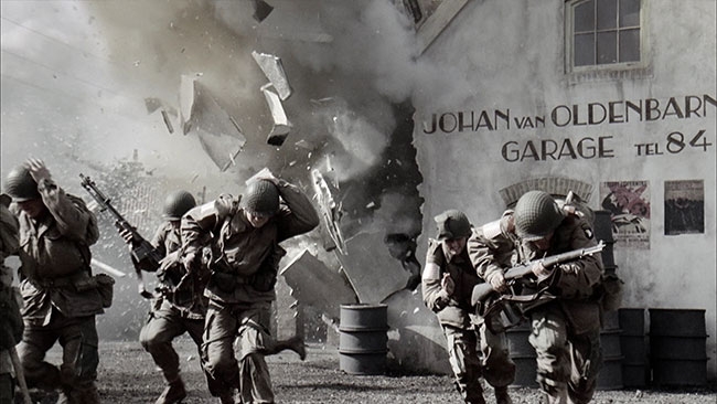 The post and grade on ‘BOB’ (That’s what we called it.) was achieved with a team of around 10 people and a pool of talented colourists and assistants. This was using bleeding edge technology at the time and probably millions of U.S. and U.K. Dollars & Pounds. It set the template for how films and TV are done as standard now, but at the time it was very time consuming and very, very touch and go. From camera negative to final HD Delivery it took longer than the period from the Allied invasion of France to end of the Second World War in Europe. Work for the Spirit So, best start at the beginning. My involvement began thus. It was 1999. I was employed at the BBC in Post Production. Back then it was an age where the BBC actually ran their own resources. It was a big department. It had grading, telecine, videotape, lots of offline- and online suites and lots of people running around and actually making television programmes. I was in the telecine department and was busy on various projects. The grading kit was ‘Pandora Pogle’ with a few antique ‘Digigrade’ systems amongst some of the telecine bays. We had just purchased a brand spanking new Spirit Telecine. This was after quite a heated debate whether to go with a Spirit or a Cintel C-Reality, (a conversation for the Pub if ever there was one.) But the Spirit was chosen and the march was on to find some work to actually use it on. Our marketing department at the time thought it would be a great hook to send out an invite to a launch with the promise of bottle of Malt Whiskey. Glasses with ‘BBC Resources - get some Spirit’ engraved on the tumbler were duly posted out in jiffy bags to all the post supervisors in the film and TV community. We had the launch event, the booze was consumed and a post production producer, Bruce Everett, attended. At the time, Bruce was engaged in building a team for the oncoming ‘BOB’ project and by chance he came across the engraved invite. Never one to look a gift horse in the mouth, he turned up. He had some new ideas regarding dailies rushes and he obviously saw something he could exploit (As well as getting a free bottle of malt). We were then chosen to provide dailies for the upcoming series ‘Band of Brothers.’ This has taught me two things: never underestimate the power of good marketing, no matter how bizarre, and never underestimate the power of free booze. Test period Contracts were signed and we then spent a few months testing. As HBO did not know exactly what their delivery requirements were, we had to build in as many options as possible. The series was shot on 35mm film for 1:78 Hi definition. Now, bear in mind that this was very early for Hi-def. Not many standards were established and the migration for analogue to digital was still not standardized by far. The 35mm negative was transferred on the Spirit to various formats simultaneously. The library master was a clean un-clipped feed out of the Spirit in full height anamorphic ratio. Each Lab roll (up to 2000 ft of film) had its own digi beta SD Tape at 25fps. At the same time, a feed out of the Spirit through to the Pandora Colour corrector via an Aspect ratio corrector and Aaton Keylink unit provided letterboxed graded images with the timecode/keycode burnt in for the editing room. This all had an offset of 2 frames. Luckily, the Pogle could handle different decks with different timecodes. This was ingested onto an Avid with a removable hard drive. A further digibeta copy was used in case the hard drive got screwed up and was also for the cutting room. Audio was synced by the edit dept. So, to recap, we had a set up that was like spinning 20 plates in the air at the same time and over a million feet to transfer. The ‘clean’ digi-beta was used as a fall back if the further finishing post went horribly wrong (I’ll get to that in a minute.). The idea was that a clean technical grade frame-for-frame copy could be used for final grade and conforms. It could also be up-rezed to HD in a pinch. And to be fair, a lot of this material was used for promotional purposes like trailers. What we did find was that, once the ducks were all in a row, the cookie cutter was set. We could realistically get through with our professional dignity still intact. It’s one of those things where checking and re-checking could not be done enough. One miscoded preset frame meant the whole thing needed to be done again. The trickiest thing I remember was that the Avid drive would often fall over. Recording when it wasn’t supposed to be etc. These were early MAC based systems and very flaky. So, imagine we have 2000 feet of very precious expensive negative on the Spirit and we’re ready to grade. The idea was to provide graded rushes that were in line with the Director of Photography’s intent. Many night scenes required balancing, and multiple cameras required matching. The brief was to make them look as good as possible. We had direct contact with the DOP’s. Any problems and we called them straight away. This could be anything from a camera scratch to lens problems. These guys wanted to know everything before the executives were watching the dailies back at base camp. This is where your relationship with the DOP begins as it is built on trust. They often don’t get to view it until end of day so they really need to trust your word that it is all ok. Our shift was from 4:30 to 9:30, six days a week. We had 2 teams of 2. A colourist and assistant. This gave us a shift pattern and also covered sick leave and emergencies. The first dailies arrived The first day of actual dailies arrived. It was 5 in the morning and we went to the film dispatch area to see how much had arrived. There were 12 cans of 2000ft of film. That’s about 4 hrs worth. That was when I realized the scale of this thing. There had been an aerial shoot the previous day. Two camera units were filming actual WWII aircraft in the air. And this was the first day of dailies. Up until that point, my experience of TV drama was cozy, intimate BBC stuff shot on super 16mm, often close up to hide the limitations of the sets. This was full on big budget Hollywood filmmaking. I certainly was not in Kansas anymore, and I better not fuck this up. We did find though that as it settled down the amount of film reduced and would average 3-4 lab rolls. Only if there was a big battle scene did the footage get crazy. A,B,C,D cameras covering the same stunt for example. Another trick we learned was that the Telecine could be shuttled on fast forward. The image was consistent and we could add grading cues using this ‘spin grade’ technique. As much as they wanted it done right, they wanted it done 10 minutes ago. Once the grading cues were in, we would hit the go button and it played out in real time to the decks. A dispatch runner would then take it up to the studio in Hatfield. This was pretty much how it was for me for at least 5 months. A new DI system was built In parallel with this, the grading system that was going to do the final grade was being built. A full DI department was being constructed at Cinesite in London. This was to be one of the first DI systems outside Hollywood. It consisted of a Spirit telecine, just like the one at the BBC, and a new device called a Specter. (A Spirit with hard drives). These would run in 2K mode and grade through a POGLE Mega-def grading system also at 2K resolution. (Well, not quite 2K, it was actually 1920x1440 pixels.) Cinesite in Hollywood had just completed the movie ‘Oh, Brother Where Art Thou’ as a full digital grade with a similar setup so they were keen to establish this further. This is where, for me, opportunity met circumstance. Probably because I hadn’t screwed up with the rushes, I was offered a role in this department. I grabbed the chance to see the project beyond the dailies stage. I had been at the BBC ten years and this was a perfect time to move on. (If you ever get breaks like this yourselves, my advice would be to always go for it even if it's a bit of a gamble. You will always regret it if you don’t. Asking yourself ‘what if?’ , that will drive you crazy.) I then took up the post as Colourist at Cinesite, in the brand new shiny Soho based DI department. The pipeline was to grade the negative in linear video colour space, similar to the ‘clean feed’ used in the rushes. This would then transfer at 3 frames per second to hard drives. The Spirit was flexible enough to output data in this mode. (You can still come across these machines labeled as a ‘Datacine’.) It was one of the first hybrid scanner devices out at the time. The colour corrector was a POGLE Mega def. Once the virtual neg rolls were on disk, they were copied onto the Specter. This was basically a Spirit without the moving parts. Again, a POGLE Megadef was at the end of it. It had an Edit timeline with multi-timeline functionality. Each grading room had a 32” Sony multi-format monitor. No projection was used. Now, bear in mind: this stuff was all hardware based. If you wanted to upgrade to six layers of colour correction, the cards were 6 grand a pop. The software amounted to a GUI that controlled the hardware. Want to soften the key channel? That will be an upgrade option. All this technology was expensive, required a lot of cooling, and was running at the limits of what was available at the time. Data transfers were often slow connections, often on parallel ports. It also required a lot of TLC by some top class engineers. As for storage, we had a whopping 3 TeraBytes, enough to hold an episode and a half. This was 15 years ago. I can now do all this on my laptop. Luke Rainey I was one of three colourists who graded Band of Brothers. My role in all of this was to handle the cut negative and grade it to match, then transfer it to the Specter where I would perform any other grading services. This is where Luke Rainey comes in. Luke was by far one of the best colourists in the country at the time. He was the guy who graded the show that gave each episode its look and feel. This was kind of a new departure for me as I was used to doing this myself, but the deal was that I was staff and he was under short-term contract from HBO. This set up of ‘lead colourist’ is kind of standard now, especially in big effects shows. These projects are often way too much for someone to do alone. It also gave me an opportunity to see how someone else worked. Every colourist has their own approach and you are never too experienced to pick up tips. The day you stop learning is the day to give up. As I said, the system was hardware based. This gave us a primary correction layer, six layers of secondary grading including a basic shape layer, and a further layer of broad secondaries. This was way before a Baselight with its infinite stacks of colour keys. As I was involved from the beginning, I was around the various conversations regarding the look. ‘Band of Brothers’ is a 10-part one hour show about a group of soldiers as they advance over Germany in the Second World War. The series is broader in scope than ‘Saving Private Ryan’. That film was shot a few years previously. It also had a very specific look. I won’t go into it now but that was achieved photochemically and in-camera. The same technique was considered for ‘BOB’ but on reflection it was deemed too risky. (Other options were considered such as shooting on 16mm but the visual effects department insisted on 35mm for their VFX work.) There were multiple directors and two directors of photography so the style was tested and approved by the producers including Steven Spielberg. For ‘BOB,’ it was decided to achieve a look digitally. This preserved all the options for change, especially if they wanted to rethink the direction. This was a TV series that had a lot of big producers like Spielberg involved. So Luke came up with a ‘recipe’ for the show. One influence was early colour reproduction in print. We had an early WWII colour picture book from the 50’s as a reference. Also the arc of the story meant the colour could become more drained as we followed the soldiers on their journey as they were getting more and more exhausted. For me this was an insight to grading as an integral part of the storytelling. It’s not just about ‘colour correction,’ which assumes that the images are somehow ‘incorrect’ to start with, but also a new tool in telling the story. The job is not about rocking up at the chair on day one and making it up. You need a conversation beforehand as to how to approach it. So on the Pandora it was broken down into channels. The channels work like a stack or layer in other systems. They are really just numbers of priority, and can be reordered. The channels are always active. On the panel there were 6 buttons: R G B Y C M. These could be assigned any colour but the starting point was the home colour. In our template, the first channel adjusted a luminance key in the black parts (a gamma curve was added to bend the dark parts into the black with de-saturation.) The next channel was the same but in the highlights. This left the middle range, which was adjusted as a primary. Another channel was assigned to specific objects such as gun flashes, skylines, etc. One was used to target specific tones like uniforms so they matched shot to shot. A final channel at the end was used as a global tweak. All of this was the base setting. The key mask of each channel showed up in each respective colour. So the green button had a green ‘show mask’ on the screen, red showed up in red, etc. A combination of the above achieved something that hadn’t been seen before. Again, this was hardware based so there was no tracking, no drawing shapes around things, none of that. I always thought that the success of this approach was pretty much copied on every World War film and commercial afterwards. Imitation is the most sincere form of flattery after all. (Saying that, I used it myself on a WWI series last year. The director wanted that ‘Band of Brothers feeling’….) In the background of all of this the DI team was running ragged getting the episodes ready. Many were recut. Team members were dust busting and fixing in a FIRE edit-suite. (I seem to remember a lot of the team doing shifts manually dust-busting.) It was not all done in episode order. The data workflow creaked under the strain. We could only keep one and a half episodes online so there was a lot of backing up to DTF2 data tapes. There were lots of late shifts churning data around and a lot of visual effects delivery. We used a giant white board to track visual effects for each episode. It was insane. Final delivery Luckily the show had momentum and at least we all knew that it was something special. I remember a visit from Tom Hanks. We got to shake his hand but were told specifically by management - ‘No small talk!’. He loved what he was seeing as he was also a producer on the show. A visiting employee from the States butted in as he entered the elevator and asked for his autograph. Tom obliged. The senior post producer had a fit afterwards and I suspect his fate was probably similar to that reserved for one of Kim Jong-Un’s generals….. When Luke finished, I was busy match grading VFX, grading and regrading shots fixing the QC. We were delivering on the Panasonic D-5 format for HD 1920/1080 at 24 psf. The play-outs were done in real time and would often fall over and require pickups. You couldn’t take your eyes off the screen as the grading would glitch and sparkle. There was no rendering as such, just the hardware working in real time. Another colourist was working on the 4x3 ‘pan and scan’ in the evening, as one of the delivery requirements was for 4x3 standard def television. I still see that happening on shows now. The sooner that format dies, the better for all humanity. The final show was delivered in Sept. 2001. I went to Jamaica on holiday when Episode One went on the air. The world was still in shock from the 9/11 attacks. I watched some of it on a 4x3 NTSC TV in my hotel room. Weird… Sadly, Luke Rainey passed away a few years ago. Some of the old team were at his service. It was good to catch up and we discussed how crazy it all was. The sheer scale of the thing. I remember being on set a few times and just being blown away by the size of it all. Luke went on to grade a lot of wildlife programmes from his home in Bristol. As ever, they looked stunning. Have things moved on? Sure they have. The grading platforms are way more powerful, with storage we could only dream about, with multiple grading layers, keys, etc. But saying that, some of the best looking films ever made were graded in a lab with Red, Green and Blue contrast settings. Non-linear grading is now the standard. If film is used, it is scanned in LOG space using the Lab rolls pulling the shots directly from an EDL. Film dust-busting is much more automated. The kit is now a fraction of the price. I reckon the build cost alone for the Cinesite Department came to 5 million dollars. The Budget for ‘Band of Brothers’ was 130 million dollars. I’ve been lucky that I have worked with some of the crew behind and in front of the camera since. They all have similar impressions of the experience. I still have a little memento: Stuart Fyvie All images and clips copyright © 2003 HBO Read about how to achieve the bleach bypass look in our Creative Looks in DaVinci Resolve course.
- 9 comments
-
- 13
-
-
-
 I had worked with the director Miles Jay before and also the DP Steve Annis numerous times when I was based in London. Miles attended the color sessions here in NY and we had a live remote going back to MPC London where the agency creatives were in attendance. The DP Steve wasn’t directly involved in supervising the color session. However, I was already familiar with his approach to lighting, exposure and aesthetics from previous collaborations. This was a job where the color grade actually played a significant part in the storytelling process as we used color to highlight and enhance the differences between the two stories on either side of the split screen. As the film progressed, we gradually increased the difference in the color balance from one side of the split screen to the other. We also made numerous small enhancements and adjustments to specific parts of each side in order to highlight the relevant differences. The film was shot on 35mm 4perf and graded at 2K from a Log scan using Baselight. We wanted to make sure that it didn’t feel too polished or perfect and retained all of the texture and character inherent in the 35mm negative. Real, moody and somewhat understated would probably sum the final look up. In the early part of the film, on the bus, the color balance is the same from one side of the screen to the other. However, even here we started to introduce subtle differences. For example, on the left side of the frame I reduced the shadows under the girl’s eyes using a tracked mask whilst on the right side I did the opposite - increasing the shadows under her eyes to make her appear slightly more tired and rundown. In the scene in the bedroom, I picked out and enhanced details such as the stain on the wall and continued to lighten/darken under the girl’s eyes. Later in the film, the color difference is much more pronounced. In the final shots we shifted the color balance of the right side towards a more cool and subdued palette - a fairly simple approach that could be executed with broad brushstrokes The biggest challenge was judging how far to push the difference between left and right. It was essential to keep the adjustments feeling realistic and true to the naturalistic 35mm tone of the film but still sufficiently noticeable to have a cumulative effect on the viewer. On some shots we went through a few different versions and revisions, and for the director’s cut we ended up having a less noticeable shift from left to right side than for the agency edit that went to air. Like most colorists, I have a toolbox of techniques learned over the years from watching and working with other colorists and experimenting on my own. I won’t always approach the setting of the first balance in exactly the same way. Generally, if working from a raw scan or Log image, I use a combination of curves and video grade in Baselight to set the initial contrast and then use a film grade layer to adjust the exposure and color balance. If I’m using a LUT or some other means of ‘de-logging’ the image then most often a film grade layer will be sufficient to get the image to a decent starting point. Having a good base to work from with an accurate and clean color balance is important because it provides an anchor for all subsequent corrections. If the final look ends up being highly stylized or pushed in a certain direction it will certainly look better if it’s constructed from a solid starting point. It’s easy to get yourself into a mess if you approach this in the wrong way. The more experience I get doing this job, the more I appreciate the benefits of doing things simply. I’m a fan of the Film Grade in Baselight and find that I can often create strong looks quickly simply by pushing the RGB color balance in a particular direction and then using the highlight and shadow controls to normalize the image. I use the Hue Angle keyer in Baselight almost exclusively for all my keying needs. Sometimes I’ll separate out the highlights and shadows using the Hue Angle and make targeted adjustments in order to help sculpt the image. I also make frequent use of shapes to enhance a shot and make it feel balanced, or to direct the viewer’s attention to a specific part of the frame. Skin tones Ideally, your initial balance should get the skin tones into a good and natural looking starting point and any further additional work specific to the skin should be subtle enhancements. If you find yourself having to make big adjustments to skin tones within a key then you should probably revisit your base layer or other layers and look for a cleaner and more efficient way to construct the grade. One typical challenge is when you are given poorly exposed footage in mixed and/or uncontrolled lighting. The same principle applies here too though - try to get the skin looking as good as you can using primaries and then if necessary key into other areas of the image to clean up the frame. Final Words It often helps to visualize in your mind the look that you want to impart onto the footage before you start making adjustments. In other words - have a clear idea of your intended destination before you set out. This way your adjustments are more likely to be focused and efficient. Even if you subsequently take a detour or head off in a different direction the same principle applies. Also much of the time the adjustments we make, at least once an initial balance is set, are actually about reducing the range of colors in the image - for example keying into specific colors or areas in the frame and either desaturating or swinging the hue in a direction that creates are more contained and harmonious color palette. We completed the film over the course of 3 or 4 sessions, which is more time than would typically be taken for a commercial. This was partly due to ongoing edit revisions and partly to a fair amount of tweaking of the grade. James Tillett All images and clips copyright © MPC