
Park Road Post Production
Colored by Trish Cahill
I came on board for the beginning of look development for the second Hobbit film, "The Desolation of Smaug", followed by "The Battle of the Five Armies". While the pickup shoot was happening during the week, I was working on snippets of shots and scenes from various parts of the film and developing a bunch of looks to present to Andrew Lesnie (DP) on the weekends. We would then craft a little more and show director Peter Jackson some options after that. After narrowing it down to our winner and making any changes, I then put that away as our bible for the scene.
Referencing a few of the best shots throughout the film keeps you on the right track, and helps with keeping a constant style, tone and level of quality
- Trish Cahill -
A reference we often drew from was the work of painter Gustav Dore. He often created depth in his artwork by crafting pools of light in the background and leaving foreground elements in silhouette. For example, a few quick windows to drop down foreground trees and some more to light up distance patches of grass can really bring a frame to life.
At times you can envisage a look straight away. The storytelling, time of day and cinematography give you very strong clues. At other times it can be a little tricky. When developing the Look, I think it is important to forget the rules and throw things around - that’s when the great discoveries happen. Out of this crazy colour “chemical reaction”, you can start seeing something that feels good, or at least a few elements that do. More often than not you discard those crazy throw-arounds and build something new, referencing all of the good parts you have found, but this time constructing in a much more stable and clean way.
A good balance is everything
I am a big believer in "a good balance is everything". An interesting look can be beautiful, but a good balance underneath a scene is what really makes it look great. I think a first balance is best done without any kinks or screwiness going on as they can hide many clues to where a picture needs to sit. Sometimes you don’t get the time to do that as thoroughly as you'd like on a film, but where I can, I spend a lot of time there.
I made the decision to run with the printer light tools and keep to 1/4 trims in R G B highlights and shadows to keep a consistency across the grade team. It keeps trims consistent and quantifiable. Using a tracker ball is great and is my native way of working but it can be slightly volatile: What "add some red to the highlights" means to one colourist will be different for the next, and then there’s a variable in how that change is applied to the next shot and so forth.
Working with printer lights kept colour balancing basic and manageable. They got hit quite a lot not only for balancing but also for developing the look as it is a nice stable way of doing things.

Once the first pass is done with the picture in its primary state, I then put the look of the film in its own layer towards the end of the grade stack and go through the scene again.
The rich bold look
Luma curves are one of my favourite tools to use in achieving a richer, bolder look. By grabbing a still of how a shot sits with the desired exposure levels etc and playing with the curve in conjunction with Lift Gamma Gain, you are able to get some extra tone into areas of the picture that the standard tools can’t reach alone. Often you end up in the same place as your still with no perceivable difference, but sometimes, with enough experimenting, you can come up with some beautiful richness and depth and still keep the same exposure level to what you started with and desired in the first place, just a much richer frame in certain subtle areas. This doesn’t always work so you have to be judicious.
Mistika moves the image around very elegantly and it can be very hard to break an image with most of its tools, but I find the curves can be very damaging if not respected. Having said that, I absolutely love them and used the curves to create many of the looks. They allow you to affect areas of the shot in different ways to what you can achieve with Lift, Gamma and Gain and therefore come up with something a little more unique. I often use the hue vs sat, but only in the slightest of ways, or if I can keep it contained within a key.
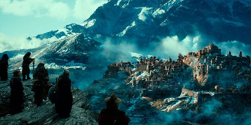

The “Bands” control on Mistika is also a great tool in dialling in extra tone into a picture. Depending on the construction of the shot and where the light sits, I make a decision on where the image is looking “thin” or boring and using the bands control on Mistika, I would manipulate more density into that area. I also keep an eye out for geographical areas of the frame that look thin. For example top left of frame is drawing the eye but is also feeling bland. Throw a window in and drop a small amount of density in there in the highlights (just under white and above midtones) and now the whole frame has a nice weight to it. This is done on a shot-by-shot basis, but then I pull my focus out and look at it as a scene in relation to story, then see where the “thin” sections are. Is there something dramatic happening on screen and did the pictures support that? Can I boost something or pull back something to make that better and have more impact on the audience?
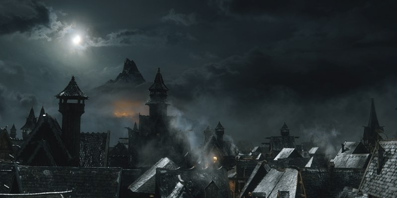
I tried to keep things as simple as possible whenever I could, to keep the natural beauty and integrity of the shot, but often a slight kink of colour is added in isolated parts of the image to help give it some style. Sometimes it was a slight kink using normal balance RGB tools. Other times, I would use a key to give tighter control on a shot-by-shot basis. It really depended on the desired look and the challenges within a scene to achieve it.
Sometimes a kink of colour in the shadows can really unmatch a scene as you could be cutting from a character standing in front of a dark wall to another character standing against the sky with hardly any shadows.
On top of this, Peter Jackson has a true creative streak and he loves to try new things and he likes to keep his options open. Therefore when building a look, I needed to make it interchangeable and flexible. I needed to be able to move in a new direction and make the global change quickly on the scene.
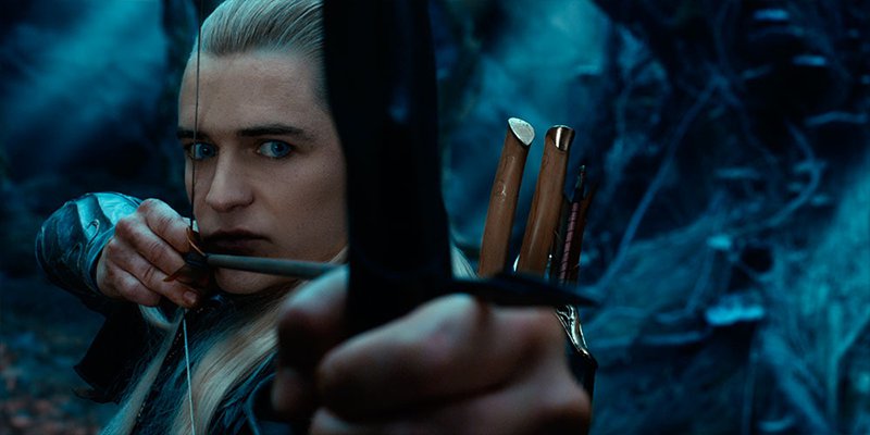

Skin tones
I guess when I create a look, I try not to take the overall “bones” layer too far. I only push to where the skintones are on the border of still looking nice. If an extra kink is needed on top of that, I will often pull keys or look for opportunities for shapes to add colour or tone.
When I come across problem skintones, I try to assess whether the change I would make within the skin would benefit the whole frame. Sometimes it does, as the problem was inherent within the whole shot itself, or sometimes it is just a mix of lighting and makeup on the character, coupled with the look graded into the scene.
If the backgrounds and other parts of frame match and look good I would use a key and a window to isolate our character and make the changes to match them in. My approach is to dissect each shot and grade it accordingly to match. For example, if there is a close-up face with skin tone taking up 60% of frame, I grade my base with regard to the skin tone. If it’s a wide shot with only 10% being made up of skin tone, I often grade for the other 90% and then the remaining 10% skin tone in a secondary.



Park Road Post have a VFX team who did a great job of taking care of most of the serious cosmetic/skin and hair work on the film. The grade team took care of the less tricky stuff - for example we took charge of lifting out eyes if they got too shadowy and of subtle skin tone lifts here and there when it was beneficial.


Highlights
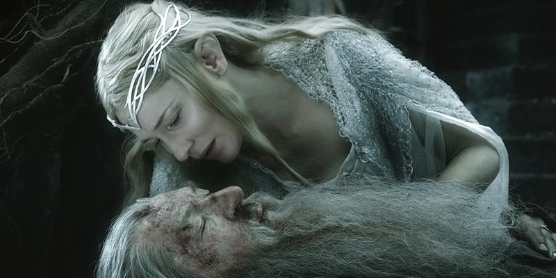
Highlights captured on a digital format can often look harsh. I like to have ready a key that is grown a few pixels and gently softened. Within that, using curves or normal contrast controls, I bring the two extremes of black and white closer together to blend the harsh edges a little.
Shots often need their own hand-crafted adjustment, both the key and the grade within. Sometimes a key may not be required and all that’s needed is to drop the extreme top whites down (if you have that sort of control on your grading system).
An interesting look can be beautiful, but a good balance underneath a scene is what really makes it look great
- Trish Cahill -
I think the craft of colour grading is assessing each shot and each problem separately, having a few problem-solving options up your sleeve and choosing the best and simplest one for the job. Overall The Hobbit had a subtle highlight blur/glow effect which was dialled in strongly but reined back to a more pleasing and unobtrusive level across frame with opacity controls.
Selection of hero shots
One of the fundamentals in working effectively in a grade is keeping a comprehensive and up-to-date stills gallery of the best shots of various scenes and referring to them often. I like to keep a selection of hero shots on hand so I can throw them up when I am getting stuck or uninspired on a scene. Sometimes I even find my self briefly comparing something random like my favourite night scene with a day scene I am grading - the still is there because it is one of my favourites, a shot I feel looks good and is graded neatly and has that X factor of beauty. I find it then acts as a carrot for me to achieve the same level of quality on the shot I am currently working on. Referencing a few of the best shots throughout the film keeps you on the right track and helps with keeping a constant style, tone and level of quality.
Another trick I sometimes use is to play through the film at high speed to get a quick overview of how it flows and to catch anything that bumps.
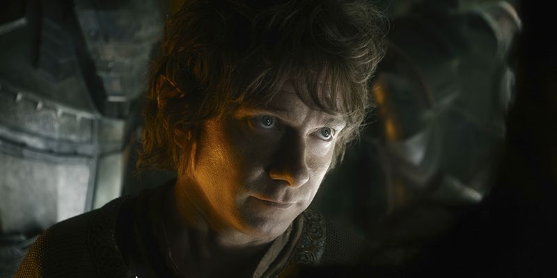
On a day to day basis, the technical challenges were many. We had films that ran an average of two-and-a-half hours each. Both had a 2D and 3D version, as well as a 24 and 48 frame delivery requirement. Final VFX shots were being handed over to us right up until the last moment, so maintaining the consistency of the grading process required a large grade and support team to manage and churn through the work.
The team at Park Road Post are an amazingly capable bunch, and we couldn’t have met these tight deadlines without their expertise, dedication and stamina.
Trish Cahill
All images and clips copyright © SF Norge AS
-
 11
11
-
 2
2

Recommended Comments
Join the conversation
You can post now and register later. If you have an account, sign in now to post with your account.
Note: Your post will require moderator approval before it will be visible.