Lowepost
-
Posts
776 -
Joined
-
Last visited
Content Type
Profiles
Case studies - Free
Case studies - Premium
Resources
Insider
Courses
Forums
Store
Everything posted by Lowepost
-
 In this masterclass, Lynette Duensing invites you into the renowned trailer company “Instinctual” in Hollywood and her color grading suite to study theatrical trailer grading. She has created cutting edge looks for numerous iconic productions. Her trailer projects for Sony Picture Animation, Columbia Pictures and TriStar include “Spider Man: Into the Spider-verse”, “Hotel Transylvania”, “Where the Crawdads Sing”, The Woman King”, and “I Wanna Dance with Somebody”, among many others. There is a ton of valuable insight in this masterclass for every colorist regardless of skill level. Watch today and get an exclusive look into the art of theatrical color grading in Hollywood! About the instructor Lynette Duensing is a Senior Colorist at Instinctual LLC in Hollywood. She has over 30 years of color grading experience using multiple finishing platforms including DaVinci Resolve and Baselight and Lustre. She’s worked in Los Angeles, Detroit, Chicago and Shanghai, grading feature film DI’s, TVC’s, episodic television, music videos and restoration/preservation projects. At Instinctual, she grades theatrical trailers for Sony Pictures Entertainment and oversees color for final DCP delivery. Lynette is a mentor for the HPA Young Entertainment Professionals, Colorist Society Fellow, and member of the Association of Moving Image Archivists. Who is this course designed for? Colorists COURSE OVERVIEW LESSON 01: Introduction Introduction to trailer grading LESSON 02: ACES workflow Lynette walks through the basics of her ACES workflow when working with trailers for Sony Animation feature films. Also touches on the importance of paying attention to the whitepoint designated by the studio or post production facility that hosts the project. LESSON 03: EXRs and embedded mattes In this lesson, Lynette talks about how shots in features films and their trailers need separate treatment. She continues to talk about how EXRs and embedded mattes are used to separate parts of the shots, and demoing how to combine mattes to create new mattes for more detailed control. LESSON 04: Node tree and parallel nodes Lynette breaks down her parallel node tree from scratch, connects mattes to the nodes and hue shifts some elements in a shot. Discusses the benefits of using parallel nodes instead of serial nodes, and the power of working with various node setups. LESSON 05: Manual transforms Demonstrating the disadvantage of using manual transforms, and discussing the colorists role in the big picture. LESSON 06: Remote grading Lynette presents the trailer of a vampire movie that uses a YRGB workflow in DaVinci Resolve. Talks about collaborative workflows and remote solutions. LESSON 07: Client management In this lesson, Lynette talks about how to conduct a session, get along with collaborators and having the client come back time after time. LESSON 08: Transforms and whitepoint Going through different scenarios with pre- and post grade placements of transforms and show luts. Continues to explain the process of rec709 to DCI transforms, and in-depth explanations of white point adaptions. LESSON 09: Grouping transforms In this lesson, Lynette walks through the process of adding transforms and trims in groups. LESSON 10: Pre-grade from home Talks about home setups and alternative ways to work post pandemic. LESSON 11: Send it upstairs Discussing when a task should be handled by anyone else than the colorist. LESSON 12: MPA Trailers are rated for suitability to various kinds of audiences, and Lynette talks about what it requires to meet the requirements and shows her node setup for blood removal. The masterclass is created together with Ravengrade.com, a Plugin for DaVinci Resolve, with powerful grading tools and cinematic looks designed by some of the most successful colorists and color scientists in the industry.
- 8 comments
-
- 10
-

-

-
We used the cable between the ZCAM and the IDX-mount, and the battery attached to the IDX-mount powered the camera.
-
Hi Stan, thanks! Have a look at the cable link below the "cable management" section, that's the one we used.
-
Lowepost Foootage for Color Reel?
Lowepost replied to Johannes Burgstaller's topic in General Discussions
Yes you can! -
Hi Marvin! Thanks for your thoughts and input. We have several high-end courses in production, and will make an announcement later this month.
- 1 reply
-
- 6
-
-
There is currently a technical issue with our domain registration partner and we are working with them to resolve the issue as soon as possible, our apologies for the inconvenience. All current licenses will keep working without disrupting, if you are a license holder and wish to re-download Ravengrade please contact us at support@lowepost.com with the e-mail address that you used to purchase Ravengrade and we will provide you with your download.
-
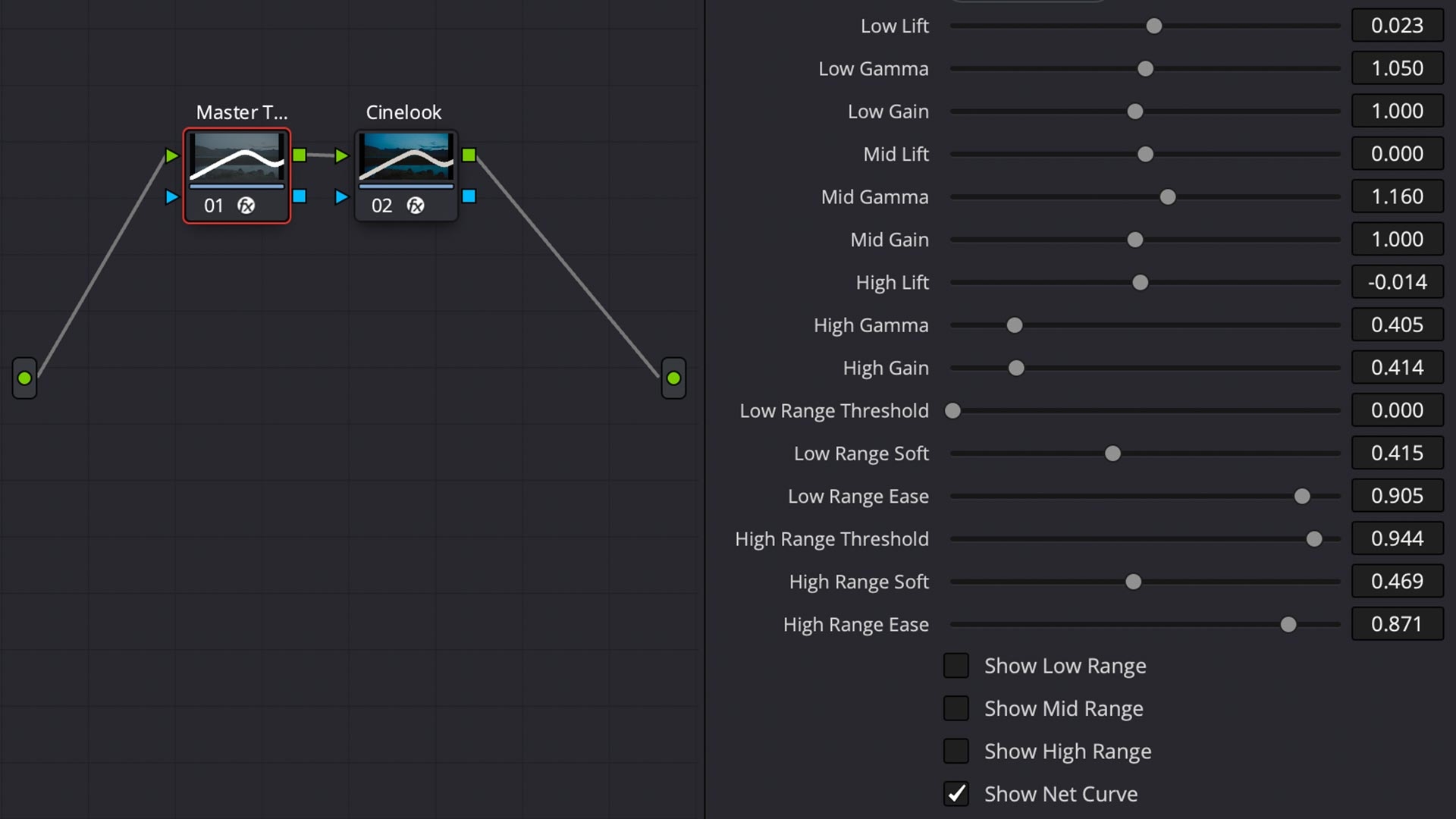
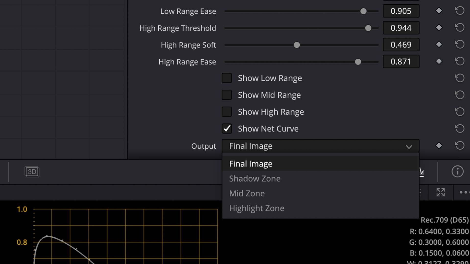
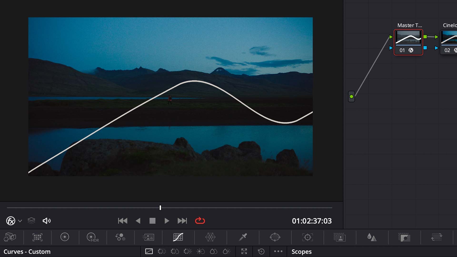
Cullen Kelly has developed a super useful plugin for DaVinci Resolve users called Master Tone. It basically mimics Nuke's ColorCorrect node, which separate Lift/Gamma/Gain operators for shadows/mids/highlights. Available at Ravengrade.com for $49.

-
Hey all! We're pleased to announce that Ravengrade.com is now open. Ravengrade brings a mix of advanced color science technology, accurately emulated film print stocks, creative looks and grading tools to DaVinci Resolve users through Cinelook, MIRA PowerGrades, Master Tone and John Daro's film look collection. We hope these tools can make you work smarter, faster and improve your grades. You can find details, videos and samples on Ravengrade.com.
-
Hi Virgil. Unfortunately, this is only possible in the RCM/ACES versions as the transforms are handled by the color management systems in those versions.
-
Hi Orash. Thanks for using Ravengrade, looking forward to see what you create with it! You should be able to use the color controls only and completely bypassing the look by setting main to zero. Will send you an email to see if we can figure out what is going on.
-
Professional Color Grading Techniques in DaVinci Resolve
Lowepost commented on Lowepost's course in The Art of Color Grading
Hi Seth. If you download and unzip the project files, you'll find 2.2GB with DPX files and footage and they are named after the lesson to which they belong. That's all you need to follow the training. -
We are super excited to finally show you our new Masterclass with Mark Todd Osborne. This is a 90 minute class with tons of valuable insight. Available now here. Enjoy! mark-todd-osborne-masterclass-promo-lowepost.mp4
-
If you have pre-ordered it should be in your mailbox now.
-
Hi Andreas. We have a few hundred pre-orders that will get access to the Plug-in next month and we'll work with them to improve all aspects of it. Currently there is no plan of when a public version will be released, price, and if a trial will be available at that point, but the documentation will be good enough for anyone to take an informed decision whether to buy or not.
-
Hi James. If you pre-ordered, you will get your copy in February.
-
Master Study in DaVinci Resolve Printer Lights
Lowepost commented on Stig Olsen's insider article in Color Grading
In Resolve YRGB Color Management set the input to you camera and output to rec709 2.4, and the printer lights will be applied in camera space (log). -
We're proud to announce the videocast "Masters of Color". Cullen Kelly is the host and we have invited some of the most renowned colorists in the industry to share insight about the high-end world of color grading. Subscribe for weekly episodes on your favorite podcast platform, or watch video version of all episodes instantly on Lowepost.com/Insider. Enjoy!
-
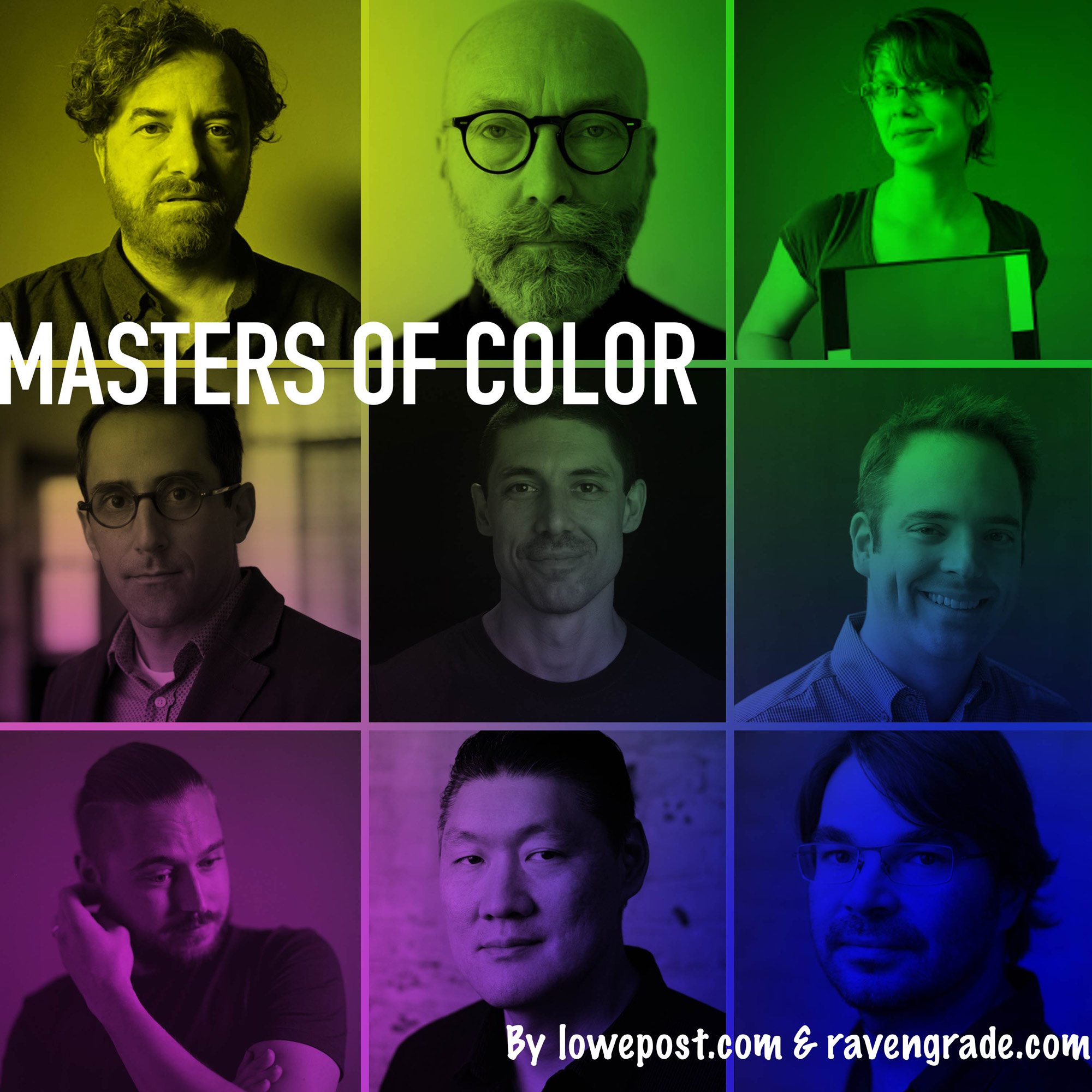 Welcome to Masters of Color! In this podcast we've invited a star gallery of renowned colorists to talk about the art and science of high-end color grading. Cullen Kelly is the host, and our guests are Peter Doyle, Ian Vertovec, Aurora Gordon, Damien Var Der Cruyssen, Toby Tomkins, Eric Weidt, Steve Yedlin and Stephen Nakamura. This is your chance to stay on top of the color game and learn from the real masters of color. A new episode will be added every Sunday, and you can subscribe to the show on any major podcast platform, including Spotify and Apple Podcast. On Lowepost, all episodes are available instantly and contains video. Episode 1 In the first episode Cullen talks with director David Fincher’s favorite colorist Eric Weidt about the art and craft of color grading. Eric has an incredible list of credits that includes Mank, Mindhunter and House of Cards. His works on these projects extends far beyond traditional tasks of color grading, incorporating complex look modeling and incredible detailed adjustments on virtually every frame. The techniques and insights he shares in this episode are unique, and includes topics such as how to sculpt the viewers experience with textural and spatial tools, the lens treatment techniques used on Mindhunter, the process behind and the swan curve used on the day-for-night shots on Mank, advanced grain work and so much more.
- 11 comments
-
- 23
-
-
-
Yes you can.
-
The industry is dominated by professional cinema cameras such as RED, Sony Venice, Panavision DXL2 and Alexa, but with the release of more high-end video cameras we have more choices than ever. Could we expect the same visual quality in a model that costs way less than the industry-leading cinema cameras? Z CAM E2-F6 Z CAM is a small and powerful cube-style cinema camera system that disrupted the market because of its impressive cinematic qualities. It slowly finds its place in the professional industry and has lately been used as both main and actions cameras in big budget Hollywood productions like A Day to Die and Mission Impossible 7. Both their entrance level camera Z CAM E2-M4 and full frame alternative Z CAM E2-F6 is equipped with sensors that give a textured and painterly feel to the footage and it nicely emulates many of the qualities of motion picture film right out of the box. Both are definitely up there with the big boys when it comes to color science. Warner Bros, De Lane Lea Studios in Los Angeles were responsible for the dailies on Mission Impossible 7 and were impressed by how well it performed. The small form factor and outstanding image quality made it a perfect match for action scenes especially with car chasing action outside of trains and plains. I think the Z CAM cameras did pretty well with the quality compared to the high-end cameras when implementing them into our Truelight ACES workflow on the set of Mission Impossible 7. A lot had to be done in terms of adding the correct LUT, and the dailies colourist putting more of an effort in matching the colour to the other cameras, but the end result was quite rewarding and can compare to the more high end cameras. - Yogi Patel, Dailies Operator at Warner Bros De Lane Lea Their line-up ranges from MFT to Full-frame and Super 35 sensors and can deliver up to 8K and 15 stops of dynamic range. Their top models have extraordinary performance in low light, and like Panasonic, Z CAM have also partnered with Atomos to transform their cameras into a complete RAW shooting system. Ravengrade just announced support for Z-log2 and makes cinematic looks designed by some of the most successful colorists and color scientists available for Z CAM and DaVinci Resolve users. Even though this is a very affordable camera system, it's also a modular system and requires a set of basic accessories to become fully usable. Read more about that in our how to build the ultimate Z CAM guide. Panasonic S1H Panasonic S1H made headlines in the film industry for its cinematic qualities and being the first mirrorless camera approved by Netflix. It promise to deliver everything a VariCam does and opens up a cinematic palette that can compare to the high-end models. Not only does it import the renowned colorimetry of the VariCam lineup, it also offers V-Log/V-Gamut capture to deliver high dynamic range and broad colors. The S1H does not require additional accessories, but when using a Ninja V HDR monitor, you can record 6K Apple ProRes RAW files direct from the camera's sensor and the result is the highest quality video images ever seen from a mirrorless camera. There are other cinema range mirrorless cameras in the same price range such as the Sony A7s iii, but in terms of cinematic quality, none of them come anywhere close. Red Komodo Back in 2007, RED redefined Digital Cinema with their game changing RED ONE camera. The cameras are known for their distinctive characteristics and are used to create some of the best looking movies in the history. RED Komodo 6K is their entry level alternative, and the small global shutter camera brings unparalleled color science into a compact box that weight almost nothing, for an affordable price. Many of the industry's leading filmmakers have tested the camera and left good reviews. The sensor is beautiful. I always wanted something this small, this sophisticated in terms of a high-quality image. It's very lightweight; very handheld. - Michael Bay, renowned director To take advantage of the incredible dynamic range in the camera and achieve superior image quality with the right post-production process, watch this training series from Lowepost. The RED Post Production training is designed for beginners and no post-production experience is necessary. It's exciting times, good luck with you camera choice! Lowepost
-
Affordable color grading suite for the home office
Lowepost posted an insider Article in Color Grading
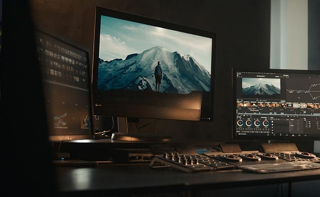 In the early days, a professional color grading suite with high performance and real-time playback was extremely expensive. Today, it’s easier than ever to build a color grading suite for a reasonable cost and get all the performance you need. In a full-service post facility you may need enormous displays, server systems, perfect lighting and unlimited performance, but here are the basic requirements to build an affordable color grading suite that let’s you work fast and precisely in your home office. Mac M4 With the massive speed increase on new Mac M4 models, DaVinci Resolve users can play back, edit and grade 4-6K projects faster and cheaper than every before. The new system is very efficient with their integrated RAM and 16GB is enough for most large projects and demanding tasks. The key to the performance will be the speed of your storage. A Mac Mini have all the necessary ports to connect screens, monitor, a capture/playback solutions as the BlackMagic Ultrastudio 4K Mini, streaming solution, and even a control surface (at least with a USB Hub) Monitor For affordable professional monitoring, we recommend to look for a used DM241 from Flanders Scientific as it delivers extremely precise color accuracy and comes with all the features you need for a very good price. It is equipped with an internal auto-calibration solution that let you perform a fast and accurate calibration yourself with the cheap 1D3 OEM probe. Recently, FSI introduced a more affordable version of the DM240, called the DM242 that shares all of the DM241’s advanced capabilities, but uses a more affordable 1100:1 contrast instead of 1500:1 contrast panel. If you bring directors or clients in for the session and need a screen on the wall, the LG OLED evo C6 55-inch is a popular model. Read our professional guide to color grading monitors to read more about this monitor and other alternatives in the professional range. Capture/Playback Solution All you need to connect the monitor and playback video from DaVinci Resolve is the affordable UltraStudio Monitor 3G device. For HD playback you will need the Ultrastudio HD Mini, and the UltraStudio 4K Mini for 4K and capturing options. GUI For GUI monitor, the Dell UltraSharps and HP Dreamcolor series are popular affordable alternatives worth considering. Audio Monitoring For clean accurate sound many facilities use these audio monitors from JBL and these from Yamaha, but there are countless alternatives from brands like Genelec, Rokit, Adam, Mackie, M-Audio and others. Control Surface Your color grading suite will feel incomplete without a color control surface as that’s the fastest and most efficient way to color grade. While BlackMagic Design offer their Mini and Micro panels for an affordable price, we recommend Elements from Tangent Elements. It’s a cost effective modular design which lets you choose only the components you need and it works with a variety of applications. Read our full guide to color grading surfaces, which also includes some ultra-affordable alternatives. Remote solution When working from home you will need a remote solution. Pixelview is a very popular all-in-one solution for colorists that enables easy collaboration with remote clients. It has a built in video-chat and you can make changes in real-time while everyone is watching the same high quality image. Lowepost This post might include affiliate agreements, for full information click here.
 -
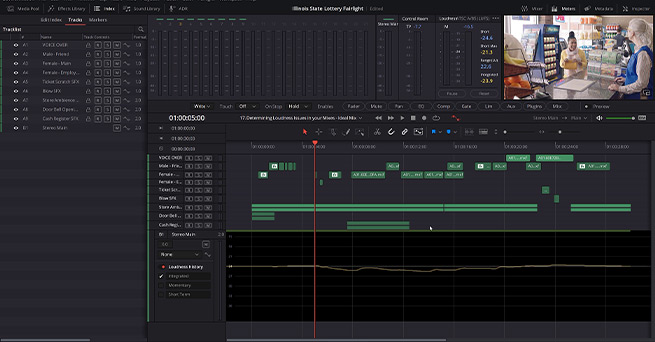 This course is for those who have already seen the Fairlight Fundamentals course and want to learn more about audio mixing and advanced audio editing features. You'll learn everything you need to know to edit, mix, and deliver your video to meet the technical specifications for digital broadcasters and TV. All within DaVinci Resolve Fairlight. The project files include both a mixed and an unmixed version of a commercial with voice over, dialogue, sound effects and music so that you can practice. Some of the topics discussed in the course are Elastic Wave Retiming, Zero Crossing, Audio Transients, LFE channels, and working with Flexbus. You will also get a deeper understanding of 5.1 surround mixing and a look at immersive mixing. The footage and assets used in this course are available for download. Download project files About the instructor Kevin P McAuliffe is an award winning editor and visual effects creator with over 20 years of teaching and training experience. Over the past years Kevin has delivered world-class work for clients such as Warner Bros, Walt Disney Company, 20th Century Fox, Universal and Elevation Pictures. Who is this course designed for? Film editors Sound engineers with background from ProTools, Logic etc Audio hobbyists Lessons overview 01: Introduction 02: Getting the Commercial Ready for Mixing 03: Elastic Wave Retiming 04: Audio Transients 05: Zero Crossing 06: Evening out the audio 07: 5.1 Output Track Setup 08: 5.1 Hardware Monitoring Setup 09: Surround Sound Analyzer 10: Surround Audio Pan Window 11: Surround Audio Vs Immersive Audio Pan 12: Surround Automation 13: Creating an LFE Channel 14: Working With Flexbus 15: Loudness Basics 16: Analyze Audio (Loudness) Levels 17: Working With Loudness Visually 18: Delivering the Mix 19: Delivering Split Elements
 -
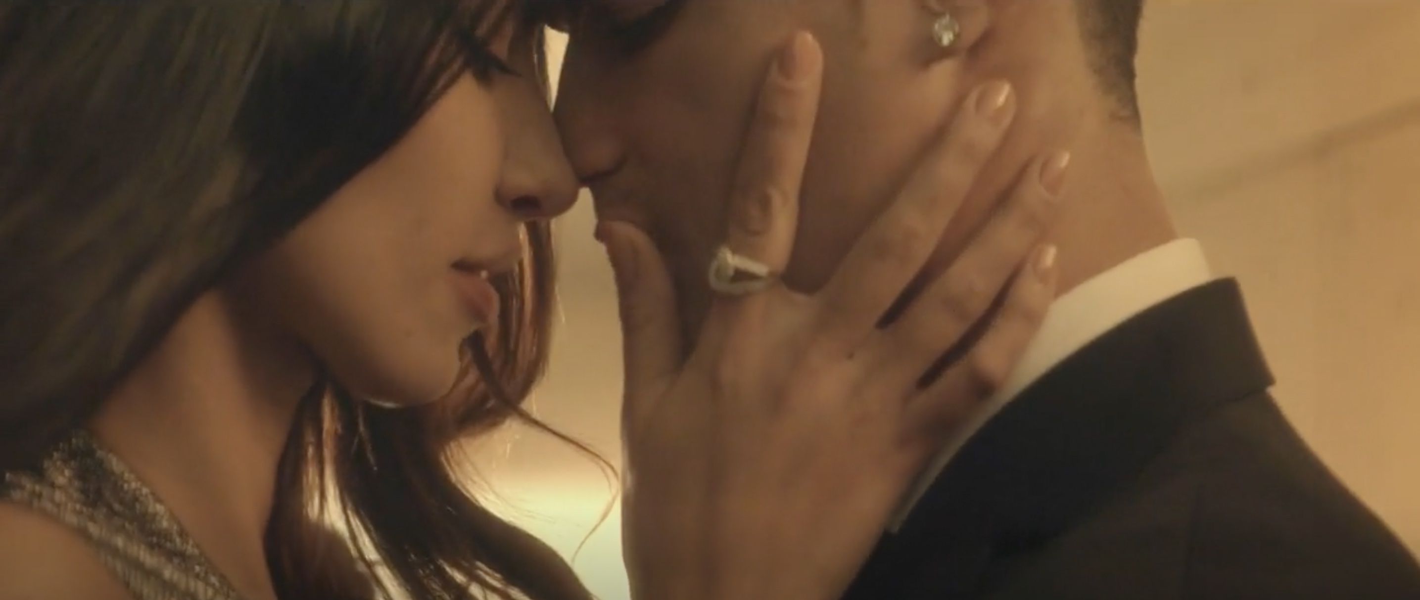 The director, Sean Thompson, wanted a warm sensual look for the spot, with a sense of gold permeating throughout. The colour reference that Sean had in mind for this was the desert fight scene from Kingdom of Heaven, directed by Ridley Scott. The challenge was to get all of the footage looking as though it was during the ‘magic hour’, when for example the opening of the commercial was shot at midday. Also, even though we went for a heavy golden look, I had to make sure it looked clean and sleek at the same time. LUTs The spot was shot on Alexa with anamorphic lenses, and graded on DaVinci Resolve. I sometimes use LUTs in my grade because that gives the picture more depth and make it look more cinematic, less digital. If utilising LUTs, I like to blend them through, so that I’m left with maybe only 5 or 10 percent of the intensity of the LUT. READ: Mitch Bogdanowicz about LUTs I find that with all the digital cameras nowadays everything is very flat, especially the skin tones, so I'm using certain LUTs that help the skin tone (giving it more colour and volume). Set your levels right One of the first rules when you train as a colourist is to set your levels right. When I first started grading, about 14 years ago when obviously we were working predominantly on film, the first step in a grade was 'Neg matching'. Meaning you would bring your neg's RGB levels to a correct point in the whites and blacks (with no crushing and no clipping). That would allow you to start with a balanced picture. An exception being when certain coloured filters or lights were used. The same still applies today, only that when working with a digital picture rather than film, it can be trickier because sometimes the footage that we get is not straight from the camera and it might have been already compressed into a QT prores, therefore not having all the range to work with. This is why it is always important to provide your colourist with RAW files, allowing the maximum range within which to work. When working on the RED or RAW files, etc, I sometimes use the camera settings option in Resolve to change the exposure or get more info in the blacks or highlights. Then, I use the primary colour corrector to set the levels right. And yes, it's very important to start the grade with a good balanced picture because it is the only way you can get the most out of the picture (and know what your limitations are as well). The golden look After I set my picture balance right, I start working on the look that the director and the DOP aim for. With this particular film ‘Legacy’, it was all about the golden sunset look. I like to work on the overall picture, and I find that this way the look is more natural, not so 'Instagram'. Having said that, on the Legacy film I selected the highlights and added a touch of warmth in them, as I was trying to recreate the warm late afternoon summer sun. I also used few subtle vignettes throughout, to make the picture look a bit more cosy and ad more depth. I kept a good healthy contrast that complements the lovely anamorphic flares from the camera. To help enhance the cinematic look I also added a touch of grain in the picture. I find that it's always great to add some texture into the clean digital images. In general, I use the vectors and qualifiers a lot, also lots of windows, the contrast and the amazing midtone detail both in the DaVinci Resolve primaries. Skin tones I like to start working towards a look in small steps, as I find it very important to keep good skin tones in my grades. With a golden look this can be a bit tricky, as in order to create it you need to find a fine balance of yellows and reds. I find that with a lot of digital cameras, skin can often look really grey and flat, so I like to add colour and some depth into the skin. I think that one of the most important things is to always having good skin tones and ensuring that they work with the rest of the picture. Basically if the picture is lit with a blue light, I think its fine to have cool skin tones, it looks natural. The briefs are different for different brands and types of films, from the translucid skins of high fashion models to the nice peachy skins of pampers babies. One colour that always creeps into the skin tones is green and I find that it is a very delicate balance of removing that and not making it look too magenta. Colour influences perception, sometimes in an obvious manner and sometimes in far subtler and unexpected ways. Fundamentally, what we’re always contending with are levels of hue, saturation, lift, gamma and gain. The balance of these and their effect can on a subjective level be quite finite but there are some accepted and proven conventions to the psychology of colour, that as individuals all of us generally adhere to, in so much as eliciting similar emotional responses; bright & warm equals happy, cold equals sad. Colour can be used to associate a positive or negative tone, make us hungry, encourage feelings of calmness or energy, etc. Clever advertising and marketing executives are of course aware of this. When you’re an established colourist and working at a certain level, it’s all about the fine details. Nowadays with a plethora of apps and software available it’s not too tricky to add a funky look to a picture but in my opinion if a grade looks as though it was done on an app, there’s not much value to it. I always try to stay true to what the cinematographer had in mind when he shot the film, and go from there. I would also say that it is very important to be interested in cinematography and photography in general. To continue to learn and be inspired. The technical side is a large part of the craft, it is important to have a thorough understanding of the pipeline, which will give you confidence in handling any job. Social and communication skills are also very important. Simona Cristea All images and clips copyright © 2016 Cake Group / Dark Energy
 -
Look Development & Workflow in DaVinci Resolve
Lowepost commented on Lowepost's course in The Art of Color Grading
The music is composed specifically for the commercial.