Stig Olsen
-
Posts
382 -
Joined
-
Last visited
Content Type
Profiles
Case studies - Free
Case studies - Premium
Resources
Insider
Courses
Forums
Store
Everything posted by Stig Olsen
-
Mad Max - Black & Chrome
Stig Olsen replied to Bruno Mansi's topic in Editing , Color grading & Finishing
I don't know who told Robert this, but it's wrong. -
You can get a 1. month full trial version by sending an email to mail@florian-utsi-martin.com
-
 B eing a good colorist is a peculiar art and one that has evolved quite considerably in the past few years. The basic skill set requires a keen eye for detail, the ability to listen and then communicate effectively with patience, confidence and diplomacy. These days one needs all those skills plus a marketing strategy, the talent pool is enormous now, you'll need to either work for one of the post production giants or have a beautiful instagram feed to win new work. Becoming better is a simple concept, keep grading, keep up to date with cinema, keep up to date with your peers work, technology and fashions, keep selling, keep relevant, develop as many relationships with DP's, producers, directors and creatives as you can. If possible, collaborating with other colourists is an incredible way of learning, we all have our unique perspective, every person will approach a shot in a different way, there is always something new to be learnt from another colourist; I've been grading for 20 years and still feel I've much to learn, not just about grading, but about rapidly changing technology, about relationships, about film, about light and most of all about having a passion for it. MATT TURNER Head of Color at Absolute Post K eep abreast of modern trends and never, ever thinking you cannot improve. After every project even now I learn something new to take to the next one. PAUL ENSBY Senior Colorist at Company 3 A great colourist has to tick so many boxes. In commercials especially, you must be a great communicator and problem solver. You must be able to suggest and deliver a middle ground when views are split in the suite. Judging the suite can be difficult, and I think this side of the job can be the hardest. Getting technically good pictures is one thing, but creating a unique look and feel with an individual style in another thing altogether. I would always suggest to first get the balance right. If you’re working in a department with other colourists, grab stills of their approach and try to match it yourself. Matching is a very important discipline, and a skill in its own right. To improve you always have to move forward. If you’ve finished a grade, go back and do it in less layers, strive for cleaner pictures. If you’ve gone for a natural look, push yourself and go hyper-real / surreal. Remember lots of times you don’t slowly advance up the the optimum grade, you generally have to go too far, take a step back, and you know you’ve arrived. Don’t be scared, and put as much work in by yourself as you can. Understand the piece you are grading, figure out who are the characters and what emotions are being portrayed. Having a reason to desaturated someone’s skin tones as they are poorly is a considered approach. Putting on a film emulation LUT on a piece that is meant to be real and observed is probably not the best approach. STEFFAN PERRY Senior Colorist at Framestore I try to keep learning and keep pushing technology. Never be afraid to stop learning. There’s always new looks, new gear, new shortcuts and new ideas to learn. Keep the conversation going. Find fellow colourists and share ideas. ERIC WHIPP Senior Colorist at Alter Ego Do as much grading as you can and try to learn as much as you can from as many outlets as you can. If you have the opportunity to work with or study other colorists work, do. Exercise your color brain. Grade the same scene 3 different ways, grade a scene without scopes, then grade the same scene using only using scopes. Grade a scene using only primary controls, then grade the same scene using only curves, then to have fun and try to grade the scene using only blending modes! Go and shoot stuff to grade. Shoot a short film on your phone’s camera! Try and watch as much stuff as you can. Watch films in the theater, watch films on your TV at home, just watch films! It’s important to see how others are practicing the craft. Watch music videos, there’s lots of cool stuff happening in that space right now. Watch online content on your phone. Just stay engaged in the art. A good colorist should have a good understanding of both color science and the tools of the trade. Any decent colorist should find balance and flow easily, attack a problem in a very effective fashion. But colorists at the top of the field rarely focus on the technical. All the best colorists I know are masters at being creative with filmmakers. The top colorists I know help shape a films look in an organic and original fashion, often effortlessly. All great colorists can manage a room full of creatives and executives where everybody may not agree, and find a solution that works for all. The longer I do color the more I see these are the things that separate the best from the rest. ALASTOR ARNOLD Senior Colorist at FotoKem Watch movies, at home, in theaters, anywhere. Visit art museums and galleries. Revel in the colors of the real world. Notice the colors in the real world. Notice the difference in the colors in the morning, in the afternoon, and at night. Read books on color, read biographies on artists. Look deeply and long at all forms of photography. Keep trying different styles of grading. Teach as much as possible because you learn more by sharing than by keeping it to yourself. Lastly, don't hog the credit, give that to the photographer and crew whose work you are now charged with polishing. RANDY STARNES Senior Colorist at Arsenal
 -
People are usually the central point of every scene in motion pictures. As we are constantly surrounded by people, we are extremely familiar with skin tones and very sensitive to even the slightest inconsistencies. In addition, regularly changing technology and the increasing possibilities in color grading have made it a difficult task to achieve proper skin tones. During film production, skin passes through many stages and different scenarios will need different decisions and adjustments. In order to gain a deeper understanding of how the visual appearance of skin is created, reproduced and shaped, I have written a paper that explores the different influences on skin which contribute to its final look. This paper is neither to be seen as a tutorial for colorists on how to edit skin, nor does it claim completeness. It rather constitutes a broad survey, based on detailed, actual experience of numerous professionals within the field. DOWNLOAD: The Visual Appearance Of Skin In Motion Picure by Marina Starke The paper includes insights from Sean Coleman, Kath Raisch, Asa Shoul, Andreas Bruckl, Adam Inglis, Alexis Van Hurkman, Andy Minuth, Kevin Shaw, and many more. Marina Starke, Colorist
- 3 comments
-
- 11
-

-

-
We did something similar some years ago on this spot. Remember we had to run it through the VHS machine several times to get the desired look we were after. Desaturated a little, added a green tint and cropped to 4:3.
-
Mad Max - Black & Chrome
Stig Olsen replied to Bruno Mansi's topic in Editing , Color grading & Finishing
There are some misleading information out there. The DI was done in-house at Warner Bros and not by Eric. -
Bleach bypass look
Stig Olsen replied to Nicolas Hanson's topic in Editing , Color grading & Finishing
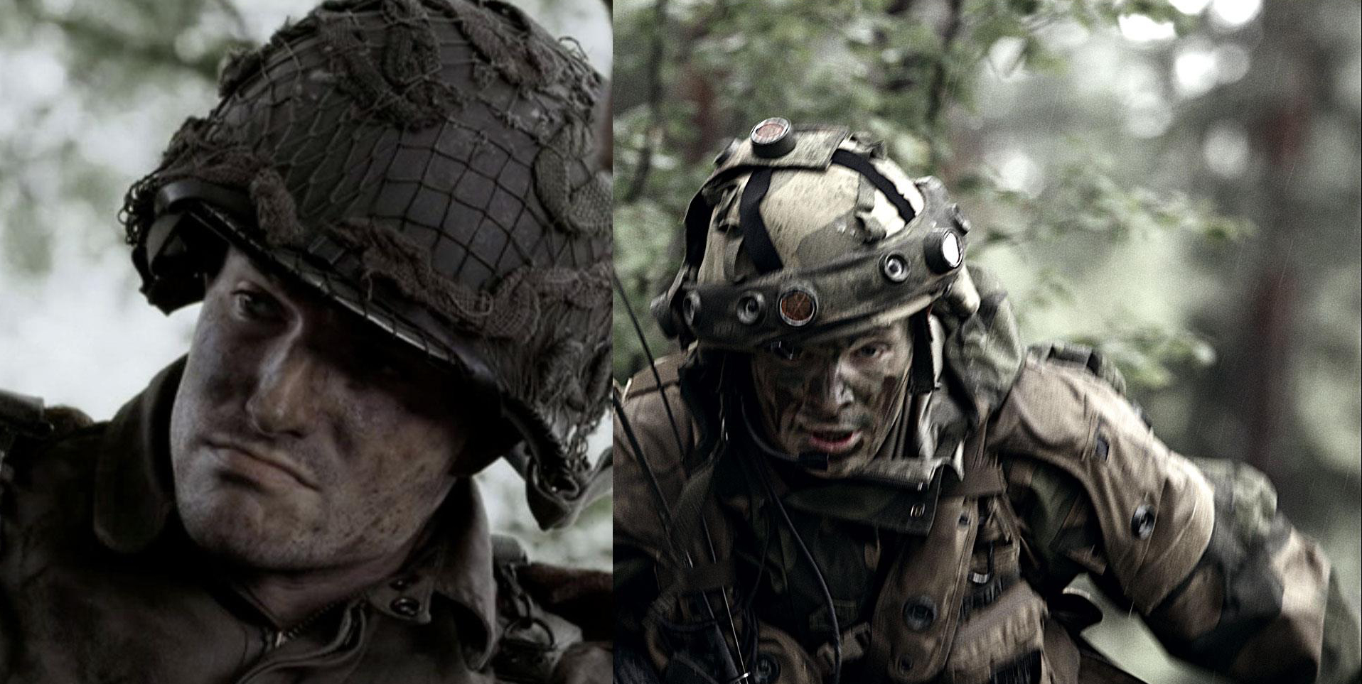
Some years ago I used the technique above to emulate the bleach bypass look on this scene. The keywords were desaturation, silver retention, grain matching and blacks / highlight control. The reference image on the left side is from Band of Brothers and the shot on the right was shot on RED MX. In the premium collection you can find an article about Saving Private Ryan by Dale E. Grahn, and we'll hopefully very soon publish a very in-depth article about Band of Brother. Like a bunch of other articles we're waiting for studio permission.
-
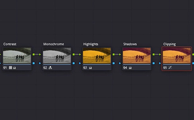
Silver retention techniques are used to emulate the famous bleach bypass look, but they are also important parts of creating other popular looks. In this video tutorial we will walk you through the techniques step by step. Let us know if you have any questions in the comment field below.
- 5 comments
-
- 24
-
-
-
You need to separate them in sequences and remove the fillers. Then you can select them all from the bin view, right click and export from there.
-
I found that one of the best options are Make MKV.
-
Congratulations, the site looks great!
-
You are right, it's fixed now. Thanks!
-
I recommend using DNxHR HQX/444 as a mastering format because of the high picture quality and file size. From Wiki :"The codec was specifically developed for resolutions considered above FHD/1080p, including 2K and 4K". DNxHR 444—4:4:4 color space; super gorgeous imagery, ideal for high-quality color correction and finishing DNxHR HQX—High quality extended; beautiful imagery for color correction and mastering DNxHR HQ—High quality; offers a great balance of beauty at a smaller bandwidth for editorial DNxHR SQ—Standard quality; ideal for editorial DNxHR LB—Low bandwidth; ideal for remote workflows and saving storage; LB 1/4 resolution and LB 1/16 resolution also available for the most bandwidth/space-constrained workflows
-
I love Bruno Aveillans work!
- 1 reply
-
- 3
-
-
The Avid operator can use MXF OP-atom and I think that's the only MXF format suitable for a fast workflow. The files can be read natively directly from the Avid MediaFiles folder, so no need for consolidating and transcoding.
-
 T he popular duotone-look was re-introduced with the new colorful brand identity of Spotify. In this Look-tutorial we will walk you through how to create it in DaVinci Resolve. The RGB-mixer plays a powerful role to highlight important parts in the image.
- 4 comments
-
- 13
-
-