-
Posts
7 -
Joined
-
Last visited
Reputation
7 NeutralAbout Gioacchino Gargiulo
- Birthday 10/09/1995
Personal Information
-
Website
https://www.youtube.com/thenerdherdforum
Recent Profile Visitors
The recent visitors block is disabled and is not being shown to other users.
-
You can find here a good explanation of the difference between the different LUT types
- 20 replies
-
- 1
-

-
- color grading
- reverse engineering
-
(and 1 more)
Tagged with:
-
I've been using LUTs from different sources and for different purposes over the short time period I've spent learning a thing or two about color grading, and I was wondering what is the "standard" procedure for creating a LUT. I'm aware that several programs like Resolve or Photoshop are able to create one, and until now I've used those programs to cook my own LUTs, but I'm unsure whether that's "correct" and/or advisable, or whether there are other more professional ways to do it. I hope I was able to clearly express the question, please let me know if that is not the case.
-
Thanks Abby! And you're right, working on better material would surely help, I'll see if I can find something less compressed the next time.
- 20 replies
-
- 1
-

-
- color grading
- reverse engineering
-
(and 1 more)
Tagged with:
-
The difference is that parallel nodes have equal "power" on the image, meaning that the order does not matter, while a Layer Mixer node prioritizes the node on top (or on the bottom, I can never quite remember until I try) and then the others come afterwards. I hope this makes sense, I know it's not a really comprehensive answer but as you may guess I'm only a beginner. As for my node structure, I used the first node to give the basic contrast and saturation, then added a layer mixer to warm up the image while keeping the shadows cool, then isolated the center to better match the original shot.
- 20 replies
-
- 1
-

-
- color grading
- reverse engineering
-
(and 1 more)
Tagged with:
-
- 20 replies
-
- color grading
- reverse engineering
-
(and 1 more)
Tagged with:
-
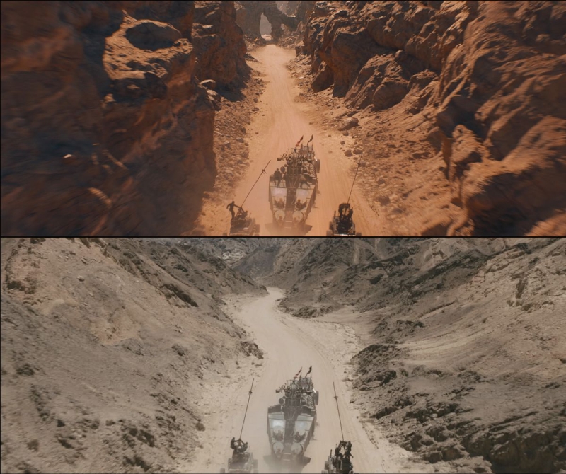
First, thanks to everyone for replying. I've tried fixing the original grade, but eventually started again from scratch. I think it's a tiny bit better than the previous version, and I tried to simplify the nodes a bit, but I'm still missing a lot of the detail from the original shot for some reason. Here are the second version and the node structure: Any ideas of how I can fix it?
- 20 replies
-
- 1
-

-
- color grading
- reverse engineering
-
(and 1 more)
Tagged with:
-
Good evening to all, This is my first post here so I'll try to keep it short and relevant. After reading the article about the grading of Mad Max: Fury Road, I tried to re-build it myself using some production stills found online. Needless to say, the results are pretty bad, so I wanted to ask your opinion on how to better recreate the grade and whether I'm headed in the right direction. This is the plate I started with: This is the original grade (+VFX) : And this is where my grade is at the moment: This is my node structure: (As you can guess by the thumbnails, I worked on an image containing both the clean plate and the graded image, which in retrospect was a bad idea) I'm not happy with both the hue of the sand and the shadows, which seem to me a bit more on the blue side in the original grade. If you have any tips on these issues, and/or on other issues I missed, feedback is most welcome!
- 20 replies
-
- 2
-

-
- color grading
- reverse engineering
-
(and 1 more)
Tagged with:


