CRISTIANO RONALDO 'LEGACY'
COLORED BY SIMONA CRISTEA
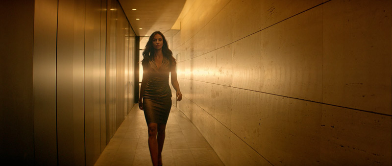
The director, Sean Thompson, wanted a warm sensual look for the spot, with a sense of gold permeating throughout. The colour reference that Sean had in mind for this was the desert fight scene from Kingdom of Heaven, directed by Ridley Scott. The challenge was to get all of the footage looking as though it was during the ‘magic hour’, when for example the opening of the commercial was shot at midday. Also, even though we went for a heavy golden look, I had to make sure it looked clean and sleek at the same time.
LUTs
The spot was shot on Alexa with anamorphic lenses, and graded on DaVinci Resolve. I sometimes use LUTs in my grade because that gives the picture more depth and make it look more cinematic, less digital. If utilising LUTs, I like to blend them through, so that I’m left with maybe only 5 or 10 percent of the intensity of the LUT.
READ: Mitch Bogdanowicz about LUTs
I find that with all the digital cameras nowadays everything is very flat, especially the skin tones, so I'm using certain LUTs that help the skin tone (giving it more colour and volume).
Colour influences perception, sometimes in an obvious manner and sometimes in far subtler and unexpected ways
- Simona Cristea -
Set your levels right
One of the first rules when you train as a colourist is to set your levels right. When I first started grading, about 14 years ago when obviously we were working predominantly on film, the first step in a grade was 'Neg matching'. Meaning you would bring your neg's RGB levels to a correct point in the whites and blacks (with no crushing and no clipping). That would allow you to start with a balanced picture. An exception being when certain coloured filters or lights were used.
The same still applies today, only that when working with a digital picture rather than film, it can be trickier because sometimes the footage that we get is not straight from the camera and it might have been already compressed into a QT prores, therefore not having all the range to work with. This is why it is always important to provide your colourist with RAW files, allowing the maximum range within which to work.

When working on the RED or RAW files, etc, I sometimes use the camera settings option in Resolve to change the exposure or get more info in the blacks or highlights. Then, I use the primary colour corrector to set the levels right. And yes, it's very important to start the grade with a good balanced picture because it is the only way you can get the most out of the picture (and know what your limitations are as well).
The golden look
After I set my picture balance right, I start working on the look that the director and the DOP aim for. With this particular film ‘Legacy’, it was all about the golden sunset look. I like to work on the overall picture, and I find that this way the look is more natural, not so 'Instagram'. Having said that, on the Legacy film I selected the highlights and added a touch of warmth in them, as I was trying to recreate the warm late afternoon summer sun. I also used few subtle vignettes throughout, to make the picture look a bit more cosy and ad more depth.
I kept a good healthy contrast that complements the lovely anamorphic flares from the camera. To help enhance the cinematic look I also added a touch of grain in the picture. I find that it's always great to add some texture into the clean digital images.

In general, I use the vectors and qualifiers a lot, also lots of windows, the contrast and the amazing midtone detail both in the DaVinci Resolve primaries.
Skin tones
I like to start working towards a look in small steps, as I find it very important to keep good skin tones in my grades. With a golden look this can be a bit tricky, as in order to create it you need to find a fine balance of yellows and reds.
I find that with a lot of digital cameras, skin can often look really grey and flat, so I like to add colour and some depth into the skin. I think that one of the most important things is to always having good skin tones and ensuring that they work with the rest of the picture. Basically if the picture is lit with a blue light, I think its fine to have cool skin tones, it looks natural.
The briefs are different for different brands and types of films, from the translucid skins of high fashion models to the nice peachy skins of pampers babies. One colour that always creeps into the skin tones is green and I find that it is a very delicate balance of removing that and not making it look too magenta.

Colour influences perception, sometimes in an obvious manner and sometimes in far subtler and unexpected ways. Fundamentally, what we’re always contending with are levels of hue, saturation, lift, gamma and gain. The balance of these and their effect can on a subjective level be quite finite but there are some accepted and proven conventions to the psychology of colour, that as individuals all of us generally adhere to, in so much as eliciting similar emotional responses; bright & warm equals happy, cold equals sad.
Colour can be used to associate a positive or negative tone, make us hungry, encourage feelings of calmness or energy, etc. Clever advertising and marketing executives are of course aware of this.

When you’re an established colourist and working at a certain level, it’s all about the fine details. Nowadays with a plethora of apps and software available it’s not too tricky to add a funky look to a picture but in my opinion if a grade looks as though it was done on an app, there’s not much value to it.
I always try to stay true to what the cinematographer had in mind when he shot the film, and go from there. I would also say that it is very important to be interested in cinematography and photography in general. To continue to learn and be inspired.
The technical side is a large part of the craft, it is important to have a thorough understanding of the pipeline, which will give you confidence in handling any job. Social and communication skills are also very important.
Simona Cristea
All images and clips copyright © 2016 Cake Group / Dark Energy
-
 4
4
Recommended Comments
Join the conversation
You can post now and register later. If you have an account, sign in now to post with your account.
Note: Your post will require moderator approval before it will be visible.