

Lowepost
-
Posts
776 -
Joined
-
Last visited
Content Type
Profiles
Case studies - Free
Case studies - Premium
Resources
Insider
Courses
Forums
Store
Everything posted by Lowepost
-
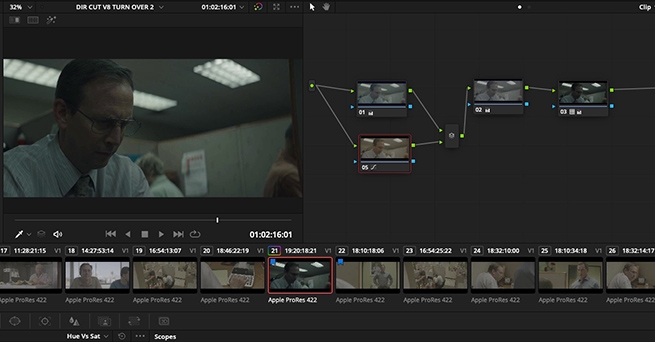
Professional Color Grading Techniques in DaVinci Resolve
Lowepost commented on Lowepost's course in The Art of Color Grading
You will have to change input color space to match the camera, in your case the Sony. The timeline color space can still be Arri Log C because you don't want your controls to behave different each time you're working with a new camera format. -
Professional Color Grading Techniques in DaVinci Resolve
Lowepost commented on Lowepost's course in The Art of Color Grading
The input color space should be set to the camera color space which in this case is Alexa Log C because Alexa footage is used in the example. When it comes to the timeline color space in general, it only affects the "feel" of the controls, so it's purely a matter of taste. From our understanding Alexa Log C is definitely the most common timeline color space used in the professional world and especially among Baselight users. -
Professional Color Grading Techniques in DaVinci Resolve
Lowepost commented on Lowepost's course in The Art of Color Grading
Thanks @James Lakey. We have seen this particular setup a couple of times, but you will quite different results by playing around in the same area, shifting hue angles and adjusting the strengths. The combination of dialing in extreme colors and mapping them to the tonal range by adjusting the strength is an extremely powerful technique that allows numerous of looks, but it can take some time to get used to. This is just an example. When it comes to hitting the numbers in general in all the lessons it's because we have walked through the lessons several times prior to recording and don't want to waste your time "experimenting on screen". -
Professional Color Grading Techniques in DaVinci Resolve
Lowepost commented on Lowepost's course in The Art of Color Grading
We are not referring to order of operations inside of nodes at 04:09 in lesson 08. Th difference is that we are dialing in exposure AFTER the color adjustments and not the other way around as seen in all the other lessons. This is because we want to demonstrate the impact brightness and contrast adjustments has on color and the reason why we encourage you to do it the other way around. -
Professional Color Grading Techniques in DaVinci Resolve
Lowepost commented on Lowepost's course in The Art of Color Grading
The first node will be optimized for the key operation only, and you don't necessarily want to build your grade on that. That's why you want to keep it separate from the main stream and leave it as a constant source to pull keys from. -
Professional Color Grading Techniques in DaVinci Resolve
Lowepost commented on Lowepost's course in The Art of Color Grading
Hi Josh, Thanks for your kind words! @Jussi Rovanperä is right, it's the LUT that causes the shift in the other channels. When you watch any correction through any LUT, the relationship between the different color channels that the curve is made up by will influence the result. That means, by pushing one of the color channels through a LUT, the other two will be altered. The more aggressive the LUT is, the more of your correction will be altered. When you do a correction prior to a Film Emulation LUT, the result will be altered differently than in a pure Technical LUT because the relationship between the color channels that the curve is made up by is different. This is even true when adjusting the exposure only. Some LUTs will push more cold colors into the blacks when you lower the brightness, while others will push more warm colors into the highlights when you do the same thing. This is what we in the course refer to when we say that your corrections will expand and compress based on the shape of the curve. It's important to understand the relationship between the correction you do and the LUT you work under, also when it comes to exposure alone. This is the way color timers worked back in the days as the signal would be altered depending on what film stock (LUT in a digital world) it was watched through. This workflow is adapted in the high-end post facilities and is considered the purest and most natural way to correct an image. -
 This course provides colorists with an in-depth overview of professional color grading techniques and look creation in DaVinci Resolve. The main concepts discussed in the course are advanced contrast management, balancing techniques and look development. The focus is primarily on higher end color grading, color theory and teaching techniques that took professional colorists years of experience to master. The course is presented by Kevin P. McAuliffe but is created together with professional colorists that have contributed with insight about their work methods. Kevin uses DaVinci Resolve, but it is taught with the goal of showing techniques that can be used in any color corrector. The footage used in this course is available for download so that you can easily follow along. In addition, we have included power grades so that you can deeply study the node structures and color grading techniques demonstrated in the course, and a free sample of 35mm film grain from our friends over at Cinegrain. Download project files COURSE OVERVIEW LESSON 01: S-CURVE MANIPULATION The curve is the key component of contrast creation, and in the first lesson we look at the basics of the curve and curve shaping. LESSON 02: CORRECTIONS IN LOG SPACE AND GAMMA SPACE We continue to explore how brightness affects the curve in log- and gamma space, and how to manipulate the curve in a log workflow. LESSON 03: COMPRESSION TECHNIQUES In this lesson we look at how to disturb the luma vs. distance ratio of the curve with compression techniques to challenge the contrast and create a printed look. This technique is often used as a base to create a painterly feeling with limited dynamic range. LESSON 04: LOW LUMA COMPRESSION TECHNIQUES We dive deeper into compression techniques and how to compress low luminance levels, add speculars and details with gamma stretching and the log controls. LESSON 05: PRINTER LIGHTS FUNDAMENTALS Now that we have a better understanding of contrast management, we look at the fundamentals of printer lights that we will use to balance and create looks later in the course. LESSON 06: PRINTER LIGHTS WORKFLOW In this lesson we look at using printer lights in a log workflow and watching the results through our curves. LESSON 07: BALANCING TECHNIQUES Now it's time to analyze and match shots with the help of what we have learned about printer lights. We also take a closer look into using the RGB-parade and the vectorscope. We will also discuss some thesis questions related to balancing in general. LESSON 08: BOUNCING TO CREATE LOOKS We are ready to create our first desaturated and moody look by bouncing in colors though a defined node structure. LESSON 09: UNDERSTANDING COLOR HARMONY Colorists need to understand what makes an image look pleasant to the eye and in this lesson we discuss the important of color harmony. We are building on the look from the previous lesson to create color separation and tweek the colors into an analogous color scheme. LESSON 10: COLOR CHANNEL MIXING TO CREATE UNIQUE LOOKS In this lesson we look at how to create a modern and cold look with the help of channel mixing and opacity control. LESSON 11: GRIT AND TEXTURE We will go though techniques to bouncing luma controls agains each other to bring out texture, create silver tints to add rawness, clip the blacks and advanced sharpen techniques to bring out grit. LESSON 12: NODE COLOR MIXING Node color mixing is a very important skill to master for every colorist, and by combining colors and strengths we will get access to unlimited color combinations that can be used in look development. We will see how our color combinations blends onto the tonal range we have established. LESSON 13: PIPING A KEY DOWNSTREAM In this lesson we work with separate streams and color transforms to pipe super clean keys. LESSON 14: LOCAL EDGE SOFTENING This lesson is about isolating the local edges in the images and working with them to create a softer image without loosing the overall sharpness. LESSON 15: CREATING VOLUME IN THE WHITES We will look at another important compression method for creating volume in the highlights and reduce the sharp thin feeling of digital images. LESSON 16: EVENING OUT SKIN TONES Going through a very popular technique to even out skin tones and take care of imperfections. LESSON 17: SOFT SATURATED LOOKS In this lesson we will dial in a soft contrast and create color contrast with varying hue strenghts. LESSON 18: FILM EMULATIONS AND GRAIN TECHNIQUES In our final lesson we will create a new look with a Film Emulation LUT, the log controls and add texture with a 35mm fine grain sample (that you will get for free sponsored by Cinegrain). We will look at different techniques to enhance the structure of the grain. Thanks to Julien Alary, Douglas Delaney, Jim Passon, Dylan Hopkin, Tyler Roth, Henri Pulla, Nikola Stefanovic, Alastor Arnold, John Daro, Paul Dore, Florian "Utsi" Martin, Walter Volpatto and David Cole for contributing to this course.
- 146 comments
-
- 79
-

-

-
Introduction to visual effects in DaVinci Resolve Fusion
Lowepost commented on Lowepost's course in Introduction
Hi Meagan. You will get access to both the project files and footage. -
During pre-production, I remember DP, Philippe Le Sourd getting in touch with me regarding the best format to use on this commercial. He was shooting with the Alexa and wanted to know if they should shoot ProRes or ARRIRAW. I strongly suggested ARRIRAW considering the amount of post that was involved and also the greater details in highlights and lows. But at the time, the ARRIRAW was a lot more expensive to work with throughout production and post. During the first session, we referenced a few spots that Fabien Baron had directed: Giorgio Armani 'Acqua Di Gio' and Calvin Klein 'Collection'. These references were used more as a warm up, as the Encounter spot was a new fragrance so we needed to have a new vision and look for this product. A visual treat From the beginning, Fabien's vision was to make a scene that could have been taken from a movie. A visual treat more than a commercial. The color palette was found pretty quickly, and I think the palette is what makes it special. The main objective was to make a very moody and interesting look that was sensual and mysterious but not menacing or scary. It's a very dark spot and what I would call a silvery night. The amount of saturation is very low and the colors are very restricted, yet not monochromatic. As per Fabien's vision, this should look like a sequence taken from a movie so the look had to be very unified and consistent throughout the spot. I usually use the snapshot function or wipe every shot with the master reference shot, to make sure they all stay consistent. It's important to always have a sort of double proof, so I use the hero beauty shot to match everything and then I use the surrounding shots to check the consistency. Grading technique I work mostly on Baselight, and I started the session without pre-balancing the shots. We established the look on a few shots and then matched it all. Sometimes I'll use the AlexaV3_ K1S1_Log to Rec709 LUT, but on this, I probably used a film grade or curve to get the Log to Rec709 stretch. The curve controls are insanely powerful, and when not using a LUT, this is where I do my main look. I also use curves at the back end when doing minor tweaks because it's more precise than the video grade or film grade. READ: Mitch Bogdanowicz about LUTs I think the level of darkness was the most challenging part of this job. The amount of contrast and black level were adjusted and changed so that it would play nicely on multiple platforms. We had four sessions where we went back and forth with the levels. Playing it safe and lifting the blacks was not a solution, and we certainly didn't want to lose details and have the picture completely buried. Beauty We wanted the skin tones very desaturated so it would fit very well with the dark grey night, and they were isolated in every shot to be matched as close as possible. I used a Lum to Lum S-curve, kept the blacks dark and stretched the gamma. The sweet spot is hard to get but by slowly adjusting the curve you'll find it. I used the curve to clip the highlights at a low level using a luminance curve in both the background and the skin tone, which is the reason why it looks very silvery. But it's a controlled clipping so for some elements I added another layer unclipped to add a bit of shine. I think it fits the mood very well, but it's very unusual for an American beauty/fragrance brand. I also enhanced the contrast in her hair and lifted the skin tones a bit. I only remember one exterior shot where we used a window and a few key frames, and that was because Fabien wanted to increase the headlights on a rock when the car arrives at the house. On beauty work, we tend to over analyze and put windows everywhere. At the same time, I hate when clients walk in my room asking for three different passes before we've even graded the first shot. To me, separate passes are something from the past and the last resort. The picture will always look better in one pass. Damien Van Der Cruyssen All images and clips copyright © 2016 Baron + Baron
-
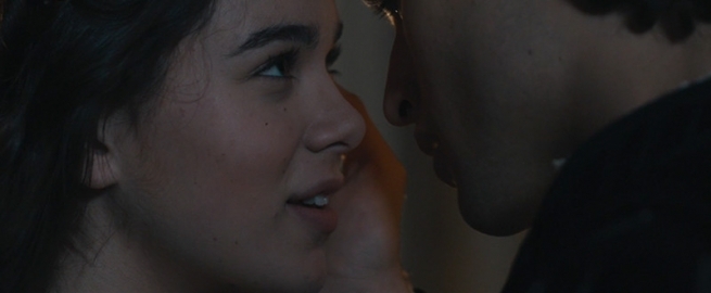
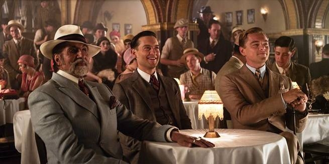 In order to reflex the hedonistic and flamboyant times of the 1920s and the characters depicted in The Great Gatsby, a super saturated and excessive look for the film was desired. Costume and Production Designer Catherine Martin worked closely with the DI team on the look of the film. Those sessions stand out as a career highlight. She has an incredible eye. She was insistent on more and more colour separation. At the time my thoughts were “there is no more”! But sure enough, with each pass the depth of the image improved. You really felt as if could fall into the picture. Catherine Martin won two Oscars for the film. While grading, I am very focused on the task at hand and prefer to work without distractions. I don’t like to have music playing and I’m not much of a talker in the suite. I’m asking myself, - Is this grade telling the story? How can I make it better? What’s the main focus? What needs to stand out? Can I improve the colour separation/colour contrast etc? Can I enhance the lighting anymore? Simple grade stack It’s easy for a timeline to become unmanageable on a high-end feature due to re-edits and the wait for final VFX; therefore, I stick to a simple grade stack at the start. I believe in keeping the images close to how they are shot and as close to their natural state as possible. All images reach a point at which they look their best. My aim is to find this point. I use edge gradients for shading and simple windows for pushing areas towards and away from the viewer. Later in the grade, I may do extra treatment for example using sharpen with a window to draw attention to certain aspects of the picture such as an actors eyes. Flashback scenes Catherine Martin showed me an amazing book of hand-tinted photographs to reference for the flashback scenes when Daisy and Gatsby first met. I researched early film stocks and worked with Richard Kirk at Filmlight to generate a bespoke LUT which emulated the panchromatic stock of the period. This gave me an interesting base by swinging the density of the colours around, particularly the red. READ: Mitch Bogdanowicz about LUTs After this, I set about making lots of shapes outlining objects and tracking them. I coloured the shapes to look like the kind of colours in the hand-tinted references. A little translucent and pastel. For example, for Daisy, I made the hair more golden, enhanced her blue eyes and tracked little pink kidney shapes onto her cheekbones. I also added some T800 scanned grain and mixed in an old fashioned flashing projector effect which I found online. Moving through the scenes Matching scenes is a fundamental part of grading and the reason I keep moving forward on my timeline. The film will eventually find its place and its natural flow. As our eyes are constantly re-calibrating I prefer to keep moving through the scenes. It’s important to keep comparing scenes and remain on task. I prefer to do global adjustments in the final days of a DI, usually adjusting brightness and contrast between the scenes. Looking at stills sequentially can be useful. Stereo grading The film was shot in 3D on RED Epic cameras using a split beam. One eyes image is captured through a mirror and is softer and less bright. First of all, you grade the 2D version using the hero (higher quality) eye as the base. The images from the second eye are then matched to the first and then the same grade is applied down-stream. Grading in stereo is difficult on the eyes as you are also checking and correcting convergence issues. Technically you have a much lower light level to work with in Stereo projection and also a colour cast offset to correct from the glasses. For creative adjustments, just like in 2D, certain colours reach your eyes quicker. Red, for example, is closer in depth than cooler colours like greens and blues. This actually works well naturally as landscapes tend to have cooler tones so warmer skin tones will sit forward. With Gatsby’s riot of colours some tweaking was needed. Stereo is wonderfully immersive. I think you are more easily able to trigger strong emotional responses from an audience in stereo than in 2D, the catch is the stereo has to be flawless. I’ve only ever seen perfect stereo projected in a professional environment or a well-run cinema. I live in the countryside so by the time it gets to my local picture house the quality is lost along with the magic and it can distract from the story. However, good colour control will help transcend projection issues. Vanessa Taylor IMDB All images and clips copyright © Warner Bros. Pictures / SF Norge AS
 -
 I was brought on board when they started scouting. I spoke to the DP, Adam Arkapaw during the testing stages and he sent various looks that he liked and thought would work for the show. We also had some in-depth conversations about what he was looking for. One of the references we spoke of, was the movie "Seven". I didn't have any interaction with the director, Cary Fukunaga prior to him coming to NY to do post. Grading Technique True Detective was shot on Kodak negative, mostly 5219 and 5207, and color corrected on DaVinci Resolve. I chose not to use any LUTs for the show as we wanted to have the most flexibility and didn't want to fight any curves. We scanned all the negatives to 2K DPX frames which I then graded. I work differently depending on the show, the look and feel they are going for. For this show both Cary and Adam wanted everything to be very real and organic. After sitting with both of them I found it faster to use printer points and basic Log controls to get the primary balance done. READ: Dan Muscarella about Printer Lights Once we had the primary balance where we wanted, I then watched it back with audio to see if the look matched the tone. I then used Linear controls to dig in and create some subtle differences in the separate areas of the image. As well as adjusting exposure and color temperature. Matching shots After I had what I felt was a good overall balance of color and brightness, I started paying attention to skin tones throughout. I was also looking if I needed to shade, vignette or pull anything out of the image. Matching skin tones is a big part of making the scene look good. When you are watching these scenes, the object you are focused on from shot to shot is the actor's face and expression. If they are not matching from shot to shot, it's going to be very noticeable and quick for any one of us to point out. I didn't do much beauty work in color on this season. We did an occasional sharpening of eyes or softening of backgrounds but that was about it. The most challenging scene was probably the one in episode 4. Cary and Adam did an amazing shot that lasted 6 minutes without a cut. They were going in and out of apartments, thru windows, in the light and dark. Cary had a very specific thought for how he wanted every turn to look. So needless to say we had a lot of color rides and tracking windows and dissolves throughout that scene. Organic feel Every scene is different. Whether it be the lighting, atmosphere, exposure or temperature. So my technique changes depending on what's needed. I try to use windows more than keys. I feel like when you over use keys, it takes you away from the natural feel of what the DP actually captured. I think most people can feel when something is over keyed and too perfect. I prefer the organic feel myself. That's not to say I don't key and won't. Or that I didn't on this show. I definitely did. My preference is to get a good balance of color from the primary balance and then use shading and subtle windows or keys to just accentuate what the DP has done. I also always try to maintain some shape in my highlights. I do everything in my power to not have a clipped white sky or highlights. This obviously depends on the scene and how it was shot. A softer highlight at times is nice. Again it's all personal preference and the feel of the scene. Every colorist works a little different and there is no one way to get something done. We work in a very subjective field. It's all about helping the director and DP see their vision in the end. This was an amazing series to be a part of. From the DP and director to the editors and post staff. Steven Bodner All images and clips copyright © HBO
 -
 Paul Thomas Anderson was getting closer to the final stage of his movie The Master, and the question of the DI came up. For how much he wanted to release the movie only in film form, the distributor needed the digital DCI for general distribution. Most of the theaters at that point where converting to digital projection and it was imperative for the distributor to fill the seats. I met Anderson during the final stages of the editing, did some VFX pulls (there are a grand total of three effects and two opticals in the movie) and we started to talk about how to approach the final DI. We wanted to work in real-time, and at that point in time we could work in 4K but the platform we had (Quantel Pablo) was not fast enough, so, we went on and built a full 4K Linux Resolve for this task. The challenge The challenge for us was to copy the 65mm answer print that he was timing in the lab. We have a room in FotoKem where we can screen the 5perf 65mm prints and I sat with Lab Timer Dan Muscarella to watch the prints go by during the part of the color timing. We did some research and calibrated the film emulation LUT to the 65mm contact print to better represent the final answer print, we did some tests with Dan and were ready to work. The 35mm was scanned from the original negative and the 65mm was scanned from the 65mm cut IP. The feel of a 1960s movie For the look of the movie, I searched through images of films from the 50s and 60s, to see how the film emulsion was developed at that moment in history, and how the lenses were deforming the image. The set of lenses and cameras, if I remember correctly was the one used for Kubrick's 2001 Space Odyssey. The idea behind it was to have the audience feel like they were looking at a 1960s movie, not a 2000s movie that looked like the 60s. Most of it was done in camera, and we were very careful to preserve it during the digital process. I sat with Dan during the screening of the answer prints and he sat with me during the color timing. We did the color mostly with a logarithmic color correction, pre-matching the 65- and 35mm scans then got closer to the answer print and refined it with Dan and Paul Thomas Anderson in the room. We spent a few hours in the same scene adding and taking away printer points of corrections until the feel for the scene was about right. READ: Dan Muscarella about Printer Lights The Master has a certain aura to it that you cannot describe but feel. It is a clever use of light and backlight that emphasizes the relationship between him and the disciple, and the color had to obey that statement. Technically, I used Log offset controls (or printerlights) for the most part, and just a touch of saturation and contrast to better blend some 35mm negative with some of the 65mm IP scenes. Although I used pretty much only logarithmic corrections, there was this one scene where the wall was a bit too close to the color of the subject. We isolated the wall and ever so slightly changed the color a bit. Paul Thomas Anderson is a fan of trying, playing and trying something just a bit different, and then playing again. He is very visual and he likes to see different options even if they are just a touch different from each other. We also have moments in the movie where a color tone plays a role in the psyche of the main character. If you think about the scene in the lab when he drinks the exposure chemicals, those are very strong colors and we went a bit further from the print on those occasions. Skin tones I needed to be really consistent throughout the movie about the skin color of all the three main actors, and we were going back and forth through the reels to constantly checking their coherency. I never use secondary correction for skin tones, as I’m under the assumption that the director of photography put a light in the set for a reason. And most of the time, that reason is to make the face of the subject to fall in a very specific place. So in my timing, I always want to go to the color of the skin tone we establish with the minimum amount of correction possible (more often than not it's just an Log offset) and see how the rest of the world plays. Even if I have to put a window there, I will still try to use a logarithmic offset or a white color balance to put it where I like it. I always feel that a secondary correction (or vector, whatever the machine calls it) will reduce the amount of subtle variations that exist in the natural skin, and make everything look a little too plastic to my eyes. Having said that, no power windows have been harmed in the making of this movie. I’m not a fan of looks, but I’m a huge fan of representing and capturing the reality as it is. Letting the audience be dragged into the movie's storytelling without being bombarded by stimulus. 65mm is a great format and I love digital cameras (Alexa is my favorite), but I find the large format are still a step above all. When the Blu-ray master coloring was done, I played the final DCP movie with Kostas, the Color Timer, and he sat with Paul Thomas Anderson again to give a slightly different interpretation for the Blu-ray. So they are somewhat the same and different at the same time. Walter Volpatto All images and clips copyright © 2016 Annapurna Pictures
 -
 I only got involved with this film during the post-production process. I was assigned the project through my employee, Technicolor, in London and met the DP, David Tattershall a few weeks before we were due to grade. David had brought some images on his laptop that he took on the shoot. This gave me an early insight into what he wanted to do in the grade and we discussed the look we wanted to go for. I personally enjoy playing with the different natural colours that this kind of production design gives us. Wonderful natural light, lavish costumes and gorgeous set designs gave us a lovely base to work from. Although this show was shot digital, my general technique was to aim for a classic film look. Grading technique We graded from ARRIRAW Log files and added a proprietary LUT that I trimmed based on the latest Kodak film stock made. This became a favourite of mine and I subsequently used it on other projects. The contrast curve and saturation mirror 35mm film nicely. READ: Mitch Bogdanowicz about LUTs I enjoy working with the filmic Log toolset. This way I keep the natural balance of colours throughout the shadows, mids and highlights on the first pass. My first pass is always kept very simple, using Log printer lights, saturation and subtle contrast tweaks. From there I review, take notes and prepare for the second pass which involves a lot more secondary work. Add to that, any kind of mix of hue, sat, curves, keying, windowing etc. whatever is needed, really. I try not to overcomplicate the grade unnecessarily but using windows can be incredibly helpful in making the image more interesting or lifting areas which otherwise would be lost. Mostly, we tried to keep the general look rich and lush but obviously certain scenes lent themselves to be a colder or darker palette. I always try and ensure we have achieved the right balance throughout the beginning, middle, and end of the film in terms of colour and light. Often, we need to review the whole film a couple of times through the process to know we have achieved the correct overall feel. Fantasy sequence Only during the fantasy sequence in the final tragic scene did we introduce an unnatural colour scheme and defocused the edges of the image for effect. The reason was to tell the audience the scene was a ‘flash forward’ in time. Here, I would accentuate a particular colour whilst removing other colours from the palette – creating more of an unnatural wash – far different to anything else in the movie. The director was also looking to introduce more camera movement to a lot of scenes and in this final scene, we often introduced a subtle camera push in or out to make the shots a little more dramatic. This was a very important moment in the movie so we spent a lot of time making this scene just right. Balcony scene In the famous balcony scene at night, we were keeping a natural darkness whilst introducing power windows to help train the eye into the correct areas of the frame which is an important skill to master. A combination of cool moonlight and warm candlelight is always a nice look and this scene looks beautiful. The first point of reference We tried to keep natural flesh tones whilst saturating the overall colour to make the image shine. Skin tones are literally the first point of reference for every scene. I always try and keep these consistent and they are an excellent barometer of how the scene wants to naturally look like from the shoot. I start on the 'master' shot of each scene - grab a still and constantly reference to this to match skin and other colours. I try not to mess too much with skin if I want to keep it natural looking. I’d rather set the tone of the shot using the skin and deal with any colour issues that arise around that separately. I’m also not a huge fan of keying but I use it when I have no other option. I’d rather get there using cleaner Log or sat curve controls. I enjoy the challenge of doing subtle beauty fixes around eyes using a window with slight blur or lifting contrast. Also, if a shot is soft I tend to avoid sharpening the whole image but just concentrate on the actual part of the image we want in focus. Paul Ensby All images and clips copyright © 2016 Amber Entertainment
 -
It Follows was scheduled to be colored at Tunnel Post in Santa Monica. So the people at Tunnel put me in touch with the director David Robert Mitchell and the cinematographer Michael Gioulakis and we had a lengthy conversation about the mood and tone of the film, a few months prior to principal photography. It was a wonderful experience to be brought in so early in the process and I wish all of my cinematographer friends would do this! Three stripe Technicolor At first, David's idea was to give the movie a three stripe Technicolor look, but at the same time, feeling contemporary. My challenge was to fuse both worlds together and make it work. Michael began sending me stills from the dailies and I experimented with different looks on my Davinci Resolve system at home. Once the film was cut and ready for color, I sat in the large theater at Tunnel with Michael and David and we began to try out the Technicolor look. It was interesting, but not exactly right for the film. It was a little over-the-top and too extreme. We didn't want to call attention to the look, so after trying a few different looks, we came up with the one that was correct. A look that had a Technicolor-like feel, but was a little "off normal". Some directors will bring in a "look book" at the start of the film and that's a good way for me to quickly get inside the mind of the director and what he or she likes to see regarding color and contrast. This was not the case for It Follows. We discussed each scene and talked about what we were trying to accomplish in regards to the mood and tone and created a look that was appropriate scene by scene. It was a great experience and one that I hope to have again soon. The film was shot with Alexa, and I really enjoyed Michael's framing and the variety of colors he used in his art direction and lighting. The movie has a "timeless" feeling, in that they used props from all eras (older TV sets, etc...). He gave me a great palette to work with and I got to further enhance the look, stylistically. I started creating a LUT that got us close to what was on the digital neg and from there, began the fine-tuned crafting of each image. I worked in the Log toolset in P3 space. I do work with printer lights quite often and It Follows was no exception. Favorite shots One of my favorite shots in the movie is when they go to this old, abandoned house and as they're walking up to it, our lead character, played by Maika Monroe, looks back and briefly stares at the camera to see what's behind her shoulder. That moment is such a beautiful image in the film and IS the film. When I first saw it, I said: "Guys, this is your poster!" Because that one single frame says it all. That sinking feeling you get when you think something is following you, but you cannot see it. I also like the scene where she is strapped to the wheelchair. This is the first scene that we began setting and creating our looks for the movie. It has that perfect blend of feeling both 1950s and contemporary at the same time. Pool Sequence In the end pool sequence, we gave it a very ominous, darkish-blue feeling to accentuate the horror that was taking place. It’s a layered process that involves first balancing out the scene as shot, with nice, rich skin tone. Then subtracting the red/adding the blue to get the right look without it looking like a wash or a tint. The trick is to keep the skin tone intact within that “look”, otherwise, it looks like you just threw a layer of blue over the whole scene. In life, you still see colors around you on a cloudy day. Those colors are just muted on the cloudy day, not as vibrant, but they don’t disappear completely. Consistent shots I do not color any movie the same as I colored the one before. Each movie moves and breathes differently and you have to attack it according to how it was lit, framed and exposed. Once we have the looks set for each scene of the movie, my job is to keep every shot consistent within those scenes and make sure that it flows smoothly, from the shot, keeping the viewer's attention on the story being told. I always go through the entire movie to make sure that the saturation level we set at the beginning follows through until the last reel of the film. I also usually keep my whites clean unless there is a motivation to add color to them, such as sunlight coming in through a window. Then, of course, there might be a bit of a “sunny” feel to the white highlights. Overall, every scene should look like it belongs to the same movie unless there's a reason to go outside of the world you've created in a particular scene or moment. That being said, it's just a matter of making sure all scenes look like they are from the same "world" that you have created. It's quite a shock to the audience if there is a shot or scene that suddenly looks "out of place" from the film they've been watching unless that is the director's desired intention. But, sometimes, there is a reason to have different saturation levels within different scenes. Skin tones For me, skin tone is the absolute most important thing in the frame. Once I get the skin right, everything else seems to fall into place. I generally like a warm, yellowish glow for most skin types. But since this film had a dark, ominous look to it, it was more appropriate to let skin tones go a little bit more "rosy" than I normally would. It did fit the atmosphere of the film. As for skin tones, it should be there already in the digital neg once you’ve correctly balanced the image. If, for some reason, the skin tone is still not pleasing (like pale skin, or skin that’s too ruddy & red) that’s when I apply an HSL key to adjust accordingly to the light in the shot. There are many times I have to “soften” skin with a diffusion key or draw a shape around a blemish, then blend & track it in. I also find myself throwing on Power Windows as a spot light on just the face, in order to lift shadows in the eyes or bring them out a bit to separate them from the background. Mark Todd Osborne All images and clips copyright © 2016 Visit Films / Another World Entertainment
-
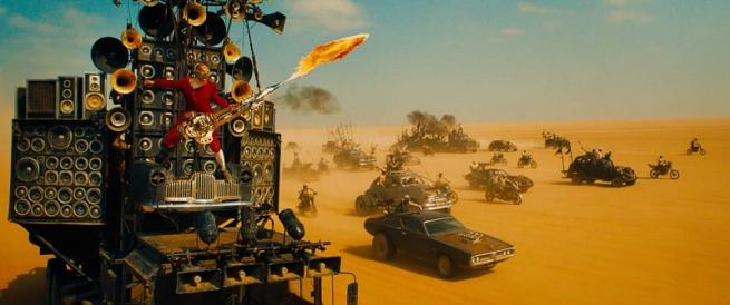 I came on board with the production in early 2014, and I met with George Miller, the director, and talked about what the look could be like. It was amazing to get such an open brief which was essentially "it should be saturated and graphic, and the night scenes should be blue". The main reason for this is quite interesting. George has been watching 30 years of other post-apocalyptic films and noticed that they all use the same bleached and de-saturated look. We knew we didn't want to make yet another film like that, so we had to find a way to make it saturated and rich. The other aspect was to keep each frame as graphic as possible. When it came to the night scenes, we experimented with silvery looks and photo-realistic looks but found that the graphic rich blue night look was the best option for the film. Grit in the image I watched all the original films again before starting just to get some grounding of the series. The one thing I was very conscious of was to make sure there was some sort of "grit" to the image. We didn't want to make an overly plastic or fake looking saturated image, there needed to be some sort of rawness in the look as well. In general, one of the aspects of the look was to apply a lot of sharpness. We liked how it made the image look sharp and how it often brought out some grit in the image. Each shot was sharpened independently and often we sharpened just certain parts of the frame more than others to help draw attention to specific areas. Because the film mostly takes place out on the desert road, we knew it could get visually boring very quickly. Which is again the reason for going with a rich colourful palette. Watching 2 hours of de-saturated desert tones would be dull. Once there was a rough cut of the film, we looked at the scenes and worked out how we could break up the visuals to create some variety in looks and also how to differentiate the landscapes and story points. Every time I worked on a shot, I kept saying to myself "make it look like a graphic novel". The basic balance The film was shot on the Arri Alexa in Raw. We used an LUT to convert the C-Log into P3 colour space, which also had a bit of a film emulation baked into it. We had someone from Deluxe provide several options for LUTs which we chose after testing. The Alexa camera has such great dynamic range which was amazing for a film like this, as I was very rarely struggling to find detail in a shot. With most of the shots we did a basic balance using printer lights first, then we jumped into video-style grading tools after that. I always worked under the LUT, but used traditional video tools such as lift, gamma, and gain. I also used some soft keys to add contrast to certain parts of the image which helped retain detail in extremes. READ: Mitch Bogdanowicz about LUTs Eye scan Every shot in the film has been worked quite hard in the grade. George is big on what he's phrased "eye-scan". The audience should not have to search the frame to know what's important in the image. We would shape each shot so your eye knew where to look and you saw the important story points in any given frame. We used standard techniques like vignettes or shading parts of the frame down to draw your eye to what's important. The overall experience should be smooth and even though levels may be changing across cuts, the idea is that you shouldn't notice it. For each look in the film, I made sure there was a connection between them. Whether it was a contrast level or a saturation level, the scenes needed to flow. Whenever I'd work on a scene, I'd always go back and watch the scenes with audio to make sure I wasn't missing anything important and that it flowed across the cut. The looks and expressions of the actors Like with any film, the main objective is to match the skin tones of the characters across the cuts. On a few occasions, we would help out an actor who might have had a pimple or something on that shoot day. The film was shot over 6 months, so it's quite normal to see blemishes appear across the cut. We simply tracked their face and smoothed out the skin to remove the acne. We also spent a lot of time on the eyes of the characters. There's very little dialogue in the film, and a lot of the performances come from the looks and expressions of the actors. The human brain focuses about 80% attention on a character's eyes, so we wanted to make sure they were clear and vivid in every shot. I essentially rotoscoped every eyeball in the film and added contrast and sharpness to them. This made the eyes vivid and helped draw your attention to their performances. The night scenes are 95% completely blue, so it obviously affects the skin tones as well. I kept 5% of the original colour in the scenes and occasionally we pushed a colour for story reasons such as some blood or a green plant. Day-For-Night One of the toughest parts of Fury Road for me was working out the right look for the Day-For-Night. The incredible Cinematographer, John Seale and VFX Supervisor, Andrew Jackson had worked out a technique of shooting 2 stops over-exposed on the day shoot. The theory behind this is quite simple. With an over-exposed image (without clipping highlights), we can expose the shot back down in the colour suite, grade the image to create the Night Blue look. Then we can selectively bring out any detail from the shadows that we wish, with virtually no noise. This enabled me to create very graphic contrasty images with detail exactly where I wanted it, and a fall off into shadows where I didn't want it. Almost every D4N shot was basically roto'd and had the sky replaced to create the look. It took a few months of fiddly work, but I think the look is different and graphic. Challenge with the interior driving shots One of the other trickier elements of the film was grading the interior driving shots. As you can imagine, shooting in the bright desert sun, if you expose for the dark interior of the car, then the background outside the window is severely over-exposed. We wanted to always retain detail and saturation both inside the car and outside the car. This meant a lot of keying and detailed shape work to keep both sides of the exposure looking rich and saturated. For the most part, I approached shapes in 2 ways. The first was to use very soft shapes as a way to shade and shape the image. The second was to do very precise shapes which usually required a lot of tracking and roto'ing, such as eyeballs. The redemption scene There's a scene in the film called "redemption". It's a scene where Max comes up with a plan and presents it to the other characters. They all discuss the plan and decide to go ahead with it. However, it's a dangerous plan, and they don't know if it will work or not. For this scene, we wanted to break away from the standard blue skies that we had seen in the other action scenes previously. Instead, we changed all the skies in the colour suite to a slightly stormy looking sky. The characters are lit in full sunlight, but there's a stormy environment behind them. The idea behind this was to create a mood where you're not sure if it's going to be a nice day or a bad weather day. Helping to create an emotion with the audience that compliments the story of whether the plan will work or not. This meant that for every shot in the scene, we needed to replace the sky with a new stormy sky, one for each angle the camera faces. The ability to replace skies in Baselight is amazing. It's fast and interactive, so George is able to see instantly and can frame it how ever he wants, or switch it out at the drop of a hat. On a technical level, it meant that every sky needed to be tracked to the background of the shot and put behind the characters which required a lot of detail work, but it was worth it in the end. VFX If there's a tool on the Baselight, then chances are I used it on this film. Everything from keying, curves, printer lights, shapes, sharpening, lens flares, blurs etc. The grading stacks are quite large on this film. I also like to keep every change in its own layer so I can control it separately and disable it if necessary. I also worked very closely with VFX on this film. There are actually a lot of VFX shots in the movie, from basic wire rig removal to CG backgrounds and of course the Toxic Storm. We were able to get mattes with every VFX shot so I was able to control specific areas of the image that were comped. For example, if there's a green screen shot of Max and the background is comped it, then it is hugely beneficial to have the matte for Max so I can adjust him independently to the background. It saves a lot of time. Eric Whipp All images and clips copyright © 2016 Warner Bros. Pictures
 -
Differences between operating on data before and after the LUT In this example, we use a normal film emulation 3D-LUT taking 10-bit Cineon Log data to P3 RGB. If you operate on the data before the LUT, the color corrector is changing the Cineon Log data which is then put through the LUT to determine how it will display. If you are color correcting after the LUT, you are operating on gamma 1.0/2.6 P3 data and the look on the screen would be whatever the colorist desires with the changes. The controls will act differently since the metric of the data is different. Operating on data after the LUT will break the "calibration" Also, the look via after the LUT, in this case, will not translate to the film out process since the film emulation “calibration” afforded by the LUT is broken. By film emulation “calibration”, I mean that the image (Cineon Log) going through the 3D-LUT displays the look (exact match of the digital image on a digital projector to the film image on a film projector) that would be apparent if the Cineon Log DPX code values went to a recorder and then printed and displayed on a film projector. When grading after this LUT, any changes will be apparent on the screen and if only a digital release is required, that’s fine. However, the Log DPX values did not change and if they are sent to the recorder, the film image would not look like the graded after the LUT image. From P3 back to Cineon If, however, the graded P3 image was then put through a P3 to Cineon DPX LUT then the DPX values sent to the recorder will reflect the grading changes. That is why when using film emulation LUT with the anticipation of going to film, the grading is done on the DPX data. Any grading after the LUT can also produce colors that are not attainable on film, grading before assures that the color on the screen will match the film out. Use the control settings that matches the data type Both Primary adjustments and Log controls will work on ANY type of data. The only caution is that the RESULTS will be dramatically different. This is the domain of the color corrector. If it is set up to control lift, gain, and gamma, then it will be most effective on linear images (either “true” linear or gamma linear where the “true” linear data has the inverse of the display gamma applied. This will result in a linear light output on the display. If the color corrector is set up to control Log data, then it will be most effective on Log images. The overall brightness of the image is then controlled by simply adding or subtracting a constant on each channel, analogous but not identical to lift. The “gamma” of the image is controlled by a multiplier by the color corrector, since the Log data is already in a gamma metric, multiplying by a constant will change the overall gamma of the image, analogous to the gain control. The gamma control operating on a Log data image actually preserves the overall gamma between black and white but repartitions it between the highlights and the shadows differently. Numerically, applying a gamma control greater than 1.0 will actually lower the gamma in the shadows (and darken them) and raise the gamma in the highlights (and brighten then). Gamma values less than 1.0 does the opposite. What we consider normal highlight and shadow control becomes a little different than the lift, gamma, and gain model but fairly easy to implement in hardware or software. Bottom line is that it is best to use the control settings of the color corrector that matches the data type of the image. Using other settings may get you to a desirable look, but the colorist must be aware of the consequences. A colorist is an artist and may use any tools available as long as they are fully understood. Mitch Bogdanowicz
-
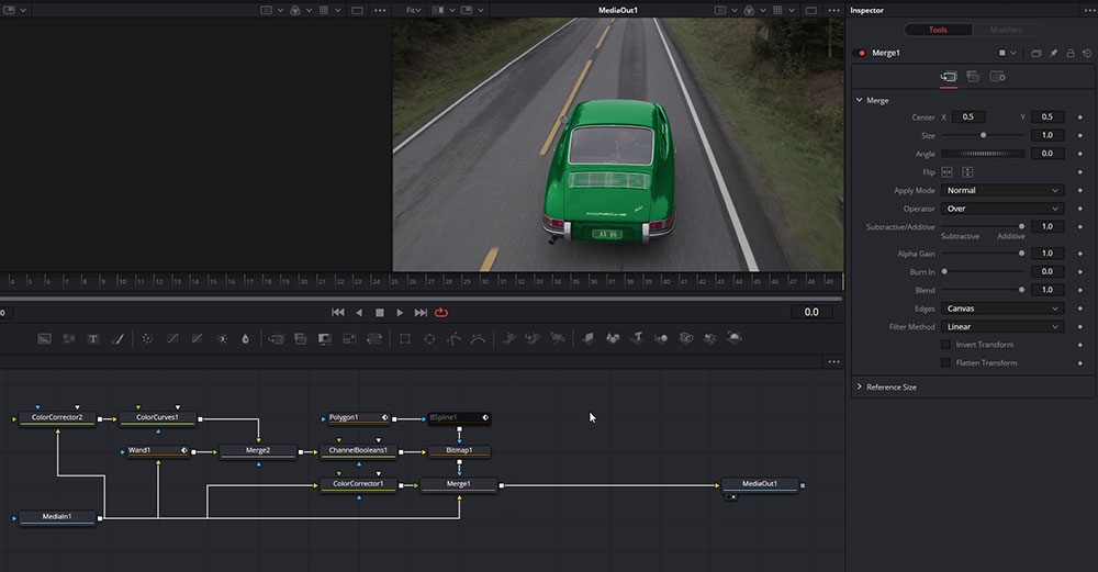 The art of rotoscoping is probably the most important skill to master for everyone working with visual effects and compositing. Rotoscoping is frequently used as a tool for removing unwanted objects, separate objects from the background so they can be placed on top of other elementsm isolating color, effects or parts of your image, cleaning-up green screen composites and much more. Rotoscoping can be a very difficult, time-intensive process that ends with a bad result, but in this course you will learn techniques to work fast, intuitive, with great precision and have fun with your work. The rotoscoping course is taught by Lee Lanier which has written several books on the topic and teached rotoscoping techniques at the Gnomon School of Visual Effects in Hollywood. The first part of the course Lee will demonstrate basic techniques, and as the course progress he will move on to more advanced topics. The course is taught in DaVinci Resolve but users of other tools (NUKE, After Effects, Flame, Silhouette etc) can also benefit from taking this course. The footage and assets used in this course are available for download so that you can easily follow along. Download project files About the instructor Lee Lanier has created visual effects on numerous features films for Walt Disney Studios and PDI/DreamWorks. Lee is a world-renowned expert in the video effects field, and has written several popular high-end software books, and taught at the Gnomon School of Visual Effects in Hollywood. Who is this course designed for? Compositors Editors Colorists Lessons overview 01: Introduction 02: Color Power Windows 03: Color Window Tracking 04: Masking in Fusion 05: Using masks with merge tools 06: Custom masking in Fusion 07: Rotoscoping in Fusion 08: Masking toolbar options 09: Using double edge masks 10: Advanced masking options 11: Creating luma masks in Fusion 12: Other Luma Mask techniques 13: Using the Color Qualifier 14: Importing and exporting masks 15: Mask tracking in Fusion 16: Paint tools in Fusion Software required DaVinci Resolve
 -
C olor timing is the process of balancing the color and density of each shot in a motion picture. This was necessary because motion pictures were filmed out of order from the final edited sequence, over a long period of time under varying conditions (lighting, exposure and film emulsions). Then the film negative was sent to the lab for film processing which also had variables which affected the color and density such as developing time, temperature and chemical balance. When the film negatives were spliced together into the final sequence to make a film print on positive film stock, it needed to be analyzed for color and density to set the printer lights for each shot so the final print would be balanced. Although the technical process of color balancing was done by the color timer, the process of reaching the final color was a collaborative effort involving the timer and filmmakers; usually the cinematographer, director, editor or other production assistants. This was done through screening film prints with the filmmakers, getting their comments and opinions then applying corrections to the film timing till final approval was achieved. This would take from 2 or 3 timing passes up to 10 or more depending on the nature of the film and demands of the filmmakers. The eyes of the color timer The tools needed to color time a film print begin with the eyes of the color timer. Before the first print is made, the film negative is viewed on a film analyzer such as a Hazeltine. This is a machine that reads the negative and presents a positive image on a video monitor. The color and density can be adjusted using knobs which represent the printer lights usually from a 1 to 50-point scale for each color (Red, Green, and Blue). The timer turns the knobs until the color and density look right so the printer lights are set for that shot. This is done for each shot of the film, then a print is made. The film print is screened by the color timer who will analyze with his eyes and make notes to what needs to be corrected. The film print is then put on a comparator projector where it can be viewed scene by scene to make color adjustments by changing the printer lights for the next corrected print. Read: Dan Muscarella about printer lights Some timers use color filters to help make color decisions. The color corrections are not seen until another print is made. Originally, these color corrections were written on a timing card which showed the footage and printing lights for each scene. The timing card was sent to a person who would have to make a paper tape with this information to be loaded into the printing machine. Now this information is input to the computer by the timer as he makes corrections and directly accessed by the printing machine. The length of time to color correct a cut negative film from the first trial to final approval can vary from a couple weeks to several months. This varies based on the number of scenes, how well it was shot, the need for reshoots or effect shots and the filmmakers demands. A typical turnaround from a first trial print to a corrected print including color correcting and printing takes several days. An average film would take 3 to 5 passes for approval which would be about 15 to 20 days total. Categories of color timers First would be the Daily Timer who would get the negatives from each day's shoot (dailies) and using a film analyzer, set printer lights for the daily prints. An Analyzer or Hazeltine Timer sets the printing lights for the edited (cut) negative to make the first print to be screened. The Screen Timer views the first print in a theater on a big screen taking notes for corrections to be made on the comparator. The Comparator Timer (usually same person as Screen Timer) views the print on a small projector and applies the corrections based on the Screen Timer's notes. With all the tools and complexities of today's digital color correction, it is easy to become too focused on micromanaging minor details and losing sight of the big picture. Film color timing was limited to color and density balance with emphasis on the overall scene to scene continuity. I would advise digital colorists to hold off using your specialty tools (secondary correction, windows, and mattes) until the overall continuity of color and density is addressed so the integrity of the cinematography does not get distorted. Now that I have been effectively retired from color timing with the closure of film labs and the industry taken over by digital projection I can only hope that the "art" of cinematography will go on. Working with some of the great cinematographers throughout my career taught me the importance of the image caught using the lighting, lenses, and techniques used by the camera. With the new technologies, it is important that this art does not get distorted by the involvement of too many opinions and people in the digital timing bay. My biggest advice is to listen to the cinematographer. Jim Passon
-
C DL stands for “Color Decision List”. It is a metadata format developed by the The American Society of Cinematographers (ASC), in order to exchange rudimentary colour correction information between postproduction tools. It is sometimes necessary to apply non-destructive look communication instead of colour correcting an image directly. The colour correction is expressed as metadata, and the image is transferred without any creative decisions. This greatly simplifies the versioning of looks, because simple metadata can be updated without the need of re-transferring image data. CDLs are very common in VFX workflows because the VFX artist needs both the ungraded shot and the intended look. The ungraded shot allows the artist to comp in truly linear light, and the intended look is needed to check if the individual plates still hold together after the grade is applied. Slope, Offset and Power CDL defines a parameterised function to individually modify the red, green, and blue channel of an image. In addition, CDL specifies a global saturation. The three tone curve parameters are Slope, Offset and Power. These parameters are simple mathematical operations, which allow the colourist to modify the incoming data. “Slope” is a multiplier to the incoming data “Offset” is a summation to the incoming data “Power” is a power function to the incoming data The formula is: out.rgb=(in.rgb*Slope.rgb+Offset.rgb)^Power.rgb in.rgb = input red, green, blue values out.rgb = output red, green, blue values Slope.rgb = Slope red, green, blue values Offset.rgb = Offset red, green, blue values Power.rgb = Power red, green, blue values A fourth parameter “Saturation” is achieved by converting the out.rgb data in a Luma and Chroma component. The Chroma Signal is then multiplied by the “Saturation” parameter. Film Grade and Video Grade With Slope and Offset you can produce both a Film Grade “Exposure” and “Contrast” and a Video Grade “Lift” and “Gain”. Exposure is achieved by Offset Contrast is achieved by a combination of Offset and Slope Gain is achieved by Slope Lift is achieved by a combination of Offset and Slope Gamma is achieved by Power Formats A CDL Grade is specified by ten values, and they can be stored in different formats. Slope.red Slope.green Slope.blue Offset.red Offset.green Offset.blue Power.red Power.green Power.blue Saturation .cdl .cdl is a text file (with the suffix “cdl”). It has an xml like structure. It defines one CDL grade and looks something like: <ColorDecisionList> <ColorDecision> <ColorCorrection> <SOPNode> <Slope>0.904771 0.931037 1.011883</Slope> <Offset>0.008296 0.017804 -0.026100</Offset> <Power>1.052651 1.005324 0.945201</Power> </SOPNode> <SatNode> <Saturation>0.801050</Saturation> </SatNode> </ColorCorrection> </ColorDecision> </ColorDecisionList> .ccc .ccc is the same concept but can contain multiple CDL structures. .ale CDL values can be stored per shot in an Avid Log Exchange. .edl CDL values per shot can be stored in a CMX 3600 Edit Decision List. Colour Management Unfortunately, CDL does not define the image state and colour management pipeline in which this formula is applied. That means, these ten values describe a colour correction but do not describe the way you apply the values. The values applied in a Log Colour Space with a viewing transform on output will elicit a different result, then the same values applied in Display Space after the viewing transform. This is the reason why sometimes CDL values do not match between applications. In order to make CDL work, you need an additional Colour Management Layer that transforms the image into the correct state, apply the CDL values and eventually convert the image into another image state. In the field, there are different colour management frameworks like “OpenColor IO” or “Truelight Colour Spaces”. Some productions also just create “Lookup Tables” for the input- and output transformation and apply the CDL values by hand. Conforming The only way to automatically apply CDL values to multiple shots is using ALE and EDL. This makes CDL only applicable in very narrow workflows. .cdl or .ccc files do not store camera metadata, which makes it impossible to “bulk paste” CDL values to multiple shots. Often manual copy and paste takes place, which is a dissatisfying and time-consuming task. Some tools offer a smarter copy and paste functionality if the .cdl values are named like the filename or clip names of the shot, so the conforming metadata is stored in the filename. Big VFX Houses use their Asset Management System to deploy the CDL values to the correct shots. Conclusion CDL is a simple concept to describe and communicate a simple colour correction transformation in a software agnostic way. It does not specify or communicate the needed colour management information, nor does it store any shot based metadata. In order to make CDL work, a production needs an additional colour management and asset management pipeline to successfully distribute CDL values between software packages. Daniele Siragusano Colour and Worklow Engineer, Filmlight
-
We are super excited to announce our new amazing course in Fairlight by Kevin P McAuliffe! Learn the basics of editing, recording and mixing, and complex concepts like equalization (EQ), noise reduction, busses, compressions and limiters, audio bouncing, automation etc so that you can dive into the world of audio with confidence. https://lowepost.com/finishing/courses/fairlight-fundamentals-r27/
-
Hi Ron! We renamed the finishing course to "Introduction to visual effects in DaVinci Resolve Fusion and the beauty course is now in the course list.
-
Learn how to edit, record and mix audio in DaVinci Resolve Fairlight. This 4 hour long essentials course is taught by the award winning editor, sound designer and instructor Kevin McAuliffe, who works with clients such as Paramount Pictures, Warner Bros and Walt Disney Studios. Expore audio editing basics, recording and mixing techniques the fast and easy way. The course break down complex concepts like equalization (EQ), noise reduction, busses, compressions and limiters, audio bouncing, automation and much more so that you can dive into the world of audio with confidence. This is the ultimate course for film editors, hobbyists, or sound engineers with background from other tools such as ProTools and Logic that are looking to transfer to DaVinci Resolve Fairlight. The footage and assets used in this course are available for download so that you can easily follow along. Download project files About the instructor Kevin P McAuliffe is an award winning editor and visual effects creator with over 20 years of teaching and training experience. Over the past years Kevin has delivered world-class work for clients such as Warner Bros, Walt Disney Company, 20th Century Fox, Universal and Elevation Pictures. Who is this course designed for? Film editors Sound engineers with background from ProTools, Logic etc Audio hobbyists Lessons overview 01: Organization 02: Understading the Fairlight interface 03: The basics 04: Recording Voice Over 05: Working with audio track layers 06: ADR basics 07: Mixing 08: Automation 09: Working with busses 10: Audio bouncing 11: Setting up deliverables 12: Exporting your master audio 13: Working with EQ 14: Limiters vs compressors 15: Noise reduction Software required DaVinci Resolve
-
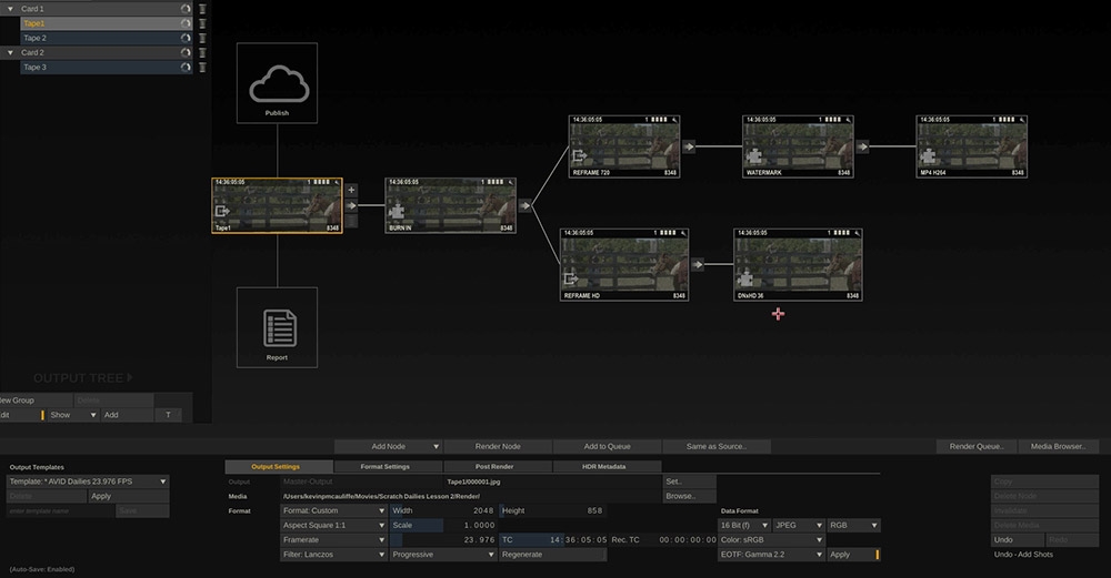 Throughout the past couple of years, Assimilate SCRATCH has become the #1 tool among professionals for today’s on-set dailies workflows. If your production requires excellent metadata management, highspeed background transcoding, superb audio sync capabilities, or solid color science for look transfers on-set, while keeping a maximum of flexibility and operating speed - there is hardly a way around SCRATCH for Dailies. Instructor Kevin P McAuliffe covers everything from project and system setup, through audio syncing, LUT-application and metadata QC all the way through rendering and reporting, so you can get your assistant editors the dailies they require. About the instructor Kevin is an award winning editor and visual effects creator based in Toronto with over 15 years of teaching and training experience. Over the past years Kevin has delivered world-class work for clients such as Warner Bros, Walt Disney Company, 20th Century Fox, Universal and Elevation Pictures. Who is this course designed for? DITs Conform Artists Editors Colorists Visual effects artists Lessons Overview: Lesson 01: Overview Lesson 02: System, User And Project settings Lesson 03: Media Browser Lesson 04: Audio sync Lesson 05: Color Luts Lesson 06: Exporting Lesson 07: Metadata reporting Software required Assimiliate's SCRATCH. Download the trial or use the code PR3MIUMUSER at checkout to activate a 20% discount when buying SCRATCH.
- 14 comments
-
- 17
-
-
-

-
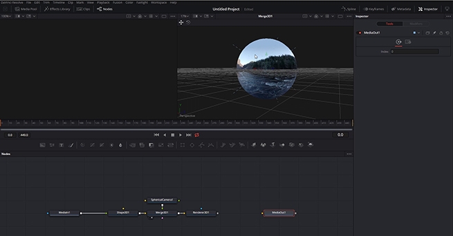 In this DaVinci Resolve tutorial series you will learn about the exciting world of Stereoscopic 3D and immersive entertainment. DaVinci Resolve has become an industry standard for this types of work, and our instructor instructor Lee Lanier dives deep into workflows and techniques that will give you the foundation to kickstart your career. The DaVinci Resolve project files and footage are available for download so that you can easily follow along. Download project files About the instructor Lee Lanier has created visual effects on numerous features films for Walt Disney Studios and PDI/DreamWorks. Lee is a world-renowned expert in the video effects field, and has written several popular high-end software books, and taught at the Gnomon School of Visual Effects in Hollywood. Who is this course designed for? DaVinci Resolve (no experience is needed) Video makers who want to build a career in VR360 and Stereoscopic 3D Lessons overview Lesson 01: Working with Stereoscopic 3D Lesson 02: Grading Stereo 3D Lesson 03: Rendering Stereo 3D Lesson 04: Working with Stereo 3D in Fusion Lesson 05: Using Stereo Disparity Lesson 06: Adjusting Stereo in Fusion Lesson 07: Setting Up 360VR Lesson 08: Adding a 360VR Paint Fix Lesson 09: Stabilizing 360VR Lesson 10: Using 360VR in the 3D Environment Lesson 11: Working with Stereoscopic 360VR Software required DaVinci Resolve
 -
My interest in Stereoscopic imaging started in 2006. One of my close friends, Trevor Enoch, showed me a stereo-graph that was taken of him while out at Burning Man. I was blown away and immediately hooked. I spent the next four years experimenting with techniques to create the best, most comfortable, and immersive 3D I could. In 2007, I worked on Hannah Montana and Miley Cyrus: Best of Both Worlds Concert directed by Bruce Hendricks and shot by cameras provided by Pace. Jim Cameron and Vince Pace were already developing the capture systems for the first “Avatar” film. The challenge was that a software package had yet to be created to post stereo footage. To work around this limitation, Bill Schultz and I slaved two Quantel IQ machines to a Bufbox to control the two color correctors simultaneously. This solution was totally inelegant but it was enough to award us the job from Disney. Later during the production, Quantel came out with stereo support eliminating the need to color each eye on independent machines. We did what we had to in those early days. When I look back at that film, there is a lot that I would do differently now. It was truly the wild west of 3D post and we were writing the rules (and the code for the software) as we went. Over the next few pages I’m going to layout some basics of 3D stereo imaging. The goal is to have a working understanding of the process and technical jargon by the end. Hopefully I can help some other post professionals avoid a lot of the pitfalls and mistakes I made as we blazed the trail all those years ago. Camera 1, Camera 2 Stereopsis is the term that describes how we collect depth information from our surroundings using our sight. Most everyone is familiar with stereo sound; when two separate audio tracks are played simultaneously out of two different speakers. We can take that information in using both of our ears (binaural hearing) and create a reasonable approximation from the direction of where that sound is coming from in space. This approximation is calculated by the offset in time of the sound hitting one ear vs the other. Stereoscopic vision works much in the same way. Our eyes have a point of interest. When that point of interest is very far away our eyes are parallel to one another. As we focus on objects that are closer to us, our eyes converge. Do this simple experiment right now. Hold up your finger as far away from your face as you can. Now slowly bring that finger towards your nose, noting the angle of your eyes as you get closer to your face. Once your finger is about 3 inches away from your face, alternately close one eye and then the other. Notice the view as you alternate between your eyes, camera 1, camera 2, camera 1, camera 2. Your finger moves position from left to right. You also see “around” your finger more in one eye vs the other. This offset between your two eyes is how your brain makes sense of the 3D world around you. To capture this depth for films we need to recreate this system by utilizing two cameras roughly the same distance as your eyes. Camera Rigs The average interpupillary distance is 64mm. Since most feature grade cinema cameras are rather large, special rigs for aligning them together need to be employed. Side by side rigs are an option when your cameras are small, but when they are not you need to use a beam splitter configuration. Beam splitter rig in an "over" configuration. Essentially, a beam splitter rig uses a half silvered mirror to “split” the view into two. This allows the cameras to shoot at a much closer inter-axial distance than they would otherwise be able to using a parallel side by side rig. Both of these capture systems are for the practical shooting of 3D films. Image comes in from position 1. Passes through to camera at position 2. It is also reflected to the camera at position 3. You will need to flip it in post since the image is mirrored. Fortunately or unfortunately most 3D films today use a technique called Stereo Conversion, which is the process of transforming 2D ("flat") film to a 3D form. Conversion There are three main techniques for Stereo Conversion. Roto and Shift In this technique, characters and objects in the frame are roto’d out and placed in a 3D composite in virtual space. The scene is then re-photographed using a pair of virtual cameras. The down side to this is that the layers often lack volume and the overall effect feels like a grade school diorama. Projection For this method, the 2D shot is modeled in 3D space. Then, the original 2D video is projected onto the 3D models and re-photographed using a pair of virtual cameras. This yields very convincing stereo and looks great, but can be expensive to generate the assets needed to create complex scenes. Virtual World Stupid name, but I can’t really think of anything better. In this technique, scenes are created entirely in 3D programs like Maya or 3DS Max. As this is how most high end VFX are created for larger films, some of this work is already done. This is the best way to “create” stereo images since the volumes, depth and occlusions are mimicking the real world. The downside to this is that if your 2D VFX shot took a week to render in all of its ray traced glory, your extra “eye” will take the same. Cartesian Plane No matter how you acquire your stereo images, eventually you are going to take them into post production. In Post, I make sure the eyes are balanced for color between one another. I also “set depth” for comfort and to creatively promote the narrative. In order to set depth we will have to offset one eye against the other. Objects in space gain their depth from the relative offset in the other eye/view. In order to have a consistent language, we speak in number of pixels offset to describe this depth. When we discuss 2D images we use pixel values that are parallel with the screen. A given cordinate pair locates the pixel along the screens surface. Once we add the 3rd axis we need to think of a Cartesian plane laying down perpendicular to the screen. Positive numbers are receding away from the viewer into the screen. Negative numbers come off the screen towards the viewer. The two views are combined for the viewing system. The three major systems are Dolby, RealD, and Expand. There are others, but these are the most prevalent in theatrical exhibition. In Post we control the relative offset between the two views using a “HIT” or horizontal image transform. A very complicated way for saying we move one eye right or left along the X axis The value of the offset dictates where in space the object will appear. This rectangle is traveling from +3 pixels offset to -6 pixels offset. Often we will apply this move symmetrically to both eyes. In other words to achieve a -6 pixels offset, we may move both views -3 instead of one view moving -6. Using this offset we can begin to move comped elements or the entire “world” in Z space. This is called depth grading. Much like color, our goal is to try and make the picture feel consistent without big jumps in depth. Too many large jumps can cause eye strain and headaches. My first rule of depth grading is “do no harm.” Pain should be avoided at all costs. However, there is another aspect of depth grading beyond the technical side. Often we use depth to promote the narrative. For example, you may pull action forward to be more immersed in the chaos, or you can play quiet drama scenes at screen plane so that you don’t take away from performance. Establishing shots are best played deep for a sense of scale. Now all of these examples are just suggestions and not rules. Just my approach. Once you know the rules, you are allowed to break them as long as it’s motivated by what’s on screen. I remember one particular shot in Jackass 3D where Bam gets his junk whacked. I pop’ed the offset towards the audience just for that frame. I doubt anybody noticed other then a select circle of 3D nerds (I’m looking at you Captain 3D) but I felt it was effective to make the pain on screen “felt” by the viewer. Floating Windows Floating Windows are another tool that we have at our disposal while working on the depth grade. When we “float the window” what we are actually doing is controlling the proscenium in depth just like we were moving the “world” while depth grading. Much like depth offsets, floating windows can be used for technical and creative reasons. Firstly, they are most commonly used for edge violations. An edge violation is where there is an object that is “in front” of the screen in Z space, but is being occluded by the screen. Now our brains are smarter than our eyeballs and kick into over-ride mode. The edge of the broken picture feels uncomfortable and all sense of depth is lost. What we do to fix this situation is to move the edge of the screen forward into the theater using a negative offset. This floats the “window” we are looking through in front of the offending object and our eyes and brain are happy again. We achieve a floating window through a crop or by using the software’s “window” tool. Another use for controlling the depth of the proscenium is to creatively enhance the perceived depth. Often, you need to keep a shot at a certain depth due to what is on either side of the cut but creatively want it to feel more forward. A great work around is to keep your subject at the depth that feels comfortable to the surrounding shots and move the “screen” back into positive space. This can have the effect of feeling as if the subject is in negative space without actually having to place them there. Conversely you can float the window into negative space on both sides to create the feeling of distance even if your character or scene is at screen plane with a zero offset. The fish will have the feeling of being off screen even though it’s behind. Stereo Color Grading Stereo color grading is an additional step, when compared to standard 2D finishing, which needs to be accomplished after the depth grade is complete. It is much more challenging to match color from one eye to another on native shot 3D footage. Reflections or flares may appear in one and not the other. We call this retinal conflict. One fix for such problems is to the steal the “clean” information from one eye and comp it over the offending one paying mind to offset for the correct depth. Additionally, any shapes that were used in the 2D grade will have to be offset for depth. Most professional color grading software has automated ways to do this. In rare instances, an overall color correction is not enough to balance the eyes. When this occurs, you may need a localized block based color match like the one found in the Foundry’s Ocula plugin for Nuke. Typically a 4.5FL and a 7FL master are created with different trim values. In recent years, a 14FL version is also created for stereo laser projection and Dolby’s HDR projector. In most cases this is as simple as a gamma curve and a sat boost. The Future of Stereo Exibihition The future for 3D resides in even deeper immersive experiences. VR screens are becoming higher in resolution and, paired with accelerometers, are providing a true be “there” experience. I feel that the glasses and apparatus that are required for stereo viewing also contributed to it’s falling out of vogue in recent years. I’m hopeful that new technological enhancements and a better, more easily accessible user experience will lead to another resurgence in the coming years. Ultimately, creating the most immersive content is a worthy goal. Thanks for reading and please leave a comment with any questions or differing views. They are always welcome. By John Daro