COLOURED BY PAUL ENSBY
COMPANY 3
I only got involved with this film during the post-production process. I was assigned the project through my employee, Technicolor, in London and met the DP, David Tattershall a few weeks before we were due to grade. David had brought some images on his laptop that he took on the shoot. This gave me an early insight into what he wanted to do in the grade and we discussed the look we wanted to go for.
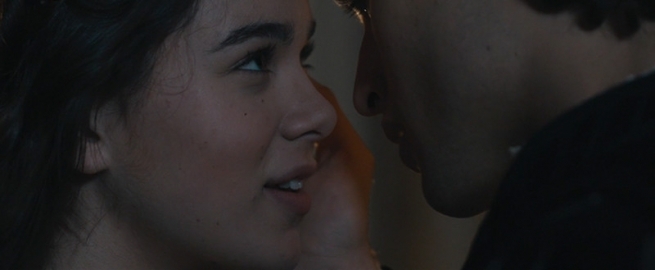
I personally enjoy playing with the different natural colours that this kind of production design gives us. Wonderful natural light, lavish costumes and gorgeous set designs gave us a lovely base to work from. Although this show was shot digital, my general technique was to aim for a classic film look.
I’d rather set the tone of the shot using the skin and deal with any colour issues that arise around that separately
- Paul Ensby -
Grading technique
We graded from ARRIRAW Log files and added a proprietary LUT that I trimmed based on the latest Kodak film stock made. This became a favourite of mine and I subsequently used it on other projects. The contrast curve and saturation mirror 35mm film nicely.
READ: Mitch Bogdanowicz about LUTs
I enjoy working with the filmic Log toolset. This way I keep the natural balance of colours throughout the shadows, mids and highlights on the first pass. My first pass is always kept very simple, using Log printer lights, saturation and subtle contrast tweaks. From there I review, take notes and prepare for the second pass which involves a lot more secondary work. Add to that, any kind of mix of hue, sat, curves, keying, windowing etc. whatever is needed, really. I try not to overcomplicate the grade unnecessarily but using windows can be incredibly helpful in making the image more interesting or lifting areas which otherwise would be lost.
Get access
This was a short excerpt, become a premium member to access the full article.
-
 1
1
Recommended Comments
Join the conversation
You can post now and register later. If you have an account, sign in now to post with your account.
Note: Your post will require moderator approval before it will be visible.