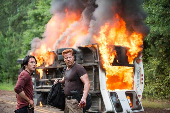
Colored by Jeremy Sawyer
Light Iron
At some point, they chose to leave the facility where they did the color for season 1 and 2. I did seasons 3-5 and I am about to start season 6. By the time the show got to me there was already somewhat of an established look to the show. Not to say that the look hasn't evolved over the past few seasons, but when it got to me the look was already there.
The Pilot
When I started my first episode, we referenced the pilot a lot. They spent a lot of time getting the pilot just the way they wanted, so we looked at that and also talked about the documentary nature of the series. Being set in an apocalypse of sorts, the photography and realism of the lighting were really going to drive the look of the show. For this show, though, I really kept the idea of documentary / photo journalism in mind. I tried not to overthink it. I really tried to be honest and true to the captured image without affecting it too much. Granted, there were times when it was shot and lit more dramatically and I, of course, don't fight that.
Sometimes I sharpen the image in some areas, usually if focus is slightly missed on eyes in a tight or medium shot
- Jeremy Sawyer -
We intentionally didn't have any real stylized looks, unless it was something very special that needed to be differentiated story wise. I describe the show sometimes as looking at the world through blood-shot eyes. Sometimes it's dirty and yellowy green, and sometimes it's really quite pretty. The dirty and yellowy green look is defined by lower contrast, a little color in the shadows (probably yellowy) and also desaturated yellow high-lights.
Get access
This was a short excerpt, become a premium member to access the full article.
-
 4
4
Recommended Comments
Join the conversation
You can post now and register later. If you have an account, sign in now to post with your account.
Note: Your post will require moderator approval before it will be visible.