Jamie Neale
Premium-
Posts
37 -
Joined
-
Last visited
Content Type
Profiles
Case studies - Free
Case studies - Premium
Resources
Insider
Courses
Forums
Store
Everything posted by Jamie Neale
-
Can you release a version of the Kharma Luts to return a log state? like LogC. Be nice to use them in HDR workflows.
-
Great, thanks for clarifying Tom, much appreciated. What would be the case use for the P3 Soft Clip etc versions? would that be if you're already in the P3 space and want the 2383 look with gamut remapping?
-
So the Cineon version is expecting R709/Cineon to output P3D65 G2.6?
-
Hey, What colour space each of the Mitch Bogdanowiscz LUTs are expecting? Also, can you let us know what the different versions of the 2383 LUT are intended for? Cheers Jamie
-
Great, works well for me. Using Nobe along with sending stills works really well. Looking forward to the update!
-
Masterclass in Color Grading with Mark Todd Osborne
Jamie Neale commented on Lowepost's course in Color Grading Masterclasses
Brilliant mix of insights/stories and just enough 'how to'. Great work MTO and LP, very much appreciated. -
Masterclass in Color Grading with Mark Todd Osborne
Jamie Neale commented on Lowepost's insider article in Case Studies
Brilliant mix of insights/stories and just enough 'how to'. Great work MTO and LP, very much appreciated. -
Company3, Tinting blacks/neutrals, Contemporary blue look
Jamie Neale replied to Rihards's topic in DaVinci Resolve
You're obviously right about the hidden complexities of LUT but my comment was more about getting someone excited to dive into the look creation rather than making it sound impossible. I'm not sure you do need to know the math to be a great colourist. But that's the beauty of being a colourist. You can be both a scientist and an artist or one or the other. There's plenty of room (dark ones) for us all- 19 replies
-
- 1
-

-
- blue shadows
- teal and orange
-
(and 3 more)
Tagged with:
-
Company3, Tinting blacks/neutrals, Contemporary blue look
Jamie Neale replied to Rihards's topic in DaVinci Resolve
Really solid advice that, becoming a jedi of the LGG and extended tools will make for a much more versatile colourist. A good exercise is take your favourite LUTs deconstruct them and try emulating them using primaries. When I started I definitely went plug in/LUT heavy but now I find most of what needs to be done can be achieved with mostly primaries. LUTs/Plug ins still play a part for me but they end being for something very specific. That said, Raven Grade is a great addition to the toolbox and well worth checking out even if it's just to understand what the different sliders do to your image.- 19 replies
-
- blue shadows
- teal and orange
-
(and 3 more)
Tagged with:
-
Company3, Tinting blacks/neutrals, Contemporary blue look
Jamie Neale replied to Rihards's topic in DaVinci Resolve
Good shout. I'm really enjoying Raven Grade, the volumetric highlight/shadow adjustment is a really nice feature too.- 19 replies
-
- 1
-

-
- blue shadows
- teal and orange
-
(and 3 more)
Tagged with:
-
Company3, Tinting blacks/neutrals, Contemporary blue look
Jamie Neale replied to Rihards's topic in DaVinci Resolve
Lots of ways to achieve the look but does also depend on where you're placing the look (locally or globally). Working globally then think broader strokes working with less aggressive tools (avoid keys etc). Working locally then follow Marc's advice or as Stefan mentioned creating a 2 strip look works well. The 2 strip look limits the colours based on an old subtractive print process, it's biased towards blue/green vs red/orange. That bias is what gets us the beloved teal/orange look but if neither of those colours are present in the frame then you will get mixed results that probably won't look like the C3 example. A really quick and dirty way to test the look on your Morocco shots would be to key the red hat in a layer mixer then on the bottom node (which is the top node) put Lum mix to 0 and then add cyan by lowering the red channel in Offset. Then use Curves to dial in the orange/red for the hat. I'm not saying that's the way to do it but at least you'll get close enough to see if the look is a good fit for your project. Some techniques that will help and worth looking into are split toning, 2 strip process and subtractive colour. It will help you build a more usable look/power grade that you could use again and again- 19 replies
-
- 1
-

-
- blue shadows
- teal and orange
-
(and 3 more)
Tagged with:
-
Great work pulling this list of folks together. Great listen.
-
Thanks Mikey, really appreciate the help it's exactly what I was after. I did come across the davinci plug in so thats good to hear you're suggesting that too. I'll check out Qscan as well. We do mostly social/online but clients are starting to want TVC versioning so this is a massive help, thanks. Jamie
-
Hi Looking into delivering a few online commercials I graded for TV and wondered if anyone could help with the AS-11 workflow? How do you create the right files and how do I need to add a clock/bars to the render? Any help would be much appreciated. Cheers Jamie
-
Thanks Nicolas, I'll give those a try. Thanks for taking the time to check out my post.
-
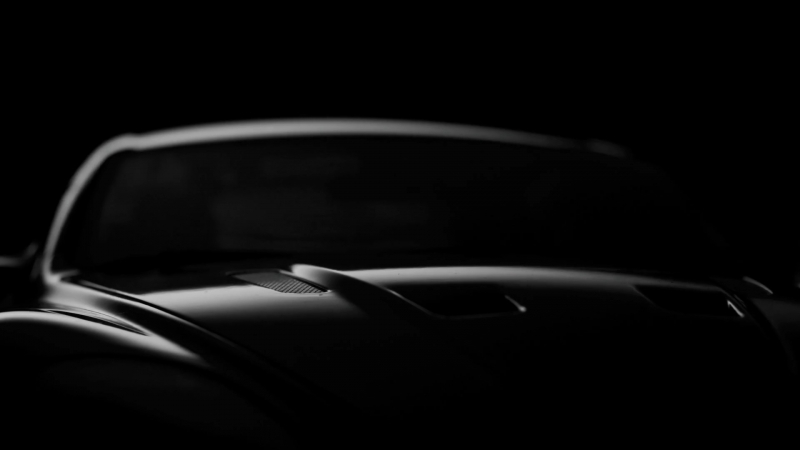
Shots are similar to this, no challenges really. I'm just interested to see if there's a way to create more of a silver effect like the example above.
-
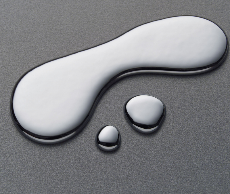
Totally understand. Not trying to be cryptic but can't post references from the actual job . Trying to think of ways to make a black and white image look a little more like mercury (pic below). I'm thinking it's about combining softening and edge sharpening, maybe luma only sharpening and lots of selective blur. Any thoughts would be much appreciated.
-
Mercury the chemical element e..g no pigment/shiny/reflective and liquid like.
-
Hey, I've been asked to create a mercury like look for a black and white car promo I'm grading. Started with a red filter style BW grade then played with luma only adjustments to add silver but I wonder if there's something I'm missing. Does anyone have any tips or techniques to share for creating more of a mercury liquid like look? Any help would be much appreciated.
-
B/W Rgb values in film stocks
Jamie Neale replied to Abby Bader's topic in Editing , Color grading & Finishing
How do you know if the numbers are plus or minus? -
@Stefan Ringelschwandtner Agreed, if it looks right then it's right. For film emulation these days I'm 90% of the time going to Look Designer and building on top of that. I'm also using a few DCTLs to save time in other areas too. Like you say, if we want the film look then we should shoot on film, everything else is borrowing characteristics.
- 13 replies
-
- 1
-

-
- kodak vision
- luts
-
(and 6 more)
Tagged with:
-
I think what you've done is super useful, especially for explaining the parts that make up a classic film look. Thanks for putting the time in to recreate the grade. I'd be interested to hear your thoughts on creating film density. Often this is the characteristic that clients want but never know how to ask for. I tend to use a combination of curves (hue/luma) with colour separation underneath a print style S curve. Plus there's various saturation tekkers that get thrown into the mix.
- 13 replies
-
- 1
-

-
- kodak vision
- luts
-
(and 6 more)
Tagged with:
-
Love the amount of effort he's gone into there. Great resource covering the some of the main characteristics.
- 13 replies
-
- 1
-

-
- kodak vision
- luts
-
(and 6 more)
Tagged with:
-
RCM Workflow - White Balancing in Log space
Jamie Neale replied to Douglas Dutton's topic in DaVinci Resolve
@Douglas Dutton some of the tools are colour space aware so switching your timeline colour space helps that feature kick in. RAW carries metadata to help resolve know how to translate to your working display colour space. If you're getting ProRes and don't have camera data/info, you could go back to the DP/Director and ask? do that all the time. The non RCM route, using CSTs and manually controlling gamut/tone mapping is great for quickly testing out colour spaces to see which works best. One big difference is when using RCM you're also getting the use of Input/Output DRTs. You can get a similar result by doing this manually with the CST. -
100% agree, I haven't really worked out a solid workflow for going back and forth yet. I tend to use ColourLab more like a sketch book, I grab my references, tweak settings and I get to see (very roughly) a decent starting point for a look. This is mad (considering all that it can do) but I really like the fact you can output a pdf with all the looks in one file that I can fire over to everyone. I know they're working on having an alternative to the LUT/CDL workflow that could see the OFX be placed into the node tree instead. Scatter is amazing, I picked up a copy last week and it's been a revolution. It's pricey but worth every penny. I come from a DP background so working in a more photographic way just feels right.
- 13 replies
-
- kodak vision
- luts
-
(and 6 more)
Tagged with:

