
Coloured by Paul Ensby
Company 3
I only got involved with this film during the post-production process. I was assigned the project through my employee, Technicolor, in London and met the DP, David Tattershall a few weeks before we were due to grade. David had brought some images on his laptop that he took on the shoot. This gave me an early insight into what he wanted to do in the grade and we discussed the look we wanted to go for.
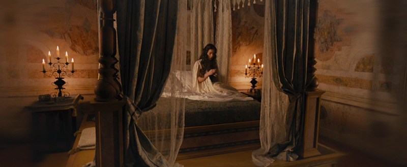
I personally enjoy playing with the different natural colours that this kind of production design gives us. Wonderful natural light, lavish costumes and gorgeous set designs gave us a lovely base to work from. Although this show was shot digital, my general technique was to aim for a classic film look.
I’d rather set the tone of the shot using the skin and deal with any colour issues that arise around that separately
- Paul Ensby -
Grading technique
We graded from ARRIRAW Log files and added a proprietary LUT that I trimmed based on the latest Kodak film stock made. This became a favourite of mine and I subsequently used it on other projects. The contrast curve and saturation mirror 35mm film nicely.
READ: Mitch Bogdanowicz about LUTs
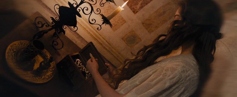
I enjoy working with the filmic Log toolset. This way I keep the natural balance of colours throughout the shadows, mids and highlights on the first pass. My first pass is always kept very simple, using Log printer lights, saturation and subtle contrast tweaks. From there I review, take notes and prepare for the second pass which involves a lot more secondary work. Add to that, any kind of mix of hue, sat, curves, keying, windowing etc. whatever is needed, really. I try not to overcomplicate the grade unnecessarily but using windows can be incredibly helpful in making the image more interesting or lifting areas which otherwise would be lost.
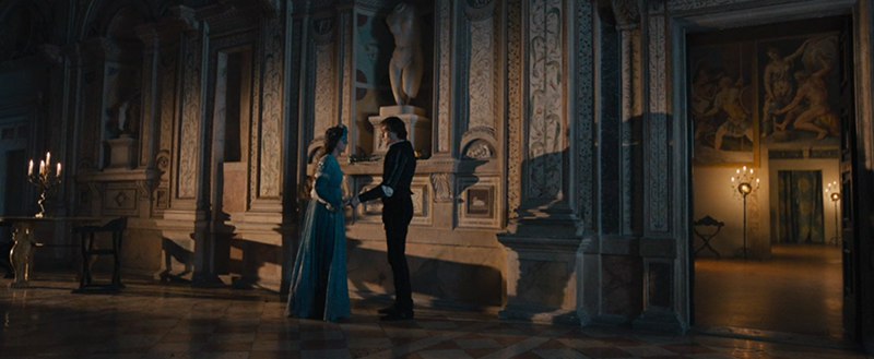
Mostly, we tried to keep the general look rich and lush but obviously certain scenes lent themselves to be a colder or darker palette. I always try and ensure we have achieved the right balance throughout the beginning, middle, and end of the film in terms of colour and light. Often, we need to review the whole film a couple of times through the process to know we have achieved the correct overall feel.
Fantasy sequence
Only during the fantasy sequence in the final tragic scene did we introduce an unnatural colour scheme and defocused the edges of the image for effect. The reason was to tell the audience the scene was a ‘flash forward’ in time. Here, I would accentuate a particular colour whilst removing other colours from the palette – creating more of an unnatural wash – far different to anything else in the movie. The director was also looking to introduce more camera movement to a lot of scenes and in this final scene, we often introduced a subtle camera push in or out to make the shots a little more dramatic. This was a very important moment in the movie so we spent a lot of time making this scene just right.
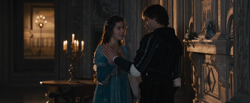
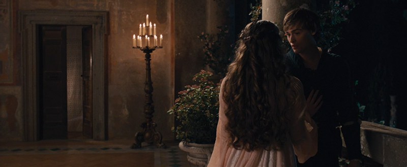
Balcony scene
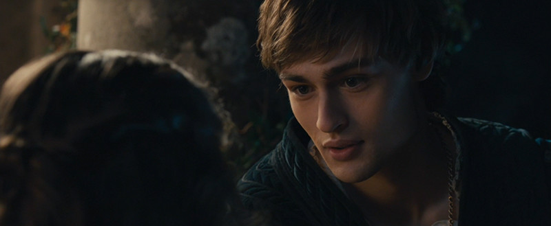
In the famous balcony scene at night, we were keeping a natural darkness whilst introducing power windows to help train the eye into the correct areas of the frame which is an important skill to master. A combination of cool moonlight and warm candlelight is always a nice look and this scene looks beautiful.
The first point of reference
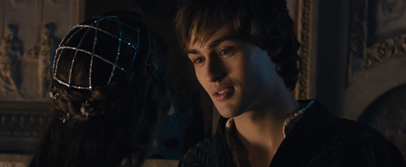
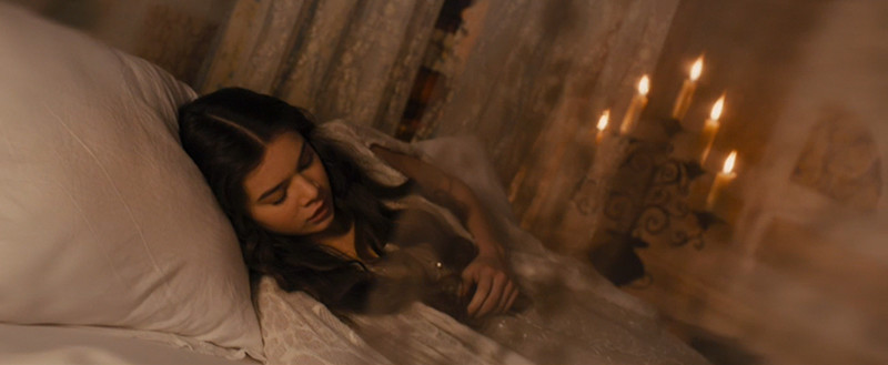
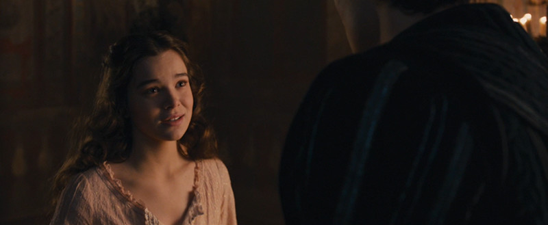
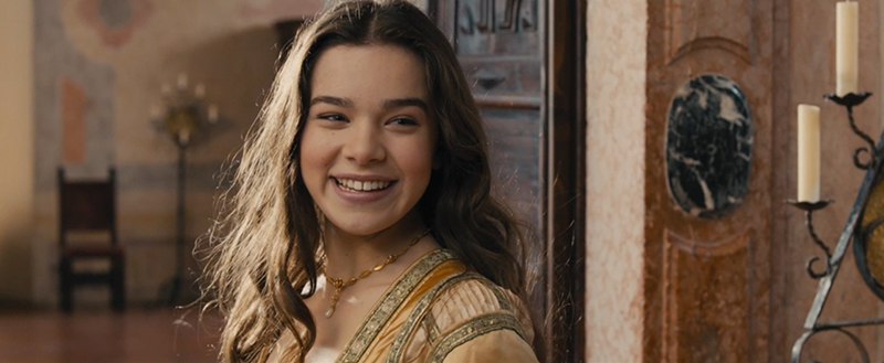
We tried to keep natural flesh tones whilst saturating the overall colour to make the image shine. Skin tones are literally the first point of reference for every scene. I always try and keep these consistent and they are an excellent barometer of how the scene wants to naturally look like from the shoot. I start on the 'master' shot of each scene - grab a still and constantly reference to this to match skin and other colours.
I try not to mess too much with skin if I want to keep it natural looking. I’d rather set the tone of the shot using the skin and deal with any colour issues that arise around that separately. I’m also not a huge fan of keying but I use it when I have no other option. I’d rather get there using cleaner Log or sat curve controls.
I enjoy the challenge of doing subtle beauty fixes around eyes using a window with slight blur or lifting contrast. Also, if a shot is soft I tend to avoid sharpening the whole image but just concentrate on the actual part of the image we want in focus.
Paul Ensby
All images and clips copyright © 2016 Amber Entertainment
-
 1
1