Colored by Eric Whipp
Alter Ego
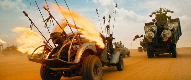
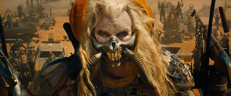
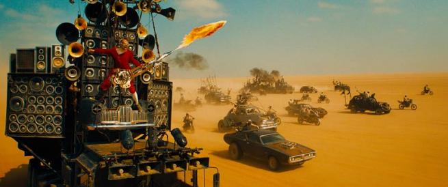
I came on board with the production in early 2014, and I met with George Miller, the director, and talked about what the look could be like. It was amazing to get such an open brief which was essentially "it should be saturated and graphic, and the night scenes should be blue". The main reason for this is quite interesting. George has been watching 30 years of other post-apocalyptic films and noticed that they all use the same bleached and de-saturated look. We knew we didn't want to make yet another film like that, so we had to find a way to make it saturated and rich.
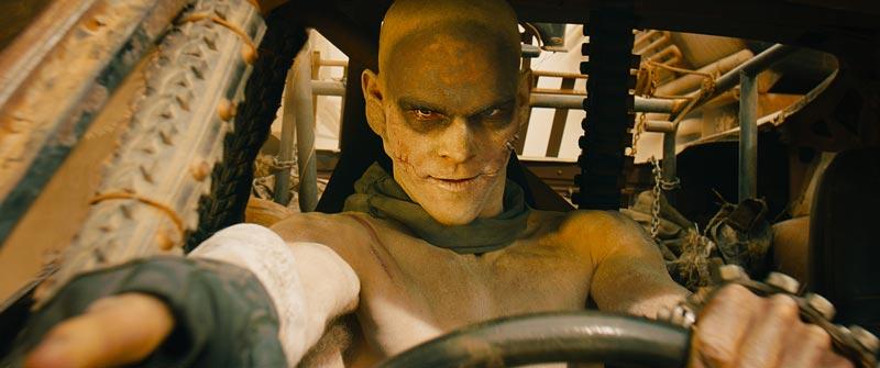
The human brain focuses about 80% attention on a character's eyes, so we wanted make sure they were clear and vivid in every shot
- Eric Whipp -
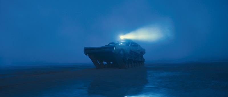
The other aspect was to keep each frame as graphic as possible. When it came to the night scenes, we experimented with silvery looks and photo-realistic looks but found that the graphic rich blue night look was the best option for the film.
Grit in the image
I watched all the original films again before starting just to get some grounding of the series. The one thing I was very conscious of was to make sure there was some sort of "grit" to the image. We didn't want to make an overly plastic or fake looking saturated image, there needed to be some sort of rawness in the look as well. In general, one of the aspects of the look was to apply a lot of sharpness. We liked how it made the image look sharp and how it often brought out some grit in the image. Each shot was sharpened independently and often we sharpened just certain parts of the frame more than others to help draw attention to specific areas.
Because the film mostly takes place out on the desert road, we knew it could get visually boring very quickly. Which is again the reason for going with a rich colourful palette. Watching 2 hours of de-saturated desert tones would be dull. Once there was a rough cut of the film, we looked at the scenes and worked out how we could break up the visuals to create some variety in looks and also how to differentiate the landscapes and story points. Every time I worked on a shot, I kept saying to myself "make it look like a graphic novel".
The basic balance
The film was shot on the Arri Alexa in Raw. We used an LUT to convert the C-Log into P3 colour space, which also had a bit of a film emulation baked into it. We had someone from Deluxe provide several options for LUTs which we chose after testing. The Alexa camera has such great dynamic range which was amazing for a film like this, as I was very rarely struggling to find detail in a shot. With most of the shots we did a basic balance using printer lights first, then we jumped into video-style grading tools after that. I always worked under the LUT, but used traditional video tools such as lift, gamma, and gain. I also used some soft keys to add contrast to certain parts of the image which helped retain detail in extremes.
READ: Mitch Bogdanowicz about LUTs
Eye scan
Every shot in the film has been worked quite hard in the grade. George is big on what he's phrased "eye-scan". The audience should not have to search the frame to know what's important in the image. We would shape each shot so your eye knew where to look and you saw the important story points in any given frame. We used standard techniques like vignettes or shading parts of the frame down to draw your eye to what's important. The overall experience should be smooth and even though levels may be changing across cuts, the idea is that you shouldn't notice it.
For each look in the film, I made sure there was a connection between them. Whether it was a contrast level or a saturation level, the scenes needed to flow. Whenever I'd work on a scene, I'd always go back and watch the scenes with audio to make sure I wasn't missing anything important and that it flowed across the cut.
The looks and expressions of the actors
Like with any film, the main objective is to match the skin tones of the characters across the cuts. On a few occasions, we would help out an actor who might have had a pimple or something on that shoot day. The film was shot over 6 months, so it's quite normal to see blemishes appear across the cut. We simply tracked their face and smoothed out the skin to remove the acne.
We also spent a lot of time on the eyes of the characters. There's very little dialogue in the film, and a lot of the performances come from the looks and expressions of the actors. The human brain focuses about 80% attention on a character's eyes, so we wanted to make sure they were clear and vivid in every shot. I essentially rotoscoped every eyeball in the film and added contrast and sharpness to them. This made the eyes vivid and helped draw your attention to their performances.
The night scenes are 95% completely blue, so it obviously affects the skin tones as well. I kept 5% of the original colour in the scenes and occasionally we pushed a colour for story reasons such as some blood or a green plant.
Every time I worked on a shot, I kept saying to myself "make it look like a graphic novel"
- Eric Whipp -
Day-For-Night
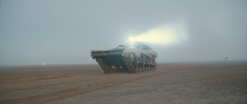
One of the toughest parts of Fury Road for me was working out the right look for the Day-For-Night. The incredible Cinematographer, John Seale and VFX Supervisor, Andrew Jackson had worked out a technique of shooting 2 stops over-exposed on the day shoot. The theory behind this is quite simple. With an over-exposed image (without clipping highlights), we can expose the shot back down in the colour suite, grade the image to create the Night Blue look. Then we can selectively bring out any detail from the shadows that we wish, with virtually no noise. This enabled me to create very graphic contrasty images with detail exactly where I wanted it, and a fall off into shadows where I didn't want it. Almost every D4N shot was basically roto'd and had the sky replaced to create the look. It took a few months of fiddly work, but I think the look is different and graphic.
Challenge with the interior driving shots
One of the other trickier elements of the film was grading the interior driving shots. As you can imagine, shooting in the bright desert sun, if you expose for the dark interior of the car, then the background outside the window is severely over-exposed.
We wanted to always retain detail and saturation both inside the car and outside the car. This meant a lot of keying and detailed shape work to keep both sides of the exposure looking rich and saturated. For the most part, I approached shapes in 2 ways. The first was to use very soft shapes as a way to shade and shape the image. The second was to do very precise shapes which usually required a lot of tracking and roto'ing, such as eyeballs.
The redemption scene
There's a scene in the film called "redemption". It's a scene where Max comes up with a plan and presents it to the other characters. They all discuss the plan and decide to go ahead with it. However, it's a dangerous plan, and they don't know if it will work or not.
The one thing I was very conscious of was to make sure there was some sort of "grit" to the image
- Eric Whipp -
For this scene, we wanted to break away from the standard blue skies that we had seen in the other action scenes previously. Instead, we changed all the skies in the colour suite to a slightly stormy looking sky. The characters are lit in full sunlight, but there's a stormy environment behind them. The idea behind this was to create a mood where you're not sure if it's going to be a nice day or a bad weather day. Helping to create an emotion with the audience that compliments the story of whether the plan will work or not.
This meant that for every shot in the scene, we needed to replace the sky with a new stormy sky, one for each angle the camera faces. The ability to replace skies in Baselight is amazing. It's fast and interactive, so George is able to see instantly and can frame it how ever he wants, or switch it out at the drop of a hat. On a technical level, it meant that every sky needed to be tracked to the background of the shot and put behind the characters which required a lot of detail work, but it was worth it in the end.
VFX
If there's a tool on the Baselight, then chances are I used it on this film. Everything from keying, curves, printer lights, shapes, sharpening, lens flares, blurs etc. The grading stacks are quite large on this film. I also like to keep every change in its own layer so I can control it separately and disable it if necessary.
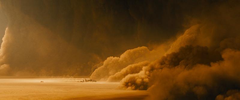
I also worked very closely with VFX on this film. There are actually a lot of VFX shots in the movie, from basic wire rig removal to CG backgrounds and of course the Toxic Storm.
We were able to get mattes with every VFX shot so I was able to control specific areas of the image that were comped. For example, if there's a green screen shot of Max and the background is comped it, then it is hugely beneficial to have the matte for Max so I can adjust him independently to the background. It saves a lot of time.
Eric Whipp
All images and clips copyright © 2016 Warner Bros. Pictures
-
 9
9
